Planning submission heightens anticipation of £70m George Square plan
October 6 2016
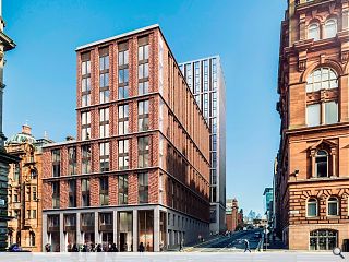
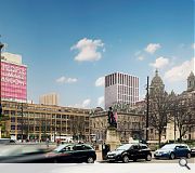
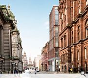
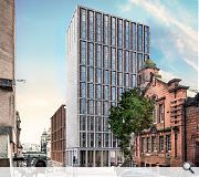
The Chris Stewart Group is to formally submit a planning application for a £70m lane development off George Square later this week after securing the backing of Glasgow Chamber of Commerce.Hoskins Architects have been brought on board to transform two listed buildings on George Street into 43 serviced apartments and office space together with construction of a 258-bed hotel and a 272 bed student accommodation block.
Chris Stewart commented: “We have been looking for the right opportunity in Glasgow for some time now, and were delighted to be chosen as the preferred developer by City Property (Glasgow) and Glasgow City Council for this important and strategic site right in the heart of the city centre. We have been working closely with GCC and a number of other stakeholders for almost a year to ensure that our proposals and vision for the site match with the city’s aspirations for high quality mixed use development.”
A new lane will also be routed through the site to provide a focal point for a range of restaurants, bars, cafes, boutiques and food stores as well as a public plaza.
CGI's courtesy Hoskins Architects
|
|
16 Comments
#1 Posted by Terra on 6 Oct 2016 at 18:16 PM
Wow; bold! I like it.
#2 Posted by alibi on 6 Oct 2016 at 18:53 PM
enourmous and largely blank gable towering over George Square. no thanks.
#3 Posted by Mao on 6 Oct 2016 at 20:49 PM
Woooooof.
Thats a sexy build.
And, we've not even had a glimpse of the lane aspect yet.
Thats a sexy build.
And, we've not even had a glimpse of the lane aspect yet.
#4 Posted by David on 6 Oct 2016 at 20:52 PM
Very bold indeed, will make a very positive contribution to the cityscape and fill a long standing gap site. However the only regrettable aspect of this proposal is the demolition of the red sandstone art deco building on John Street, which if restored and reconfigured, could have created some beautiful office or residential accommodation. And when buildings like this come down they are lost forever...
#5 Posted by nitpicker on 6 Oct 2016 at 23:55 PM
I like it very much, though I can't help but think that the proportions of the facade to George St would be better if they flipped the top two blocks, so the window rhythm was 2-2-3-2 rather than 2-2-2-3.
As for the blank facade towards George Sq - love it. Bold. Reflects the blank east & west facades of the Wylie Shanks Glasgow College building.
As for the blank facade towards George Sq - love it. Bold. Reflects the blank east & west facades of the Wylie Shanks Glasgow College building.
#6 Posted by Chris on 7 Oct 2016 at 08:14 AM
I quite like the red brick, and I personally love the single brick row about each storey so there isn't floor to ceiling windows, however the grey imposing tower over George Sq, no thanks
#7 Posted by EM on 7 Oct 2016 at 09:25 AM
Yup I say keep the Art Deco building, incorporate it into the design and reduce the height of the tower that it doesn't impose on George Square, then its an all win design for Glasgow!
#8 Posted by Yaldy on 7 Oct 2016 at 10:12 AM
Some really nice work here - love the red brick building in particular and I like the suggestion of #5.
Agree with #4 about the art deco red sandstone building, first thing I noticed and shame it wasn't incorporated into the design.
Agree with #2. There's another large student accommodation tower in build (replacing the old white church/furniture store) so it seems like new builds towering over george square are coming, whether we like it or not. However, the largely blank side doesn't work
#9 Posted by Fat Bloke on Tour on 7 Oct 2016 at 11:40 AM
Game of two halves.
The red brick closer to GSq. looks OK.
Takes onboard its surroundings and offers something to the street.
The modern tower on the other hand looks like "stack-a-pleb" design on a budget. Great opportunity to work with the existing B+P tower to offer a much improved cityscape.
However the current design is poor with little character and no roof top personality. It looks like a teenager who isn't as good looking as either of their grandparents.
Needs work.
#10 Posted by Sir Ano on 7 Oct 2016 at 14:23 PM
I like it but the big blank sides of the tower just don't sit comfortably with me. Hopefully this is just the resolution of the visual and there is actually something going on here.
#11 Posted by Yaldy on 7 Oct 2016 at 14:45 PM
#3
Chairman, it isn't up to much at first glance...
http://www.bbc.co.uk/news/uk-scotland-glasgow-west-37587727
Chairman, it isn't up to much at first glance...
http://www.bbc.co.uk/news/uk-scotland-glasgow-west-37587727
#12 Posted by E=mc2 on 7 Oct 2016 at 16:24 PM
The red brick would be better as an ashlar stone finish
#13 Posted by Patema on 7 Oct 2016 at 19:03 PM
Looks good, although the enoch area needs to be gentrified.
#14 Posted by Fraser on 7 Oct 2016 at 22:06 PM
I really like this
#15 Posted by Keith on 8 Oct 2016 at 13:46 PM
What's not to like? No plastic looking cladding, no zinc top floors, no random windows. Get it built. As for its relation to George Square, the planning department have allowed so many roof extensions in various guises they've already ruined the cities main civic area. The hotel has to get another 5 floors or thereabouts, then there's the other student tower on cathedral st (the one with the diving dale sticking out)
#16 Posted by Billy on 9 Oct 2016 at 17:56 PM
Good to see some movement here. Like the proposals. I understand the need for height restrictions here but can we a bolder and go above 30 storeys in Tradeston and the Charing Cross corridor. Make our city centre easily identifiable by its skyline. Most of the tallest buildings are in the surburbs. A dynamic skyline on the entrance to our city centre via trains to Central and the airport Charing Cross corridor will give the city a gutsy, happening, you want to locate here appeal. City planners make it happen and stop being cautious. We need some more signature buildings on this corridor to support The co-op building ,Charing Cross Mansions and the Mitchell library. That building over the motorway is an 80s eyesore. It's our front door! First impressions count. It needs to be made over in some way. The building building next to the leaning fountain of Glasgow is another blot on the landscape and has to be demolished or given a much needed makeover. A building can project a perception, negative or positive of the tenant . I wish some businesses would remberer this.
Post your comments
Read previous: Lochrin Square ‘defurbishment’ nears completion
Back to October 2016
Like us on Facebook
Become a fan and share
News Archive
Search News
Features & Reports
For more information from the industry visit our Features & Reports section.


