Holmes Miller complete Edinburgh Premier Inn
August 31 2016
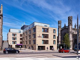
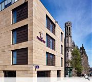
Holmes Miller and Interserve Construction have unveiled their newly completed Premier Inn hotel at York Place, Edinburgh, a conversion of a 1970’s exposed concrete office block.Situated within the New Town conservation area the project saw the existing structure stripped back to the frame and remodelled to accommodate 127 bedrooms.
In a statement the practice said: “The existing massing allows for a quiet, respectful relationship to the existing buildings on York Place, while taking advantage of dramatic views to the north over the Firth of Forth.
“Holmes Miller worked closely with City of Edinburgh Council to produce a design sympathetic to the sensitive and historic context, whilst being contemporary and refined. The development creates the missing link to the streetscape created by the 1970’s office building.
!Clad in stone, zinc and full height glazing, the building is enhanced by a restrained approach to detailing and proportion. A subtle variation at ground floor provides a sense of scale, activating the streetscape."
|
|
5 Comments
#1 Posted by MoFlo Bro on 31 Aug 2016 at 17:20 PM
A bit routine, though from the description it sounds like an improvement an what was there before. Can't help feeling they've missed an opportunity here though. It seems to be facing the wrong way, like it has it's back to the church. Surely would've made a more impressive entrance facing the other way.
#2 Posted by Cyril Sneer on 1 Sep 2016 at 10:08 AM
The back-painted glazing system looks to be the wrong colour at high level. It neither blends with the sky nor looks like translucent glass. It also jars with the poky inset hotel window. All a bit arbitrary and dull.
#3 Posted by Terra on 1 Sep 2016 at 14:28 PM
It's definitely an improvement on what it looked like before, no doubt...
Saying that, I agree with MoFlo that this is a bit of an opportunity wasted. They really could have added something interesting to a beautiful street instead of pretty much recladding a building that sticks out a bit too much in the first place. A total redevelopment would have been better but, as it is this is at least better visually than it was before.
Saying that, I agree with MoFlo that this is a bit of an opportunity wasted. They really could have added something interesting to a beautiful street instead of pretty much recladding a building that sticks out a bit too much in the first place. A total redevelopment would have been better but, as it is this is at least better visually than it was before.
#4 Posted by Cadmonkey on 2 Sep 2016 at 09:19 AM
"Plonked" springs to mind.
Could be absolutely anywhere.
Could be absolutely anywhere.
#5 Posted by Town Planner on 5 Sep 2016 at 13:02 PM
Shocker...Particularly given the location and buildings around it.
Post your comments
Read next: £6m Inverness student housing complex opens
Read previous: Dundee hotel extension goes before planners
Back to August 2016
Like us on Facebook
Become a fan and share
News Archive
Search News
Features & Reports
For more information from the industry visit our Features & Reports section.


