Planning sought for Dalmarnock primary school
August 22 2016
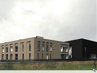
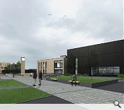
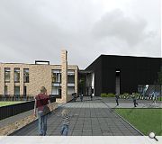
Glasgow City Council’s development and regeneration services department has filed plans for a new primary school in Dalmarnock to augment ongoing regeneration around the Commonwealth Village.The school has been conceived as two elements namely a brick-clad classroom block and double height metal-clad multi-purpose hall with a small clock tower signifying the main entrance square at the junction of these two halves.
In their design statement the council wrote: “The double height gym/assembly block flanks Sunnybank Street, forming an active edge to both the street and the pedestrian path. The 2-storey teaching block is set back from the road, allowing all classrooms direct access to the playground. The main entrance is located between the two blocks.
“Each wing is proposed to have a different function and a different structural strategy. This will also be reinforced through contrasting cladding materials.”
Possible future expansion is allowed for within the masterplan, enabling the school to cater to a maximum of 528 pupils should future needs make this necessary.
|
|
10 Comments
#1 Posted by lm on 22 Aug 2016 at 11:14 AM
Really good :)
#2 Posted by Edward Harkins on 22 Aug 2016 at 11:25 AM
Let's hope that on the back of the Commonwealth Games redevelopment successes that this is a turnaround for this locality. An immense (unmeasured?) amount of public funding has been poured into this neighbourhood over many decades - without the evidence of commensurate socio-economic returns.
#3 Posted by Dug on 22 Aug 2016 at 12:29 PM
The Architects of Glasgow City Council should be commended for continuing to produce such high quality exemplar education projects with design at the fore. Long may this continue!
#4 Posted by Sir Ano on 22 Aug 2016 at 14:07 PM
What does a 4-11 year old get from that?
Seems to lack a bit of imagination.
Seems to lack a bit of imagination.
#5 Posted by Auntie Nairn on 22 Aug 2016 at 14:17 PM
Air Ano, what a 4-11 year old gets from that, is that someone has actually made an effort to design them a half-decent place for them to spend the next seven years of their life - obvious, no?
#6 Posted by Sir Ano on 22 Aug 2016 at 15:55 PM
That's not being questioned Auntie. I'm sure it will be a great place to learn but that building could quite easily be a gp surgery, council office, regional college..etc
Close your eyes, imagine being a 5 year old again walking up to school on your first day it wouldn't have done it for me.
Close you eyes
Close your eyes, imagine being a 5 year old again walking up to school on your first day it wouldn't have done it for me.
Close you eyes
#7 Posted by Sir Ano on 22 Aug 2016 at 16:14 PM
If I'm completely honest I probably would of had nightmares about that clock.
#8 Posted by Jimmy Tee on 22 Aug 2016 at 16:33 PM
@Sir Ano....
I think that patronising 'its a primary school so lets make it primary colours and lets make so zany shapes' attitude to educational architecture, in order to create an imaginative building that stimulates children is where most architects have been going wrong over the past decades.
it may seam boring, but the best schools are all about creating excellent and practical environments for learning. Understanding what varying spaces are required for teaching and learning as well as controlling ventilation and acoustics will inform the quality of a child's education to a much greater extent than 'imaginative architecture'.
This looks like a considered, functional and elegant solution and I commend the council for that.
............. on another note when did the council start deigning their own schools? I though Anderson Bell Christie and JM Architects were designing them? This seams like a bit of a step up from the UPVC replacement windows in listed buildings, dodgy lean-to extensions and horrendous care-homes that usually comes from the council's architects!
#9 Posted by Clive on 23 Aug 2016 at 06:18 AM
Sir Ano, it is clear that you were a clock-watcher, and not a studious pupil.
"I would of had"
Ye gads, man!!
With regard the building, I like it. However, it is not possible to tell what the children will 'get' from it from three exterior renders. The quality of the interior is quite important, would you not say? Interior layout, scale, colour and flexibility are key.
"I would of had"
Ye gads, man!!
With regard the building, I like it. However, it is not possible to tell what the children will 'get' from it from three exterior renders. The quality of the interior is quite important, would you not say? Interior layout, scale, colour and flexibility are key.
#10 Posted by Sir Ano on 23 Aug 2016 at 15:45 PM
Argghhhhh you guys are infuriating.
Who’s talking about “primary colours” & “Zany shapes”? I’m just looking for a little imagination, playfulness, intrigue, excitement…. et ceteraaaaaaaaaa
I wish I had never said any now. The ministry of truth has spoken.
Who’s talking about “primary colours” & “Zany shapes”? I’m just looking for a little imagination, playfulness, intrigue, excitement…. et ceteraaaaaaaaaa
I wish I had never said any now. The ministry of truth has spoken.
Post your comments
Read previous: TK Maxx set up shop in Edinburgh
Back to August 2016
Like us on Facebook
Become a fan and share
News Archive
Search News
Features & Reports
For more information from the industry visit our Features & Reports section.


