Glasgow nightclub makes way for more student housing
August 19 2016
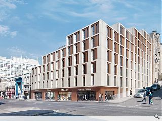
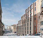
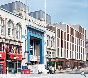
A Glasgow nightclub is to make way for the city’s latest student residential build, following submission of plans by Haus Architects on behalf of GRS, owners of ABC 1 and 2.185 studio flats will be housed in a single building extending from three to eight storeys as it rises from Sauchiehall Street up Dalhousie Street, with ground floor retail provision stretching along the former and a central lightwell drawing daylight to the interior.
The scheme also adopts a structural solution allowing for apartments to be combined post construction to allow the applicant maximum flexibility in configuring layouts to meet greatest need.
In their design statement Haus remarked: “Adopting the simple rule of three – stylobate/base, portico/middle, entablature/roofline we have developed the elevations to address how each building touches the ground to engage with the city streetscape; the main body of the composition and how it creates visual interest that is legible from eye level; before finally addressing the composiition to the top of each building as it engages the skyline.”
Faced with smooth pre-cast concrete with copper rainscreen panels the build will include a range of Internal and external amenity spaces.
|
|
16 Comments
#2 Posted by mole on 19 Aug 2016 at 12:24 PM
A fine pattern on the facade which one might well be very happy with for, say the fabric of a train seat. Facile for a building of significant scale and location however.
The relationship with the art school is untenable.
The relationship with the art school is untenable.
#3 Posted by Sue Pearman on 19 Aug 2016 at 12:36 PM
Hmmmm, cries of Mackintosh vandalization.... would be ok with a 3 floor reduction I think.
#4 Posted by Art Vandelay on 19 Aug 2016 at 12:56 PM
WTF is a coffee studio?
Also, their 'rule of three' thing is tenuous at best.
Also, their 'rule of three' thing is tenuous at best.
#5 Posted by QMD on 19 Aug 2016 at 14:18 PM
It was all fine until the last image. Did anyone spotted the two grey boxes behind the brown facade? What's the height in comparison with the GSA building? An elevation/section is important!
#6 Posted by Cadmonkey on 19 Aug 2016 at 15:34 PM
Edinburgh's Missoni plonked next to the Mac.
Repetitive window details to save time drawing - check
Minimal facade modelling to save cost - check
Pack in as much massing as we dare without laughing - check
Ok, press submit....
Repetitive window details to save time drawing - check
Minimal facade modelling to save cost - check
Pack in as much massing as we dare without laughing - check
Ok, press submit....
#7 Posted by Town Planner on 19 Aug 2016 at 18:27 PM
Disappointing. Given its central location next to GSA opportunity missed.
#8 Posted by Yaldy on 19 Aug 2016 at 21:39 PM
I know the GSA and all that lies within a few streets radius holds divine meaning for you architect types, but I'm struggling to think of an area of town I care less about that the a**e end of sauchiehall st. This is a plot that is literally attached to the ABC
#9 Posted by AL on 19 Aug 2016 at 23:06 PM
A really difficult design task - bridging the gap between the short building at the bottom of the hill to the much taller one perched on top. I think the elevations look slightly awkward on the Sauchiehall street section (and will date very quickly), but luckily all negative attention will be drawn to the monstrosity that is the facade of the O2 ABC next door.
#10 Posted by Jimbob Tanktop on 19 Aug 2016 at 23:16 PM
I like how the desired tenants are a 'Gallery' and 'Coffee Studio', whereas they should be "24 Hour Rizlas", "Kebabakab" and "Fag Replacement Wands R-Us!"
Nice that the monolithic dark towers couldn't even be hidden in the PR images. They should be looooovely.
Nice that the monolithic dark towers couldn't even be hidden in the PR images. They should be looooovely.
#11 Posted by Terra on 20 Aug 2016 at 04:06 AM
I think they've come up with an interesting design for a challenging location. It could use a bit more detail instead of the usual perfectly smooth boxy vibe it's got going on but overall it decent enough.
#12 Posted by Fraser on 20 Aug 2016 at 12:14 PM
I like it. I walk past the site every day to get to uni, and it is a dead area. I like the way they build up the mass as it reaches the mack. Only complaint is the windows on the lower floors seem a little dull. They could have made the dalhousie street elevation more interesting
#13 Posted by bannister fletcher on 21 Aug 2016 at 08:54 AM
irrespective of the architectural approach, this scheme simply does not work at all from a fire strategy point of view. It will also require a significant redesign from scratch, unless haus have engaged the services of a world-class fire engineer who has Glasgow Building Control in his pocket which is as likely as this scheme ever being built in its current layout. So really all this talk is just mere talk.
#14 Posted by Curious on 21 Aug 2016 at 18:51 PM
@ 13. Can you clarify why you think it doesn't work Bannister?
#15 Posted by Barbara on 23 Aug 2016 at 10:08 AM
@13 I would also like to enquire as to how you can make such assumptions Bannister? I can only assume you have read the design statement and reviewed the submitted plans ?There possibly could be a "world class fire engineer" working with the team, either way I am sure the team involved are more than aware of the site restrictions and issues regarding fire egress.
Personally I think this is a considered design which comment @9 touches on, is a difficult site. It will be good to see how the scheme moves forward. Personally, I don't see it anyway how it affects the Mac, which from Sauchiehall Street you only notice viewing up Dalhousie Street really, to the Green box at the top.
Personally I think this is a considered design which comment @9 touches on, is a difficult site. It will be good to see how the scheme moves forward. Personally, I don't see it anyway how it affects the Mac, which from Sauchiehall Street you only notice viewing up Dalhousie Street really, to the Green box at the top.
#16 Posted by OSmosis on 23 Aug 2016 at 12:43 PM
I wonder do they propose to rename Renfrew St to Renfield St as indicated in the Level 00 Plan?
Post your comments
Read next: Former Perth Mart earmarked for new homes
Read previous: Partick Interchange bus station to be redeveloped
Back to August 2016
Like us on Facebook
Become a fan and share
News Archive
Search News
Features & Reports
For more information from the industry visit our Features & Reports section.


Other than that, nae bad.