Carnoustie Links club house extension secures approval
August 5 2016
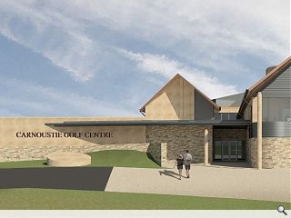
Carnoustie Golf Links have obtained approval to press ahead with a new club house extension despite concerns that the development could undermine existing bars and restaurants in the town.The decision by Angus councillors clears the way for work to begin on a revised iteration of the scheme, which has been reduced in scale from 1,665 to 1,469sq/m together with the addition of new simulator.
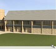
Utilising a base course of random pattern stone reclaimed from existing buildings and dressed stone the extension will sit under a slate roof to harmonise with the existing hotel with extensive views across the course.
In their design statement Wellwood Leslie Architects wrote: “The extension of the Golf Centre maximises natural daylight with orientation towards the Links course for the first floor bar and terrace.
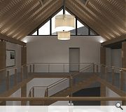
“The atrium space has been retained and strengthened to make it a more important feature within the remodeled facility. All services are visible from the point of arrival both improving the experience of arrival and wayfinding.”
A first floor walkway will also be installed around this atrium to further improve access and also showcase the club’s history and heritage.
|
|
8 Comments
#2 Posted by FHM on 5 Aug 2016 at 14:43 PM
This is what happens when Big Chantelle is given a platform...
#3 Posted by dom on 5 Aug 2016 at 15:46 PM
I would hope that even Big C has better taste than this...
#4 Posted by Terra on 6 Aug 2016 at 20:02 PM
Undermining the existing bars in town is the least of their problems if they are happy to go ahead with that design. Help ma boab.
Honestly, never thought I'd say it but if they want a good example of tasteful..."golf architecture"...so to speak; look no further than Trumps golf course that's just been finished recently.
This isn't just a poor design, it's almost wilfully sticking it's ar!e in the face of basic architectural forms. You wonder if the person(s) involved in the design even know that there are "basics", so to speak. It's like something a kid would design if you asked them to "draw me a building".
#5 Posted by themadattic on 8 Aug 2016 at 07:41 AM
I'm all for open comments on this site. However, I think it only fair to whoever developed this scheme that you check out the planning portal link within the article and base your comments on that as the external image above doesn't appear to illustrate the current approved scheme but the previous iteration.
#6 Posted by Urban Realm on 8 Aug 2016 at 08:31 AM
Quite right Attic - I've updated the visuals to the most recent iteration.
#7 Posted by dom on 8 Aug 2016 at 09:59 AM
#5 & UR - Not really much of an improvement to be honest though
#8 Posted by Terra on 9 Aug 2016 at 02:22 AM
#7 oh it's an improvement but that's not saying much.
To be fair, maybe it's that the renders look like they were done on a BBC Acorn computer from the 80s. But still...
To be fair, maybe it's that the renders look like they were done on a BBC Acorn computer from the 80s. But still...
Post your comments
Read next: 4,620 homes earmarked for Angus by 2026
Read previous: Fort William student block considered by planners
Back to August 2016
Like us on Facebook
Become a fan and share
News Archive
Search News
Features & Reports
For more information from the industry visit our Features & Reports section.


Unaffordable curved glass-tick
Inexplicably offset columns-tick
Strange curvey arches with no support-tick
No hierarchy of material-tick
Fake chimneys-tick
Heavy masonry walls supported on piloti-tick
I'll stop there.