Aberdeen conference centre breaks ground
July 6 2016
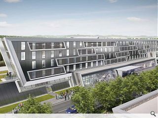
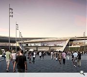
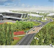
Work has begun in earnest to construct an exhibition and conference centre in Bucksburn, Aberdeen, following a sod cutting ceremony on site.Henry Boot Developments and Keppie Design are spearheading the Aberdeen Exhibition & Conference Centre which is being built on the site of the former Rowett Research Institute to help draw major artists and events to the city.
Council leader Jenny Laing said: "The City of Aberdeen is currently undergoing one of the largest regeneration programmes in its history and it is fantastic that work has now started on the AECC which is a key part of Aberdeen City Council's overall Strategic Infrastructure Plan.
"The new venue will ensure that Aberdeen retains events such as Offshore Europe which brings £140million to the local economy, and the significant economic benefits they bring, while securing new events for the city. It will provide a step change for the future by providing a modern and fit-for-purpose facility, which will be the most sustainable of its kind in the UK.”
Offering four times the exhibition space of the existing AECC alongside a 12,500 capacity arena the new facility should be open for business by 2019.
|
|
8 Comments
#1 Posted by Sue Pearman on 6 Jul 2016 at 14:23 PM
Looks like its been well Keppified and little of the land form concept taken through...on the other hand more like the collision between an oil tanker and platform is probably apt...
#2 Posted by Jon on 6 Jul 2016 at 16:03 PM
Its like looking at a Zaha masterpiece, only in Marley Eternit...
#3 Posted by Cyril Sneer on 6 Jul 2016 at 17:21 PM
Where do you start here? The layers of angled ‘wrap’ are devoid of any coherence or sophistication. Unless you’re paragliding to an event then it’s absolutely pointless designing an overly complicated roof plan. Any comparison made to the late Zaha would be ridiculous. I can’t understand why this wasn’t flagged up as being absolutely rotten & conceptually weak at the early design stage by either the planners, the directors in charge or indeed the client group? Who actually agreed to this 80’s robotic tosh. It’s the type of iconic building that the city councillors are craving, but with none of the skill or integrity to make it successful. The addition of each whimsical angle adds on huge expense and material waste without actually achieving the desired effect of a beautiful and well-designed piece of cultural architecture. Aberdeen has had years of terrible architecture, starting with the existing conference centre, only refurbished in 2003. This monstrous lump will be sure to win one award, the 2019 Carbuncle Cup. It’s great that they have chosen to locate the building well within reach of local amenities, the train stations and bus station...or by foot? Actually, it’s 5 miles away near the airport at Bucksburn. Aberdonians are always travelling to local events by plane, so the proximity to the airport should be really useful?!
On refection, it’s so far away that people won’t actually have to look at it.
On refection, it’s so far away that people won’t actually have to look at it.
#4 Posted by David on 6 Jul 2016 at 17:31 PM
"Students from Grays School of Art are being invited to contribute art to the scheme" - presumably they are getting paid for this? Or is it a case of "We cant pay you it will look good on your CV"
#5 Posted by Terra on 7 Jul 2016 at 01:41 AM
I like it. It's also infinitely better than the current conference centre there.
If they build it as it shown in the renders, with all that lovely greenery, trees lining streets and ivy on walls, then it will be a nice addition to Aberdeen.
If they build it as it shown in the renders, with all that lovely greenery, trees lining streets and ivy on walls, then it will be a nice addition to Aberdeen.
#6 Posted by E-mc2 on 7 Jul 2016 at 13:24 PM
#3 Angled 'crap' perhaps? Totally spurious. Reminds me of Maxim on the M8.
#7 Posted by David on 8 Jul 2016 at 08:46 AM
Seeing it again it's certainly not getting any prettier...
#8 Posted by J Harvey on 9 Jul 2016 at 10:49 AM
#1 Sue you are spot on, "well Keppiefied" indeed.
This has lost all it's original design essence by the concept architect. Too many uneccesary angles, corners, sharp edges introduced by the current architects that makes the original design almost unrecognisable! Borrowing details from Hadid and sticking them on a building that is far from the original, is like stealing a Mercedes badge and sticking on the grill of a Lada.
In any case, this now a fete complete, and like the Brexit vote, like it or not, you will just have to live with it.
Post your comments
Read previous: 1920’s banking hall reborn as contemporary ‘brewpub’
Back to July 2016
Like us on Facebook
Become a fan and share
News Archive
Search News
Features & Reports
For more information from the industry visit our Features & Reports section.


