Plans go in for University of Glasgow teaching hub
June 23 2016
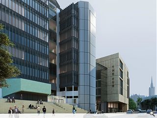
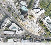
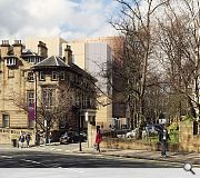
The University of Glasgow has filed plans drawn up by HLM Architects and WSP Parsons Binckerhoff for a Learning & Teaching Hub on its Gilmorehill campus.Faced in large format buff concrete panels and bronze coloured metal panels the hub entrance will be expressed by a signature cantilever with an area of feature glazing providing a direct link to the refurbished Boyd Orr Building.
In a design statement the architects wrote: “We believe that the application proposals achieve a successful response to an area of informal car parking and mathematics buildings that together have a detrimental impact on the visual appearance of what id an important site within the Glasgow West Conservation Area.
“We believe that the development is sensitive to its surroundings achieving a sense of place and delivers the quality of facility required by the University to meet its learning and teaching needs.
Key features of the build include a 500 seat auditorium, café and roof terrace in addition to classrooms.
|
|
11 Comments
#1 Posted by Yaldy on 23 Jun 2016 at 10:19 AM
I've seen a few of you architect types on here talking about "mass" and "scaling". Both of these seem off here. As ugly as the Maths Building is, it does seem better on these fronts
#2 Posted by Fraser on 23 Jun 2016 at 11:11 AM
Dear Yaldy.
Has it not occurred to you that the massing here is as small as is humanly possible? Especially considering the brief requirements for this project. I think this building looks nice, and would sit very positively within its context.
Has it not occurred to you that the massing here is as small as is humanly possible? Especially considering the brief requirements for this project. I think this building looks nice, and would sit very positively within its context.
#3 Posted by Gringo on 23 Jun 2016 at 12:59 PM
Seems pretty cheap and nasty to me. Ill proportioned, and lacking in finesse.
No wonder the old boy in the visual is walking past blowing his chops!
No wonder the old boy in the visual is walking past blowing his chops!
#4 Posted by Yaldy on 23 Jun 2016 at 13:04 PM
Not once did it occur to me, no. It certainly fits within its context, yes. Glasgow has an exceedingly ugly campus, with some obvious exceptions aside.
#5 Posted by bar of chocolate in back pcket on 23 Jun 2016 at 13:11 PM
#3 Gringo... white bunnet!! is the ghost of chic murray still haunting the west end!
#6 Posted by Scunnered on 23 Jun 2016 at 13:11 PM
Well that's a pity.
The refined collage-like contextual and textured appearance of the Boyd Orr building was one of the most successful towers from the 70's in Glasgow. It would seem that this historic aesthetic will now be erased.
To be replaced by what? - An industrialised banal 'anywheresville' corporate facade that Ed bloody Durell Stone could have penned 60 years ago.
Yaldy has a point. The existing textured materiality does break down the scale of these buildings compared to the over-scaled materiality of the big 'modern' industrialised components of HLMs proposals.
Ugly. Ugly. Ugly.
The CGI is a still from a 50's B movie called - 'The day the architects xxxxed it up'
#7 Posted by QMD on 23 Jun 2016 at 16:10 PM
the elevation/material/colour palette is just not inspiring as a top academic ground. Probably more suitable for a factory building.
Cost issue?
Cost issue?
#8 Posted by D to the R on 24 Jun 2016 at 13:17 PM
Where the new bit .... oh .... this is the new bit. Why does it look like it was born in the 80s?
#9 Posted by Terra on 24 Jun 2016 at 13:21 PM
Oddly enough, a part of me wants to like this, it's bold. However, like QMD said, the materials and colour are really not good.
That font aswell, surely they wouldn't use that on the final building.
That font aswell, surely they wouldn't use that on the final building.
#10 Posted by Chris Ditchfield on 27 Jun 2016 at 15:11 PM
Anything would improve this area, which is ridiculously windy due to the Boyd Orr's height, but this is a pretty disappointing effort.
The buildings, both old and new, opposite ( Medical School, etc) look a lot better and this design makes very little effort to blend in with University Gardens.
The buildings, both old and new, opposite ( Medical School, etc) look a lot better and this design makes very little effort to blend in with University Gardens.
#11 Posted by D to the R on 28 Jun 2016 at 08:26 AM
When did we start reading words top to bottom ... theres an utter fascination with this and i don't get it?
Post your comments
Read previous: Quartet of townhouses proposed for Glasgow’s Botanic Gardens
Back to June 2016
Like us on Facebook
Become a fan and share
News Archive
Search News
Features & Reports
For more information from the industry visit our Features & Reports section.


