Fletcher Joseph lodge amended King’s Stables Road proposals
May 13 2016
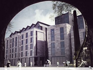
Fletcher Joseph Architects have brushed up their mixed use proposal for Edinburgh’s King’s Stables Road, submitted at the turn of the year, to accommodate a 111 per cent increase in housing provision.This has seen removal of upper floors shown in a prior proposal to allow insertion of ‘dynamic roof elements’ which have been conceived in response to the surrounding context and as a tool to break down the overall massing when viewed from street level.
In a statement the practice commented: “The articulated forms further integrate into the site, while also being conceptually authentic not competing or presenting a pastiche but rather, adding a further layer of variety to the range of roofscapes visible from around the site, with particular attention paid to views from the Castle, the Esplanade and Johnston Terrace.
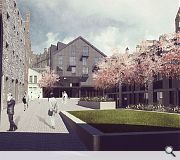
“Finally, the elevations have been rationalised in order to clarify the architectural language to be deployed around this highly sensitive site with fenestration and parapets used to limit the perceived horizontality of the scheme, in particular the larger building elements. Materials have also been considered in order to achieve successful junctions between new and old buildings and, where possible, the use of traditional building techniques.
"Traditionally finished sandstone combines with brickwork, grey cladding and elements of render, consistent with the palette of materials found on site and on surrounding buildings. Windows have been ordered to ensure consistency around the proposals and balconies have been added to give the scheme a domestic language.”
The revised scheme now offers 59 homes alongside a 650sq/m arts facility, 92 bed hotel and 167 rooms of student accommodation together with ground floor retail.
Back to May 2016
Like us on Facebook
Become a fan and share
News Archive
Search News
Features & Reports
For more information from the industry visit our Features & Reports section.


The design is actually quite nice, better than what's there now. I like the Victorian era factory look and it's good they've brought the height down, but the grey cladding ruins it completely. Honestly, grey cladding? Good job apart from that.