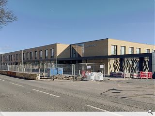
£32m Harris Academy reaches practical completion
April 13 2016
Holmes Miller Architects have reached practical completion at the £32m Harris Academy ahead of its first intake of pupils this August.Hosting 1,200 pupils the new secondary provides 15,000sq/m of accommodation arranged around a split level social and assembly space on the site and includes its own swimming pool and sports facilities which will be made available for community use.
In a statement the architects said: “Externally, a restrained and limited palette of materials (including 250,000 facing bricks) creates a building that is both considerate to its context and is contemporary in form. A considered approach to the landscaping around the building ensures that the building sits easily within its surroundings, with large terraces bridging the changes in level.
“Holmes Miller embraced the opportunity to create outdoor classroom spaces, environmental gardens and social areas. A high level plaza accessed from Perth Road provides a view across the tree line towards the River Tay, and creates a distinctive break-out space adjacent the school library.”
The new school is set amidst the historic B-listed Academy buildings, a number of features from which have been carefully incorporated.
5 Comments
#1 Posted by Islands of sanity on 13 Apr 2016 at 17:59 PM
This good listed building as effectively been demolished apart from a few remnants. There should have been a full Conservation Statement highlighting degrees of significance and a serious attempt to negotiate a better balance between retention and new. The blandness of the new is exacerbated by the overly strong chroma of the brick, which shouts rather than complements its genteel neighbourhood.
#2 Posted by Clive on 14 Apr 2016 at 05:20 AM
It is clear that they were trying to emulate the old Timex factory. I think the Timex factory was a better looking building, though.
#3 Posted by Art Vandelay on 14 Apr 2016 at 09:38 AM
#1 - this is the UR comments section. You could just have used the word 'colour'.
#4 Posted by Islands of sanity on 14 Apr 2016 at 14:25 PM
#3 - Point taken. I still don't like the colour.
#5 Posted by Shutupfakearchitects! on 26 Apr 2016 at 07:57 AM
#1 You are correct that a few more areas of this projects should/could have been saved, however the old Harris wasn't in a good state of repair. Forget about the character of the building and remember it's a school, now with a lot more to offer than its predecessor!
Post your comments
Read previous: Centre for the Scottish War Blinded to rise from mid-May
Back to April 2016
Like us on Facebook
Become a fan and share
News Archive
Search News
Features & Reports
For more information from the industry visit our Features & Reports section.


