‘Unique’ Eaglesham affordable housing unveiled
February 19 2016
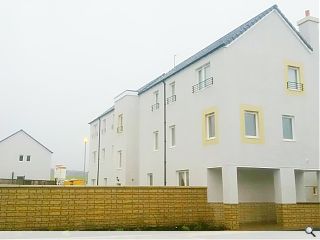
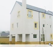
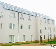
Mactaggart & Mickel have unwrapped seven affordable homes at Polnoon, Eaglesham, in the latest phase of a 121 home development designed by Proctor and Matthews Architects with Horner + Maclennan Landscape Architects.Embracing the principles espoused by Designing Streets the project seeks to ‘set new standards in urban planning’ through its approach to placemaking.
Mactaggart & Mickel director Peter Shepherd commented: “Polnoon is particularly unique; catering to the needs of pedestrians rather than vehicles, it showcases what can be achieved by looking at development design differently with a fresh perspective on community and sustainability.”
The estate has been designed to respect the existing village and neighbouring moorland.
|
|
17 Comments
#2 Posted by Theeagles on 19 Feb 2016 at 14:13 PM
"respect the existing village", did they bother visiting the actual village.
"The estate has been designed to respect the existing village and neighbouring moorland." - what does this even mean, how as this attempted to incorporate the local architecture.
Didn't Mr Salmond & Co champion this as Scotland's first eco-village. Whats eco about this?
http://www.s1homes.com/scottish-property-news/2009-11-23-1.shtml
#3 Posted by Byronic on 19 Feb 2016 at 16:16 PM
I think it looks awful! A design award? Is someone taking the mic (no pun intended!)
#4 Posted by John on 19 Feb 2016 at 19:13 PM
Set new standards? This is pretty much top end of Castlemillk or Townhead. Exactly the same layout, possibly even cheaper materials. Does this improve the existing environment / landscape? If not, why build it?
#5 Posted by Sven on 20 Feb 2016 at 16:00 PM
Will be interesting how quickly the white render will age badly in an exposed place like Eaglesham moor. I must admit to agreeing with the above: it looks like 1970's council housing that has been renovated with a new facade.
#6 Posted by George on 22 Feb 2016 at 07:02 AM
I've driven past this development and can confirm that it looks really terrible. How they got approval for this in a nice conservation village like Eaglesham, I'll never know.
The grey render is already looking discoloured and weathered and there is absolutely no 'respect' for the surroundings in any aspect of this development - very poor show indeed from MacMic and Proctor & Matthews.
The grey render is already looking discoloured and weathered and there is absolutely no 'respect' for the surroundings in any aspect of this development - very poor show indeed from MacMic and Proctor & Matthews.
#7 Posted by "El" on 22 Feb 2016 at 13:42 PM
I can concur with George.
I drove around the development yesterday, to have a look at this "New Standard".
Unfortunately, the bar is fairly low, if this is what we have to aim for.
It reminds me of developments in Cumbernauld or Erskine from over 40 years ago.
Nothing really new in style, except for the stick on chimneys and acid trip smooth render feature panels around the windows.
The buff recon stone to walls and base courses are extremely garish and badly coursed. It doesn't sit well with the pale dash render at all.
The entrance canopies are very strange too, both in design and aesthetic; their terrible detailing has lead to some of the doorways already showing signs staining.
I appreciate this is meant to be the key development to champion Designing for Streets, but I found the amount of hard-standing an uncomfortable and very expensive response. Surely there is a better solution to achieve DfS.
In all, I feel this development will probably look outdated by the end of this decade.
Which is not very good if we are trying establish a new standard in my opinion.
#8 Posted by Neil on 23 Feb 2016 at 09:43 AM
Worth noting that the original elevational treatment and colour palette was far bolder - UR's link in the article should give you an idea. It seems MacMic got cold feet further down the line and substituted in the white uPVC windows and odd beige bits, losing the larger contrasting panels that would have given the elevations rather more life.
#9 Posted by Joe Dolce on 24 Feb 2016 at 13:21 PM
Re post#3..."design award"....inevitable...Mac & Mic will sponsor the event to ensure it...as usual
#10 Posted by Sven on 24 Feb 2016 at 17:14 PM
Re-looking at the photos - why did they add that dead semi enclosed space at ground level? They actually made a flat smaller to allow for it (look at photo 1 and 2). Am baffled as why would you decrease living space for a wasted void?
#11 Posted by Walt Disney on 25 Feb 2016 at 10:39 AM
Brillianrt. Lots of people have driven past it! Has anyone actuall bothered to walk round? No, you prefer to pass comment on some pretty poor external photos of one tiny element of a 100+ unit development. Glad to see you architects aren't superficial! Also not sure how you sponsor the Saltire Awards for innovation in housing, which this scheme won? Away back to your kitchen extensions.
#12 Posted by Walt Disney on 25 Feb 2016 at 12:43 PM
.........and I think you'll fined they are white timber windows.
#13 Posted by Boss on 25 Feb 2016 at 13:31 PM
Oooo. Someone’s a little touchy. I can only assume you have bought one of the £500k monstrosities and are very proud of its wonderful architecture.
I can say that I have driven past, walked around and visited one or two of the houses and I must concur with the sentiments above. The idea that it is someone setting a new standard is highly concerning. I can only assume that new standard is one of cheap materials, boring architecture and poor detailing.
I can say that I have driven past, walked around and visited one or two of the houses and I must concur with the sentiments above. The idea that it is someone setting a new standard is highly concerning. I can only assume that new standard is one of cheap materials, boring architecture and poor detailing.
#14 Posted by In the know on 25 Feb 2016 at 13:43 PM
The people who buy these houses don't give a toss about architecture. These homes are only being snapped up at exorbitant prices due to their postcode in the hope that their children will be sent to one of the 'better' schools within the catchment area. The developers can do what they please and name their price.
Any meaningful discussion on the architectural merits of the scheme is entirely wasted, unfortunately.
Any meaningful discussion on the architectural merits of the scheme is entirely wasted, unfortunately.
#15 Posted by Walt Disney on 25 Feb 2016 at 15:19 PM
We can't all live in a converted barn or a Victorian villa. Superficial architects slagging each other off.
#16 Posted by Sven on 25 Feb 2016 at 20:38 PM
@ Walt Disney - whilst you are entitled to your opinion, so are we. No one has personally attacked you or your taste, or lack of, so why are you attacking everyone else?
This estate is not unique and the non-architecture looks like a standrd 1970's council or even Wimpey estate that has been painted white. There are homes and estates exactly like it all over Scotland. One wonders what new standards it is setting in urban design as it is not unique: it is a multiphase mass housing estate with the usual marketing blurb of 'village', 'vibrant', 'energy efficient' and 'family friendly'.
This estate is not unique and the non-architecture looks like a standrd 1970's council or even Wimpey estate that has been painted white. There are homes and estates exactly like it all over Scotland. One wonders what new standards it is setting in urban design as it is not unique: it is a multiphase mass housing estate with the usual marketing blurb of 'village', 'vibrant', 'energy efficient' and 'family friendly'.
#17 Posted by Stewart on 29 Feb 2016 at 13:49 PM
Take a look at the original masterplan
http://www.gov.scot/resource/doc/292798/0090361.pdf
and compare the finished article to see how far MacMic have diluted the original Proctor and Mathews ideas.
A missed opportunity. A look at Proctor Mathews website might give you a flavour of how this could have looked before it was "value-engineered".
Post your comments
Back to February 2016
Like us on Facebook
Become a fan and share
News Archive
Search News
Features & Reports
For more information from the industry visit our Features & Reports section.


Mac & Mic - consistently lowering the bar.
Also, is it so difficult to choose a palette of materials that actually go together? That 'reconstituted stone' is awful.