Robertson to deliver £40m Dundee Waterfront development
February 11 2016
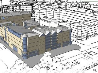
Robertson has been selected as the preferred developer for a £40m comprising 67 flats, 50,000sq/ft of office space and a 120 bed hotel on Dundee Waterfront.Marketed as Site 6 the development lies to the north of the under construction V&A museum and opposite the planned new entrance to Dundee railway station and will include a mix of one to three bedroom flats for private rent as well as open plan office space arranged over four floors.
Derek Shewan, chief operating officer at Robertson said: “This development promises to be a high quality addition to Dundee’s flourishing Waterfront area and we are looking forward to moving on to the next stage of the project.”
Designs for the plot are still under development but the master plan dictates a variegated roofline rising to between four and seven storeys with a predominantly masonry finish, varied street frontages and private balconies.
13 Comments
#1 Posted by Neil on 11 Feb 2016 at 11:08 AM
Apparently it's still 1998 in Dundee. Corner roundels and everything!
#2 Posted by Not so masterplanned on 11 Feb 2016 at 11:21 AM
But the 'master plan DICTATES a variegated roofline...'
Clearly masterful.
Clearly masterful.
#3 Posted by Dunday on 11 Feb 2016 at 12:14 PM
Please no... it's the Overgate: 2!
#4 Posted by Expat on 11 Feb 2016 at 13:22 PM
and cunningly positioned to obscure any view whatsoever of the V&A from anywhere in town...
#5 Posted by brut100 on 11 Feb 2016 at 13:56 PM
Dreadful
#6 Posted by Trombe Wall on 11 Feb 2016 at 13:58 PM
“This development promises to be a high quality addition to Dundee’s flourishing Waterfront.."
It doesn't.
As noted above, the only local precedent the scheme appears to draw from is the Overgate. At least it doesn't have an awkward use of green cladding or copper. A sad trend, of misplaced 'design', since the excellent DCA completed. After the vision to clear the waterfront and start afresh, this sort of thing makes you want to cry.
#7 Posted by Paul on 11 Feb 2016 at 14:15 PM
Before making comment, people would be better to read the actual brief - that drawing is a massing drawing, not a proposal of what the final scheme will look like- it's simply a mirror image of the site next door. It's disappointing that Robertsons don't seem to have released an image showing what they are proposing. Or indeed I'm not even sure they're developing the whole site
#8 Posted by Stewart on 11 Feb 2016 at 14:23 PM
This is not the design! This is simply the massing briefing from DCC.
#9 Posted by Anna Martin on 11 Feb 2016 at 15:05 PM
Thank you Paul & Stuart. it is just a massing drawing, not what the development will actually look like. It's amazing how people love to be neg ferrets and complain without actually reading and understanding things. The plans for Dundee Waterfront are so positive and already huge achievements have been made on site https://www.dundeewaterfront.com/zones/central/centralopenspace or download the app. Well done Dundee!
#10 Posted by Not so masterplanned on 11 Feb 2016 at 15:58 PM
...and there was me thinking some of those things called we call lines and tone signified:
1. delineation of storeys giving scale
2. relative areas of suggestive glazed wall and solid wall (with windows i'd presume)
3. gabled facades
4. glazed ground floor conditions
5. vertical division (also suggesting scale) unless they are downpipes ;-) (but we wont go there)
6. Circular glazed corner elements
7. Canopies suggestive of entrances
Still, we can always blame the readership for not understanding what a massing drawing looks like.
Maybe the image should have carried a health warning for ferrets?
#11 Posted by Stewart on 11 Feb 2016 at 16:24 PM
'Not so Masterplanned', I'm not an architect or involved in the construction industry and I know what it means. It doesn't take a genious to work out what it means.
#12 Posted by Ever the optimist on 11 Feb 2016 at 19:09 PM
Dundee city of discovery...
Look at the NIA to design cost % on that bad boy!
Master plan, more like precedent for zero £*&%s to be given!
Look at the NIA to design cost % on that bad boy!
Master plan, more like precedent for zero £*&%s to be given!
#13 Posted by D to the R on 11 Feb 2016 at 20:09 PM
Yes it just massing - so why not show something half decent at this stage? This scheme will end up as crass at that massing image .... Watch this space
Post your comments
Read previous: Tenders invited for Kirkmichael Heritage Centre
Back to February 2016
Like us on Facebook
Become a fan and share
News Archive
Search News
Features & Reports
For more information from the industry visit our Features & Reports section.


