Plans tabled for £5m Briggait Creation Centre
February 9 2016
Collective Architecture has submitted plans for a £5m physical performance space in Glasgow, specialising in offering accessible space for disabled dancers, on behalf of Wasp‘s Studios.The Briggait Creation Centre will play host to circus, street theatre and trapeze artists and is the second phase of development at the site following a £6.8m refurbishment of the Briggait in 2009.
Embedded within the remaining portion of A-listed market halls built in 1889 and 1904, as well as a gap site facing Clyde Street, the 12,000sq/ft space will accommodate up to 600 performers.
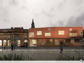
In a statement Collective Architecture wrote: “The extension has an expressive form projecting dynamically over the pavement and reaching out towards the river exploiting the Clyde promenade location.
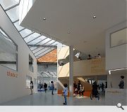
“The form has been expressed as stacked boxes representing the distinct spaces within and the glazing floats freely providing dramatic views while drawing light deep into the large studio volumes within and giving clues as to the dynamic activities within. A dramatic atrium brings light and social space into the heart of the development and allows the vital heritage of the site to be experienced.”
Collective were appointed to the design team back in April.
|
|
11 Comments
#2 Posted by David on 9 Feb 2016 at 14:31 PM
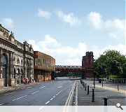
The renders appear to show the demolition of the existing white painted, 120 year old arches. How can this be allowed if they are A listed like the rest of the building? Maintaining these with a new build infilling the empty site located in the middle would surely create a more interesting dialogue and maintain a historical substantial stone set of arches.
#3 Posted by wonky on 9 Feb 2016 at 16:19 PM
"The renders appear to show the demolition of the existing white painted, 120 year old arches"- that's exactly what I was thinking- yet the renders appear to show some manky looking arch surviving in their absence? There is a hint of editorial dishonesty in the renders I think. Certainly disappointed they could not be incorporated into the design ( which is decent- the materiality compliments the rusticated palate of the Briggaits stonework).
#4 Posted by Irritable on 9 Feb 2016 at 19:43 PM
Doesn't make any attempt to complement or reference its location or the Briggait. Form and material seem to be taken straight from the pages of Dezeen (around 2005) rather than from the context.
Good to get some animation of this frontage though and seems an interesting facility.
Good to get some animation of this frontage though and seems an interesting facility.
#5 Posted by Big Chantelle on 10 Feb 2016 at 09:04 AM
Take a look at thu buildin on thu left -- thu classical beauty ae it. Noo, take a look at thu abomination on the right -- a blocky, modernist mess.
And yous like this? You hink this is good enough fur Glesga's waterfront?
Shameful.
And yous like this? You hink this is good enough fur Glesga's waterfront?
Shameful.
#6 Posted by John Betjeman's 5th cousin on 10 Feb 2016 at 10:04 AM
Crash! Bang! Wallop!
'Ther ye's go! Get your pseudo-heterotropic architecture here! Two furra pound!'
Except that the image shown is not convincing. At all.
The elevation design is lazy and banal. It makes me say, 'so what', or 'and?'
Where's the drama? What's the story? Where's the tension? What is the relationship to the existing buildings? Oh, sorry you've just said, 'feck dat'.
The sculptural cantilever reads as pure artifice to try and compensate for the lack of anything else happening.
What the design does say (while jumping up and down) is, 'Oh! look at me in my new shiny clothes! Aren't they pretty? Aren't they so contemporary? Look at me! Look at me! I'm a new building!'
Ironically, this external design excludes me as a citizen, whereas the Briggait elevation on Bridgegate is all about a civic urban response and responsibility to the street and the city.
This is a far more inclusive and successful urban approach.
Yes, the graphics are confusing. White arches in or out?
Or mebbes just shake it all about? After all, the inside does look interesting!
#7 Posted by Joe Dolce on 10 Feb 2016 at 12:58 PM
Gaun yersel Chantelle...this is a definite crib of my 6 year old daughters corrugated cardboard attempt at a rabbit hutch....and like her attempt...the cardboard box should have been left untouched
#8 Posted by Billy on 10 Feb 2016 at 13:26 PM
Eyesore. Really it does not compliment the building at all. Would not look out of place on an industrial estate where it belongs and not on the waterfront. Another disappointment for Glasgow. Bet Edinburgh would not allow that on one of its prominent streets.
#9 Posted by David on 10 Feb 2016 at 13:47 PM
I wouldn't go as far to say it is another disappointment, it does create an interesting dialogue with street lines and its relationship with the public realm. However, the gap site is sandwiched between two historical structures, one of which is derelict -
http://www.buildingsatrisk.org.uk/details/979045
I am not convinced that this new structure would merit the loss of a historical facade which is A listed. A better solution would be a new build infill bridging the two historical buildings, still allowing for plenty of creativity without sacrificing the stone arches. As for whether or not Edinburgh would allow this on one of its prominent streets, I don't think it's of any concern for this conversation, its rather like a dusty relic in a museum, rather like Bath, York or Durham where any new building is a poor imitation of its Victorian predecessors. Pretty yes, but its not a good reference when discussing urbanism in much larger European cities like Glasgow.
#10 Posted by Jamie on 10 Feb 2016 at 14:39 PM
For once I agree with Big Chantelle. Never thought id say that...
#11 Posted by mags on 13 Aug 2016 at 22:26 PM
I can't and won't believe that the existing facade could not have been incorporated in the new structure. It doesn't seem to mean zip if a building is listed let alone A listed. I'm all for this facility. It sounds great, but come on! Too much of our beautiful city is being left to rot or being demolished!
Post your comments
Read next: Further wave of homes planned for Bonnington
Read previous: Architecture Scotland Annual 2016 launched
Back to February 2016
Like us on Facebook
Become a fan and share
News Archive
Search News
Features & Reports
For more information from the industry visit our Features & Reports section.


From the images on show this looks like a really interesting scheme. Relationship of the upper storey to the bulk of the bridge is great and the internal view looks to have carved out some pretty interesting spaces.
Interested to see what the external material actually is. £5m doesn't seem that much right enough for a building of this sort? Hope the integrity of the design can be maintained.