‘Signature’ Broughty Ferry apartments plan hits planning
January 13 2016
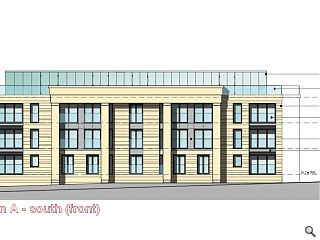
Fouin + Bell Architects have submitted plans for 29 contemporary apartments at Forthill Road, Broughty Ferry within a local conservation area.Faced in ashlar sandstone and inset zinc panels the scheme will require demolition of the existing unlisted Anton House and outbuildings whilst improving the landscaped grounds.
In their design statement the practice observed: “Given that the existing house has some features that contribute to the character of the area, but that it presents a space planning and economic roadblock to the successful re-use of the brownfield site.
"It is proposed that its loss is outweighed by the gain of a proposed high quality contemporary design which will enhance and contrast with but compliment the existing character and contribute a signature building to the evolving urban landscape.”
The proposal is being brought forward by Chamberlain Bell Developments.
10 Comments
#2 Posted by Neil on 13 Jan 2016 at 12:43 PM
@BC
But it's got columns, great big ones, and a sort of stripped-back entablature on top. And it's faced in ashlar sandstone. It's a stone-faced classical building, not a very good one but a stone-faced classical building nonetheless, and that's the sort of thing you love. Isn't it?
But it's got columns, great big ones, and a sort of stripped-back entablature on top. And it's faced in ashlar sandstone. It's a stone-faced classical building, not a very good one but a stone-faced classical building nonetheless, and that's the sort of thing you love. Isn't it?
#3 Posted by Big Chantelle on 13 Jan 2016 at 13:08 PM
@Neil
It's also got zinc panels. We've got to huv them in every new build haven't we? I mean. it's "unapologetically contemporary" afterall. And before the illustration above wiz posted, a realistic render wiz shown.Let's just say if boxy nothingness is yer bag, then u'll be lapping up this.
Broughty ferry is a nice wee place wae a beautiful character.It's noo gettin that taken away fae it.
P.S Neil, if u hink this is classical then well, you probably hink Toyah Wilcox is oor generations Maria Callas.
#4 Posted by basho on 13 Jan 2016 at 13:39 PM
'Signature' apartments. Is the signature Terry Farrell, and is it dated 1982?
#5 Posted by domeafavour on 13 Jan 2016 at 19:00 PM
I think it's fair to say BC doesnt actually know what she(?) likes.
#6 Posted by Channeys boss on 13 Jan 2016 at 22:18 PM
Duzna matter what big channey wants! If he don't get that signage schedule he's been stretching out for the past month done, he's back tae driving taxis!
#7 Posted by Yaldy on 13 Jan 2016 at 22:40 PM
To be fair #5, you architect types come up with some fair abominations on a regular basis. What have you done to British towns over the past half century??
#8 Posted by Neil on 14 Jan 2016 at 12:21 PM
#3
Wow, Toyah Wilcox. You're right on the button with your contemporary cutural references, BC. What I meant was it paid enough lip service to classicism that I thought it might keep you quiet (no white render!) but evidently not... Facetiousness aside, I do agree it's pretty dire actually.
Wow, Toyah Wilcox. You're right on the button with your contemporary cutural references, BC. What I meant was it paid enough lip service to classicism that I thought it might keep you quiet (no white render!) but evidently not... Facetiousness aside, I do agree it's pretty dire actually.
#9 Posted by Cateran on 16 Jan 2016 at 12:49 PM
The proposal replaces a fairly humdrum building but looks very average at best - 'par for the course' housing. Given the views and south facing aspect it seems surprising you would put large obstructions such as the columns right across the front. With no apparent detail, they're just stuck on. It's about time domestic architecture moved on but I've been thinking that for years.
#10 Posted by Gunga on 20 Jan 2016 at 09:55 AM
Its a proper collonade! The columns stand off the facade by at least 900mm. Quinlan Terry would love it, except maybe on the top floor where he will cook. Poncey Edinburgh development for Dundee, magic.
Post your comments
Read previous: £41m East Ayrshire Learning Campus pushed back to March
Back to January 2016
Like us on Facebook
Become a fan and share
News Archive
Search News
Features & Reports
For more information from the industry visit our Features & Reports section.


It's like Replacing Giselle Bundchen wae kerry Katona as the face a Gucci.
Yuk.