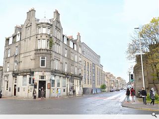
Aberdeen student flats go in for planning
October 16 2015
Yeoman McAllister Architects, acting on behalf of McLaren Property, have submitted plans for 147 studio apartments for students on Aberdeen’s George Street.Clad in light grey cladding panels, render and stone the property will back onto an internal courtyard with access provided directly from the street.
In their design statement the architects observed: “The proposals will enhance the identity of George Street by replacing a building which offers no contribution to enhancing or complementing the area, with one whose use is appropriate and is designed in a well-mannered language that is contemporary and sensitive to its surroundings, adopting a scale consistent with its neighbours.
“The flats have a well-designed front entrance which opens onto George Street, and allows for level access to communal spaces, flats, a lift, stair cores and reception area, with a WC.
“The site contains residential occupancy over all floors which in the future has the potential to adapt to changing living trends.”
The scheme will entail demolition of an existing warehouse.
3 Comments
#1 Posted by Thomas on 16 Oct 2015 at 16:54 PM
Bleurgh!
#2 Posted by TamP on 18 Oct 2015 at 23:13 PM
Yikes! What a deceptive view. Regardless of the fact that the visual shows the datum at eaves height tying in with the existing eaves, the proposed development is out of scale. There is an existing datum inscribed on the existing gable, which indicates where the historic height of the terrace that would have abutted the gable.Whilst the building currently occupying the site is by no means a thing of beauty it does have a more appropriate scale. The general scale of the buildings on this section of George street is two stories. In general streets have tall focal points that rise at street intersections and corners, not part the way along- doing this interrupts the well established urban grain. I would like to ask Yeoman McAllister how they have defined what a 'well-designed front entrance' - So you have created a glass frontage along a section of street which does not have glass frontages. Good to see you are learning from the surroundings or per haps you mean it has a door- congrats! I do believe the mark of any well designed front entrance is a door. Smashing stuff. The existing granite stock has a robust & humble quality to it, non of these characteristics are present in the proposed development. This development makes the new Potterrow student halls in Edinburgh look good. Universities and Colleges should really put their weight behind the developers and push for better quality of accommodation stock- surely the quality of the surroundings is part of the offer to students and not just the institution.
#3 Posted by David on 19 Oct 2015 at 08:38 AM
Is it just me that's a little bit worried these days about the quality of architectural descriptive text within some of these articles?
Post your comments
Read previous: Dismaland and protest define Urban Realm's autumn edition
Back to October 2015
Like us on Facebook
Become a fan and share
News Archive
Search News
Features & Reports
For more information from the industry visit our Features & Reports section.


