Falkirk Council press ahead with new HQ
October 6 2015
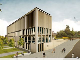
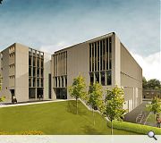
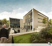
Ryder Architecture has submitted plans for a new headquarters and civic space for Falkirk Council on the site of the town’s former Westbank Clinic, West Bridge Street.Adopting a stepped profile in-line with surrounding topography the scheme will be faced with acid etched, precast frames with an inner layer of bronze anodised curtain walling
A spokesperson for Falkirk Council commented: “We have reduced the height of the building by a further 2.5 metres and design team have evolved the 3D visualisations and elevational treatments to highlight that this is a high quality, yet functional design, which will be appropriate for the Council’s main HQ and will complement the architecture in this part of the town centre.”
The project aims to rationalise the authorities current estate of 31 buildings totalling 32,624sq/m, spread across Falkirk and neighbouring towns, by moving to a more efficient space that will reduce floorspace by 60 per cent.
Falkirk Council’s planning committee will assess the proposal early in the New Year.
|
|
7 Comments
#1 Posted by designer on 6 Oct 2015 at 16:55 PM
looks great, well done !
#2 Posted by CADMonkey on 6 Oct 2015 at 21:49 PM
Is this a refurbishment?
#3 Posted by Kim Jong-un's brother on 7 Oct 2015 at 08:04 AM
It's guy grey ken.
#4 Posted by Bairn on 7 Oct 2015 at 12:53 PM
Not a refurb #2. A new building on same site as the current HQ
#5 Posted by these buildings shouldn't just pass without some comment on 7 Oct 2015 at 13:26 PM
My wife works for Falkirk Council. To describe this particular bureaucracy as North Korea is an understatement.
I find it interesting that in the late 60's and 70's local authorities fashioned themselves various headquarters. Fifty years on and they are being converted and demolished etc. (HLM's award-winning Cotton St. buildings in Paisley e.g.)
This building appears to adopt that very same municipal ethos - that what the Council builds and fashions now, will last their lifetime, somehow irrespective of the continually demographic changing needs and required services of those whom they serve.
Superficially, I can see that it has the language of faux 'accountability' in its big windows for the serfs to see their masters, the faux 'democratic-look' in its varying scales of fenestration, but ultimately it is all a 'closed geometry' and that is the lie. cf. the work of Herzberger eg.
Once you take away the clothes, beneath it all, it's not that much different from the Piazza Della Liberta by Piacentini in Bergamo.
Yes, it's all about power. Lots and lots of lovely, lovely power.
#6 Posted by The Bairn on 7 Oct 2015 at 16:06 PM
#4 get your own unique name please!!
I must say the building design looks fine without any wow factor, accountability of taxpayers money and all that, but a replacement for the existing Council HQ is long overdue...glad to see an outside architects practice being used as Council architects generally struggle to deal disabled adaptations to any great standard.
My only concern would be the harsh materials proposed may grate against the sandstone villas and other properties nearby.
Not a bad attempt I suppose. 6 out of 10 With an introduction of solar panels on roofs and rainwater harvesting maybe a fine 7!!
#7 Posted by D to the R on 7 Oct 2015 at 21:41 PM
Nord? ... Riech & Hall? ... Nothing new here ... The main elevation is a honker ... Upper levels offer very little relief from the monotony of an aesthetic like this.
Post your comments
Read next: ICA finalise plans for Old Town hotel
Read previous: Devil’s Elbow & Tomintoul Scenic Routes winners chosen
Back to October 2015
Like us on Facebook
Become a fan and share
News Archive
Search News
Features & Reports
For more information from the industry visit our Features & Reports section.


