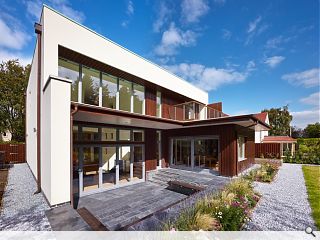
Purcell unveil contemporary suburban home
September 18 2015
Purcell has lifted the lid on a contemporary family home in suburban Edinburgh, squeezed into a narrow plot sandwiched between two existing houses.Arranged around a feature chimney the home is entered via a wide angled doorway offering views of ground floor spaces and leads into an open plan kitchen and double height living room. An oak, open tread staircase ascends behind the chimney toward the bedrooms.
Utilising traditional materials the home makes use of a Scottish larch timber clad dining room projecting from the rendered main block and connecting to the garden pavilion opposite.
Diana Borland, senior architect at Purcell commented: “From the early stages of emotional mapping and the intrinsic involvement of the client in the design process, we knew that we were creating something special. The house is a haven of openness, space and stylishness and sits in a league of its own in its suburban setting.”
Designed to create a light and airy feel the property is heated with an air source heat pump and rooftop photovoltaics.
|
|
7 Comments
#2 Posted by Mike on 18 Sep 2015 at 11:57 AM
The last picture does nothing for the building, it could be a 1960's doctor's surgery. I wonder how long before the white render goes dirty and it looks a mess from the main street. The interior and rear garden views on the other hand look very well done.
#3 Posted by Art Vandelay on 18 Sep 2015 at 12:17 PM
Very nice interior. Although the brown stain on that timber is boke-inducing.
#4 Posted by M is for Mungo on 18 Sep 2015 at 14:02 PM
"Squeezed"; "Narrow"; "Sandwiched".
Really? The site must be all of 20m wide - just how did they manage this feat of architectural judo?
Really? The site must be all of 20m wide - just how did they manage this feat of architectural judo?
#5 Posted by Toro Rosso on 19 Sep 2015 at 16:10 PM
Am I alone in thinking this is a clumsy version of almost any Spanish house from Dezeen.......check out those rwps!!
#6 Posted by Sven on 26 Sep 2015 at 20:29 PM
Am glad everyone else thought that the woodstaining ruins the build and ages it terribly.
The facade does not work as it lacks focus and is so bland as to be boring.
I suspect painting the wood grey and adding in house numbers in a creative way or adding large architecutral plants would help this build.
The facade does not work as it lacks focus and is so bland as to be boring.
I suspect painting the wood grey and adding in house numbers in a creative way or adding large architecutral plants would help this build.
#7 Posted by E=mc2 on 1 Oct 2015 at 13:21 PM
"Architectural judo"
LOL
LOL
Post your comments
Read next: Tarfside trio laid low in weekend blow down
Read previous: City of Glasgow College move into £50m Riverside Campus
Back to September 2015
Like us on Facebook
Become a fan and share
News Archive
Search News
Features & Reports
For more information from the industry visit our Features & Reports section.


3 quibbles:
1. The daubed walnut stain that obliterates the cladding to almost render it as mahogany.
2. What happened to the legs of the stove?
3. 'Emotional mapping' ?????????? can someone please explain this to me, as I suspect this is clearly where I've been losing out so badly on those competitive quotes?
and lastly but not related - can someone please tell me why it is easier for a fat businessman to pass through the eye of a needle than trying to access South Lanarkshire Council's planning portal?
It's a friday.