Glasgow’s Merchant Studios to welcome first students
August 18 2015
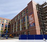
The finishing touches are currently being made to Glasgow’s latest student residential build, 257 bedroom scheme nestled within the Collegelands masterplan by Fresh Student Living.Merchant Studios will include a study room and coffee lounge and is designed to tie in with a neighbouring car park and office block through complementary use of red brick cladding panels and precast concrete.
Designed by ICA Architects the L-block scheme slots behind the brick wall of the former railway goodsyard on Duke Street and will eventually back onto a new public square.
Tenants of the £10m development will also have access to a basement gym, games room, courtyard and private terrace.
|
|
10 Comments
#2 Posted by Dave on 18 Aug 2015 at 14:20 PM
I like this - much more refined than the surrounding buildings.
#3 Posted by Stephen on 18 Aug 2015 at 15:28 PM
Various City areas could be enhanced by an influx of students (in the way that Jan Gehl harnessed their positive contribution in his plan for Copenhagen). This is one of them, but the Southside too could do with more. Too many in one area can also be detrimental though and Finnieston surely has enough cheap student housing now, skewing a sustainable demographic. I'd like to see the Council encourage (and dissuade) development along these lines.
#4 Posted by Le-La-Les on 18 Aug 2015 at 22:15 PM
I walked past this building today on a stroll around Glasgow and I must say I found the build quality to be dreadful. The materials used look cheap and and the 'design' looks like it's intended to be an overspill car park for a car park.
Is this really what passes for architecture these days? I'm hoping that whatever student was responsible for this mess returns to folding drawings on the next job.
Is this really what passes for architecture these days? I'm hoping that whatever student was responsible for this mess returns to folding drawings on the next job.
#5 Posted by Shoddy Roddy on 19 Aug 2015 at 09:00 AM
I passed this the other day
ist a very poor quality build
ist a very poor quality build
#6 Posted by Big Chantelle's love child on 19 Aug 2015 at 10:33 AM
Not sure if #4 and #5 had walked past the same building I had, but for me the build quality was actually much better than similar buildings in this typology, particularly recent ones in the West End. The junctions are crisp and the brick seems solid, not tacked on as so often seen.
The overall form and massing suits the urban grain well, with it reminiscent of large warehouses fronted in an austere brick and stone facade. I am not so sure about the playful, coloured glass to the rear, but it is student accommodation so I can understand the need for a slightly "warmer" feel to the courtyard.
The overall form and massing suits the urban grain well, with it reminiscent of large warehouses fronted in an austere brick and stone facade. I am not so sure about the playful, coloured glass to the rear, but it is student accommodation so I can understand the need for a slightly "warmer" feel to the courtyard.
#7 Posted by Fraser on 19 Aug 2015 at 11:26 AM
I’m in agreement with Chantelle on this one. The massing is apt and sufficiently respectful to the surrounding area; I’m glad to see that a high rise strategy was not incorporated as with so many recently constructed or proposed student accommodation projects. I cannot comment on the overall build quality, however aesthetically I think the materiality is appropriate and well rounded; reminiscent of some 19th/20th century warehouses – as Chantelle mentioned previously. Hopefully there is a continued sense of reverence in the future stages of the College Lands masterplan.
#8 Posted by Yaldy on 19 Aug 2015 at 17:51 PM
Walked past this quite a few times & always quite liked it. Some of the buildings around this area and further down the high street are appalling by comparison.
On a more general note, I know absolutely fa about architecture but care very much about glasgow, and UR is a great place to keep up to date.
#yaldy
On a more general note, I know absolutely fa about architecture but care very much about glasgow, and UR is a great place to keep up to date.
#yaldy
#9 Posted by Fraser on 20 Aug 2015 at 13:52 PM
#yaldy
You don't have to know anything about architecture to identify merit in a building. Back to this scheme, I hope they hurry up and continue the same aesthetic through the remaining masterplan. This area could really do with the cohesive redevelopment.
You don't have to know anything about architecture to identify merit in a building. Back to this scheme, I hope they hurry up and continue the same aesthetic through the remaining masterplan. This area could really do with the cohesive redevelopment.
#10 Posted by stef3d on 24 Aug 2015 at 11:02 AM
This masterplan has been languishing on the drawing board since people still used drawing boards. While I am all for building quality, as long as they are competent and in line with the masterplan I am just happy to see density being restored to this area and things moving forward.
Post your comments
Read previous: Aberdeen’s Union Square shopping mall set for expansion
Back to August 2015
Like us on Facebook
Become a fan and share
News Archive
Search News
Features & Reports
For more information from the industry visit our Features & Reports section.


build em nasty