Keppie throw open the doors to Ronald McDonald House
June 24 2015
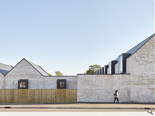
Keppie have opened the doors to a £3.4m accommodation wing for the families of sick children within the grounds of South Glasgow Hospitals Campus.Run by an independent charity Ronald McDonald House provides free accommodation within domestically scaled surroundings, in stark contrast to the institutional environment of the surrounding hospital.
An ‘industrial’ façade fronting Govan Road masks a light and airy interior and secluded courtyard, bounded by three brick wings finished in brick and slate punctured by large glazed openings.
David Ross, design director at Keppie, said: “It has been wonderful for us to work on such a worthwhile facility that is crucially important to the families who use it. Our aim was to create a building that addressed the sensitivities of its users who are reaching out for comfort, reassurance and respite at a very difficult time in their lives. With this design we feel we have really achieved the human scale and the nurturing “home from home” environment that we intended.”
Ceilings follow the external roofline to maximise volumes and inject a touch of drama to a communal lounge, kitchen and play area.
|
|
11 Comments
#2 Posted by Roddy on 24 Jun 2015 at 10:23 AM
Thumbs up from me
Well Done Keppie
Well Done Keppie
#3 Posted by Barbara on 24 Jun 2015 at 10:50 AM
I really like this. Nice material palette with simple clean details. Great project and Lovely photos.
#4 Posted by cadmonkey on 24 Jun 2015 at 10:55 AM
So is the roof drainage all brought inside?
#5 Posted by james on 24 Jun 2015 at 20:10 PM
Applause.
Solid. Protective. Dignified.
Quietude. Rest. Spiritual.
Solid. Protective. Dignified.
Quietude. Rest. Spiritual.
#6 Posted by Art Vandelay on 24 Jun 2015 at 22:42 PM
Swoon.
#7 Posted by Neil C on 25 Jun 2015 at 10:45 AM
Remarkable.......even more astonishing is that it is by Keppie.
#8 Posted by Stephen on 25 Jun 2015 at 12:03 PM
Looks a very nice project as far as can be seen (though no idea of context). Not ground breaking, maybe even a bit (too) derivative, mimicking fashions developed by others, but appropriate, respectful, contemporary and assertive. This should be the base standard for every project. There's no excuse for anyone to be designing anything worse than this. Perhaps sadly then, this is one of the best projects I've seen here for a long time.
Sorry, that didn't come across as complimentary as it should have done! Nice to see most comments (this one excepted!) are positive for once. Keppie have been making great strides recently IMO.
Sorry, that didn't come across as complimentary as it should have done! Nice to see most comments (this one excepted!) are positive for once. Keppie have been making great strides recently IMO.
#9 Posted by Beautiful buildings on 25 Jun 2015 at 13:43 PM
Drive past it most days and the building looks great.
Don't know if anybody else has noticed that when it rains heavily, the walls that are saturated go a buffy colour.When it dries out it looks even whiter than before.Are you thinking what I'm thinking, efflorescence! Still looks go through.
Don't know if anybody else has noticed that when it rains heavily, the walls that are saturated go a buffy colour.When it dries out it looks even whiter than before.Are you thinking what I'm thinking, efflorescence! Still looks go through.
#10 Posted by "El" on 25 Jun 2015 at 14:01 PM
There are so many projects of late on here that have missed the mark completely, or just not been my cup of tea.
However, I think this is a fantastic scheme for a fantastic cause.
Simplicity of design that hides its strength. Very appropriate for all of those resilient parents and courageous children who rely on Ronald McDonald House and the services that it provides.
I approve.
However, I think this is a fantastic scheme for a fantastic cause.
Simplicity of design that hides its strength. Very appropriate for all of those resilient parents and courageous children who rely on Ronald McDonald House and the services that it provides.
I approve.
#11 Posted by Sue Pearman on 29 Jun 2015 at 10:26 AM
This is a very good scheme and disappointingly but unsurprisingly I'm told that the designers no longer work for the named architects.
Post your comments
Read next: Aberdeen city centre masterplan approved
Read previous: Stirling develops £200m City Development Framework
Back to June 2015
Like us on Facebook
Become a fan and share
News Archive
Search News
Features & Reports
For more information from the industry visit our Features & Reports section.


The architecture seems worthy of the function the building serves.