Carlton Hotels to occupy four star Edinburgh development
June 22 2015
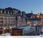
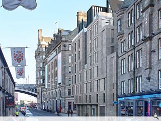
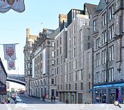
The EDI Group has partnered with Carlton Hotels to bring forward a 98-room venue on Edinburgh’s Market Street, plugging a long-standing gap site in the heart of the Old Town.A four-star boutique hotel is planned for the site, designed to sit in harmony with its Scottish baronial neighbours through vertical features and a solid façade of Hazeldene stone.
In a statement JM Architects said: “The patterns of place and architecture within Edinburgh’s Old Town have been determined by many different factors throughout the life of the city, which have, in turn, generated an enormously complex urban condition. In understanding this DNA, we believe we have created a site specific response to these historic patterns and processes which celebrate the unique qualities of the Old Town.
"The design is intended to be non-invasive and respectful of its neighbouring buildings while at the same time unapologetically of its own time and culture. An evolution of its context and truly indigenous.”
Uncoursed stone walling to the north will be reclaimed from the existing site and seeded in over-sized joints with wall ferns, a feature which the architects state will create a micro-climate when colonised by mosses to form a natural green wall.

An upper level lounge area will be housed within a feature, folded roof form, offering panoramic views of the city
|
9 Comments
#1 Posted by Auntie Nairn on 22 Jun 2015 at 13:54 PM
More boxes, just not as articulated as the last Edinburgh scheme of boxes, except for the roof - oh God! the roof!
#2 Posted by Tenement Funster on 22 Jun 2015 at 16:02 PM
I'm sure I've seen this somewhere before, just can't put my finger on it...
#3 Posted by CADMonkey on 22 Jun 2015 at 17:36 PM
Well I like this. It will fit in to the context well. It's subtle and interesting and remembers it's just a hotel.
No incongruous materials, treatments or architectural gymnastics like the blot that is Advocates Close.
No incongruous materials, treatments or architectural gymnastics like the blot that is Advocates Close.
#4 Posted by AF on 22 Jun 2015 at 19:11 PM
The ground floor interface at street level seems overly compressed. Either that or the part 2 who did the image does not understand scale.
#5 Posted by Sir Ano on 23 Jun 2015 at 08:21 AM
@CADMonkey "remembers its just a hotel" really? interesting I didn't realise there were specific building types were proper design wasn't as important. I'll need to remember that for the furture, Thanks.
#6 Posted by John Glenday on 23 Jun 2015 at 10:49 AM
The 'inverted turret' roof feature has been removed from the most recent iteration of the design. I've updated the article images to reflect the current approach.
#7 Posted by Rabbie on 23 Jun 2015 at 12:42 PM
Slots in rather nicely. Promising.
#8 Posted by Magnus on 23 Jun 2015 at 13:44 PM
I think this is a great, yet unobtrusive addition to the face of Edinburgh.
I agree that the interface with the public realm at street level looks a little small and unwelcoming. Is there perhaps a more appealing opening round the corner where the building lines steps up?
I think the roof line looks great and would make for an amazing suite or two.
I agree that the interface with the public realm at street level looks a little small and unwelcoming. Is there perhaps a more appealing opening round the corner where the building lines steps up?
I think the roof line looks great and would make for an amazing suite or two.
#9 Posted by cadmonkey on 23 Jun 2015 at 13:55 PM
#5 The first rule of architecture club is to understand where landmark and background buildings should be placed. A hotel of this ilk is not an important building in cityscape terms. This is also a fairly run of the mill background site, not occupying a corner or significantly prominent location. The building should therefore blend in to it's locus, and this one does. It's also well designed, which is a bonus.
If you look at image 2 background, you can see a cluster of timber and render clad, cantilevered, flat roofed portacabins peeking out trying to be seen. That is Advocates Close and a building trying too hard to be different and it grates and detracts.
If you look at image 2 background, you can see a cluster of timber and render clad, cantilevered, flat roofed portacabins peeking out trying to be seen. That is Advocates Close and a building trying too hard to be different and it grates and detracts.
Post your comments
Read previous: Professor Robin Webster nets RIAS lifetime achievement award
Back to June 2015
Like us on Facebook
Become a fan and share
News Archive
Search News
Features & Reports
For more information from the industry visit our Features & Reports section.


