Page\Park lodge plans for Woodside Health Centre
June 1 2015
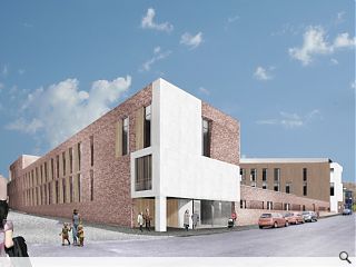
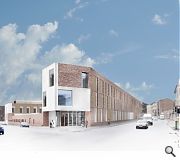
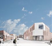
Page\Park architects have lodged plans to build a new health centre in north Glasgow, replacing an existing 1970s facility and drawing together a range of primary and community care services currently scattered throughout the city.Woodside Health Centre is situated on a triangular plot fronting Garscube Road on the site of the former Woodside Primary the scheme will see each corner allocated a ‘gushet’ entrance serving the health centre, addiction services and an elderly day care centre.
In their design statement the architects noted: “The building is organised over three floors around an atrium space to the north and an external courtyard space to the south. This forms an ‘A’ shaped plan.
“The Atrium is the gentle heart of the health centre. It deliberately adopts a curvilinear geometry to soften the character of the space. It is conceived as a soft edged balconied space extending down into the walls of the seating areas and the main staircase which sweeps up to the first floor.
“The roof follows this shape and has an enhanced edge detail to act as smoke reservoir below the glazed upper skin.”
A green roof and terrace will cap the build although the latter will be available for use by staff only
|
|
9 Comments
#1 Posted by bear post please on 1 Jun 2015 at 14:50 PM
YES..well done page/park. refreshing and considerate scheme. nice to see surrounding context taken into consideration, scale, materiality etc. really like this only having the white on the corners, nice touch. sometimes it can be over used on a design but not in this case and it works very well.
#2 Posted by hotspur on 1 Jun 2015 at 21:13 PM
the design is just plain dull and lack of inspiration, similar to the near-completion Glasgow Academy.
#3 Posted by Roddy on 2 Jun 2015 at 06:52 AM
Are they fighting it out with Reiach & Dull to see who can design the most boreing health centre ?
#4 Posted by james on 2 Jun 2015 at 08:55 AM
Not that Page and Park are in need of any endorsement, but this understated and restrained design is a welcome infill into the fabric of that area.
On a quick reading of the images (aren't they odd - maybe an attempt at an experiential rendering? Don't mind the out-of-focus, but not too sure about the naive 'paste line' and the blue sky though - as its invariably grey in these here parts.
I can see the 3-storey element is to the North and fronts onto the hostile road/corridor making it a win win south-facing courtyard space.
I like the scale and narrow verticality of the openings akin to the texture of a Marzaroli image of a tenement street photographed in perspective.
I like that it is NOT a pseudo 3 storey tenement with pitched roof and that it is modern (sorry BC) and that it has a 'dutch' scale and connotation to it probably helped by the bricks. In short, I think it is human.
I think that an image of the interior /arc atrium would contrast with the austerity of the exterior. All common spaces are led to via a curve! Any other explanatory images?
I also think the form of the building is greatly helped by being on a triangular site!
I like the omni-directional corners.
I like that it is not an alien-like edifice dropped from the sky like the imperious Possil Health centre in Saracen street. (What an overtly offensive building in many ways).
So all in all - I like it :-)
#5 Posted by Sven on 2 Jun 2015 at 15:00 PM
One tweak would make this building more appealing: use of red sandstone instead of boring and very English, bricks. A sandstone facade fits in with the Cityscape and would contrast beautifully with the white artifacts in the facades.
#6 Posted by Ralph Rogers on 2 Jun 2015 at 15:20 PM
This building looks almost identcical to the Oberlanders Townhead Student Resi Project featred the other week http://www.urbanrealm.com/news/5479/Oberlanders_submit_Towhead_student_flats_scheme_for_planning.html
#7 Posted by james on 2 Jun 2015 at 16:25 PM
#6 'this building looks almost identical'
- a 3-storey building compared to a 6-storey one?
Now that is stretching things, or do you really just mean they both use bricks?
- a 3-storey building compared to a 6-storey one?
Now that is stretching things, or do you really just mean they both use bricks?
#8 Posted by D to the R on 3 Jun 2015 at 17:26 PM
Eh Ralph ..... Naw it disnae
#9 Posted by Roddy_ on 4 Jun 2015 at 01:16 AM
I would just like to point out that comments #3 are not the views of this Roddy. A name that I have been using on this forum for quite a number of months now. I am a big supporter of both Page/Park and of Reiach and Hall. I will add an underscore to my name in future to distinguish it from others who are unable to spell. Perhaps if individual names are registered on UR we can avoid such confusion.
Post your comments
Read previous: Crawick Multiverse readied for Summer solstice reveal
Back to June 2015
Like us on Facebook
Become a fan and share
News Archive
Search News
Features & Reports
For more information from the industry visit our Features & Reports section.


