£50m ‘Scots Baronial’ style hotel wins planning
May 14 2015
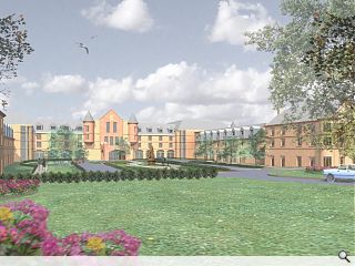
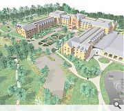
A 200-bed five star ‘Scottish Baronial’ style hotel has received planning consent from Aberdeen City Council, clearing the way for developer Castle Rock to begin work on the £50m scheme on green belt land at Hazlehead Park.Finished with extensive areas of harling the BMJ and TGP landscape architects designed build incorporates two banqueting halls catering for up to 350 guests apiece with a limited amount of decorative stone elements and slate pitches to roof areas visible from the ground.
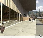
Situated close to a former farm steading, which will be retained, the hotel will benefit from addition of a new equestrian centre replacing existing facilities with a spectator gallery, stable block, shop and café.
In their design statement BMJ said: “The hotel design places an emphasis on the Scottish Baronial with the use of traditional design and natural materials. The façade aesthetic has been developed to a level which establishes the quality of detail, craftsmanship and materiality to justify a development of this nature in this particular location.”
|
|
30 Comments
#1 Posted by J on 14 May 2015 at 14:23 PM
Disneyland Aberdeen?
#2 Posted by wonky on 14 May 2015 at 14:27 PM
This is actually painful. What is happening up in Aberdeen? I really despair. Its Toryism made of decorative stone elements and David Cameron as a 'slate pitches'...aaahhh!
#3 Posted by Auntie Nairn on 14 May 2015 at 14:30 PM
Oh my giddy Aunt! Really??
#4 Posted by The CMB on 14 May 2015 at 14:34 PM
What this needs is more concrete, zinc and white render. And take the pitches down a bit, say to 0 degrees. Loose those turrets too, corner windows is the way forward there.
Mwa ha ha ha, beautiful!
Mwa ha ha ha, beautiful!
#5 Posted by monkey9000 on 14 May 2015 at 14:37 PM
#1 The architecture of Disneyland is more convincing!
#6 Posted by james on 14 May 2015 at 15:11 PM
Clearly, the planning process must consider that philosophy has no place in a planning application, or architecture.
#7 Posted by Alf on 14 May 2015 at 15:15 PM
This could, emphasis on could, look OK if it was 100-150 years older and traditionally built. I think as it is, it will probably look too new and 'plastic' to be as effective as they want it to be. Pity, could've been a belter.
#8 Posted by Big Chantelle on 14 May 2015 at 15:21 PM
Praise the Lord!
Aberdeen, you're not so bad after all. Well done. J'adore this.
And I might have guessed the usual llefty concrete modernists would pipe in with their 'disneyland' adjectives.
Of course, they could these people would rather the building resembled Cumbernauld shopping centre. I rest my case.
So Aberdeen, I give you my approval. You may proceed and build this.
#9 Posted by modernish on 14 May 2015 at 16:39 PM
Disgusting! I almost boaked up my couscous and tofu salad. Aberdeen I forbid you to construct this disgrace. We'll never build a modernist, concrete, left wing utopia at this rate! Must try harder.
#10 Posted by Sven on 14 May 2015 at 16:41 PM
@Big Chantelle - if you google pictures of hotels near Disneylands Resort Paris or the one in Orlando and you will see hotels which look like this. In fact the St Andrews Bay hotel rather looks like it, sans the pseudo 'Scottish Baronial' aspects.
I agree with The CMB, lose the towers and repeat the Zinc attic roofs and it would be the better for it.
I agree with The CMB, lose the towers and repeat the Zinc attic roofs and it would be the better for it.
#11 Posted by Vic Ferrari on 14 May 2015 at 16:42 PM
Shame the new equestrian centre isn't given a rural vernacular treatment as opposed to the 'could be anywhere' design approach employed. Guess it was too much to ask to continue with traditional design motif throughout the site.
#12 Posted by FHM on 14 May 2015 at 16:48 PM
At last I can agree with Big Chantelle! This is a wonderful design, surely one of the best, most unique ones that has been approved in Aberdeen recently. Putting aside the silly little issues of building on Greenbelt for developers profit, I think what I like best is the utter contempt the designers have shown for context. This really shows how much understanding they have of the site, Scots Baronial architecture, form and materials and what is ultimately presented is an excellent example of blissful ignorance. From the lobster like plan (historically accurate?), to the faux symmetry, mansard roofs, peculiarly proportioned dormers and token turrets, the brilliance shines from its sullen orifices.
Sheer brilliance! Well done Aberdeen, Oil Capital Of Europe.
PS: This is for Planning Permission in Principle.
Sheer brilliance! Well done Aberdeen, Oil Capital Of Europe.
PS: This is for Planning Permission in Principle.
#13 Posted by Big Chantelle on 14 May 2015 at 16:50 PM
Sven, if you google pictures of concrete modernist hotels, you'll get 'premier inn at pacific quay with value engineered exposed rivet screws coz the architects coudnae be bothered even trying'.
Yep, I'll reject classy stone architecture over your brand of modern utopia.
And the Disneyland remarks is designed as an insult. The idea is that it is cartoonish and fake. It's a silly remark. Baronial architecture IS Scottish. The fact this is being built in a style Scotland is famous for, I applaud. You might not. But I do.
#14 Posted by Chris on 14 May 2015 at 17:50 PM
This is a mockery of Baronial. If you're going to be traditionalist, at least do it properly.
#15 Posted by Partick Bateman on 14 May 2015 at 18:03 PM
Will someone PLEASE think of the horses confined to their horrible timber clad concrete modernist box.
Horses Need Mock Baronial Too
Horses Need Mock Baronial Too
#16 Posted by Ian Alexander on 14 May 2015 at 19:56 PM
Please assure me this is an April Fool stunt that is just a little late! Did Aberdeen's recent architectural 'award' not indicate to those in power that things need to improve and dramatically.
#17 Posted by Jamie on 14 May 2015 at 23:41 PM
Pretty sure Big Chantelle is just trolling now... Are you actually serious?
#18 Posted by Big Chantelle on 15 May 2015 at 05:37 AM
Jamie, a person casting their opinion doesn't make them a troll. I am allowed one ya know.
Is this what discourse has become -- anyone not subservient to the dominant view is a troll? Pathetic.
Is this what discourse has become -- anyone not subservient to the dominant view is a troll? Pathetic.
#19 Posted by D to the R on 15 May 2015 at 08:49 AM
Boke
#20 Posted by Egbert on 15 May 2015 at 09:47 AM
*wades in*
Big Chantelle, as one of your hated lefty-concrete-modernist-straw man brigade, I have to say what repells me most about this isn't that someone's had the temerity to go against the dominant orthodoxy, but that they've done it so poorly. This is an insult to traditional architecture. It has all the subtlety and considered detail of a late-1980s shopping centre. The mansard roofs are heavy and overbearing and the candle-snuffer turrets look like an afterthought, and I can't think of a Baronial building that uses quite such a grotesque colour scheme. Surely you would want to see something better than this? As it stands it's a very, very poor advert for any traditionalist revival.
Big Chantelle, as one of your hated lefty-concrete-modernist-straw man brigade, I have to say what repells me most about this isn't that someone's had the temerity to go against the dominant orthodoxy, but that they've done it so poorly. This is an insult to traditional architecture. It has all the subtlety and considered detail of a late-1980s shopping centre. The mansard roofs are heavy and overbearing and the candle-snuffer turrets look like an afterthought, and I can't think of a Baronial building that uses quite such a grotesque colour scheme. Surely you would want to see something better than this? As it stands it's a very, very poor advert for any traditionalist revival.
#21 Posted by wonky on 15 May 2015 at 09:56 AM
BC personally I think for parody to be really effective the joke needs some hint of truth- there's simply no way anyone in their right mind could find this design aesthetically pleasant. Its exosketch architecture. Its the design equivalent of an Aldi's gingerbread biscuit smothered in way too much marzipan...so sickly sweet as to induce an emetic reaction in any person with a moderate sense of taste.
#22 Posted by Big Chantelle on 15 May 2015 at 10:37 AM
Wonky, I like it.Deal with it. Your lefty arrogance is always centred on telling ppl what is right despite your left wing architectural faulures. The audacity of someone like you to be so deterministic as to tell me i cant like this without being mentally unhinged. What this is is architecture which doesnt conform to your own likes thus it scares you. My taste is perfectly good-- bad taste would be if i chose cheap aviator glasses i bought from the barras to frame my calorifically aided/bloated face.
#23 Posted by The CMB on 15 May 2015 at 10:41 AM
The CMB supports the horse box design, but is it too late to change to a smooth white render and zinc cladding?
#24 Posted by jacosaco on 15 May 2015 at 10:53 AM
Imposingly no worse than St Andrew's Old Course Hotel or Gleneagles IMO. Their market being the same kind of dull customer.
#25 Posted by wonky on 15 May 2015 at 15:54 PM
Wooft talk about taking the man & not the ball Big Chantelle!Irony ain't yer strong point pal...lessons in arrogance from the most arrogant commentator on these pages. Hahaha. Obviously like most other people interested in Architecture I passionately appreciate the original Scottish Gothic revival style- Inveraray & Dunrobin in particular- & even the Baronial style represented by the likes of Abbotsford House...but as others have already pointed out what has this building to do with architects like of Bryce? Pastiche has been described as "an unconvincing reproduction of the styles of the past"- this travesty is pastiche bordering on parody. PS I know a beauty fascist like yourself will be glad to know that photo was taken a few years ago & I've lost a few stone since then. I still believe you have bad taste ( why oh why do you continue to come onto a site that mainly promotes modernism?) Lastly: what do you have against concrete?
#26 Posted by Bob, Ag & Willie on 18 May 2015 at 21:21 PM
Scotland Hotel, Las Vegas?
Looks great
Looks great
#27 Posted by Nairn's Bairn on 18 May 2015 at 21:59 PM
Jeez-oh.
In 100 years time this building will either be:
a) heralded as the forerunner of the Post-Modern Scottish Baronial movement, or
b) demolished.
I'm kinda thinking 'b'.
In 100 years time this building will either be:
a) heralded as the forerunner of the Post-Modern Scottish Baronial movement, or
b) demolished.
I'm kinda thinking 'b'.
#28 Posted by Cadmonkey on 19 May 2015 at 10:51 AM
Build it and the public will come
= a successful project!
= a successful project!
#29 Posted by Gavin Fraser on 21 May 2015 at 02:35 AM
I think everyone heralding this building will soon revoke their comments of wonder as they witness the erection of a very Scottish Baronial steel frame, in which truly captivates the style. This will, and it is a matter of fact, date tremendously quickly.
#30 Posted by Walt Disney on 21 May 2015 at 13:17 PM
I hate that when anyone sees tasteless pastiche - I get the blame. Come on!
Post your comments
Read previous: Loch Lomond timber pyramid viewpoint unveiled
Back to May 2015
Like us on Facebook
Become a fan and share
News Archive
Search News
Features & Reports
For more information from the industry visit our Features & Reports section.


