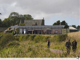
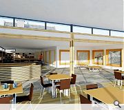
Archial Norr to design Dunottar Castle visitor centre
April 20 2015
Dunecht Estates have unveiled concept images of a planned of a £1.5m visitor centre for Dunottar Castle, Aberdeenshire, as part of work to improve access to the historic fortification amidst a rise in visitor numbers.This will see a coastal walkway built around the 15th century ruin as well as the creation of new viewing points, a park and five homes.
Incorporating a café, shop and exhibition space the visitor centre will boast panoramic views of the castle.
Neil Cruickshank of Archial Norr, said: “The scheme we have developed has been done in close communication with (council) planning and went through different phases and guises.
“We are not looking to do something that is twee (but) something that is built of its time but without shouting its presence for miles around. We’re looking for something that is high-quality. We don’t want to do something here that is just a shed. This is a once in a lifetime project to design this site.”
A planning application for the project is expected shortly.
|
|
12 Comments
#1 Posted by Jon on 20 Apr 2015 at 13:29 PM
Pretty bland - looks like a missed oppurtunity
#2 Posted by visitor on 20 Apr 2015 at 17:00 PM
i like this. i think it looks well considered, and, at a guess, squeezes quite a lot out of a tight budget.
#3 Posted by sultan of brooneye on 20 Apr 2015 at 19:59 PM
This is entirely generic in appearance, I feel like AN have copy/pasted this countless times. The building looks like it was bored before it even began.
#4 Posted by Darth Vader on 21 Apr 2015 at 14:10 PM
Is this the winner of an architectural competition?
#5 Posted by archfan on 21 Apr 2015 at 19:19 PM
The proposed building looks pretty good, about time they built a visitor centre that keeps the focus on the main attraction.....the castle. Shame it didn't happen a few years ago, the castle has been in need of some form of facilities for a while now.
#6 Posted by sultan of brooneye on 21 Apr 2015 at 20:29 PM
This is entirely generic in appearance, I feel like AN have copy/pasted this countless times. The building looks like it was bored before it even began.
#7 Posted by D to the R on 21 Apr 2015 at 22:03 PM
If you want Richard Murphy ... Get Richard Murphy
#8 Posted by Rem-Job on 22 Apr 2015 at 09:12 AM
I would be interested to see the other 'guises' ... just to see how they reached this point. I imagine the next 'guise' will be a signature AN cladding panel to replace the stone .....
#9 Posted by RJB on 22 Apr 2015 at 13:08 PM
It looks pretty cool in the second picture, but really lumpen in the first (to much glass maybe?). Something along the lines of Munkenbeck and Marshall Isle of Bute Vistor centre would be cool . (though as a precedent its pretty different from the situation here)
#10 Posted by dalrylama on 22 Apr 2015 at 16:31 PM
I wonder of the phases it went through were something like this -
Phase 1: design a shed
Phase 2: tell everyone it isn't a shed
Phase 3: submit shed for planning
Phase 1: design a shed
Phase 2: tell everyone it isn't a shed
Phase 3: submit shed for planning
#11 Posted by Shabbadoo on 22 Apr 2015 at 20:28 PM
Unfortunate choice of views for the images..... or it's just a fairly boring design.
Reading between the lines, looks like archial have lost the argument with the planners.
Reading between the lines, looks like archial have lost the argument with the planners.
#12 Posted by local on 4 Feb 2021 at 10:51 AM
This is a real shame. A visitor centre for one of Scotland's greatest heritage assets, and the design is far from appropriate.
It looks like it was drawn up 20 years ago and already set for demolition. Dunnotar castle has stood for centuries, but this thoughtless counterpart will barely last 50 years.
Building is a permanent act. I say open this to a competition and the entries will be far more inspired and appropriate.
It looks like it was drawn up 20 years ago and already set for demolition. Dunnotar castle has stood for centuries, but this thoughtless counterpart will barely last 50 years.
Building is a permanent act. I say open this to a competition and the entries will be far more inspired and appropriate.
Post your comments
Back to April 2015
Like us on Facebook
Become a fan and share
News Archive
Search News
Features & Reports
For more information from the industry visit our Features & Reports section.


