Scottish National Gallery redevelopment wins first-round HLF support
March 30 2015
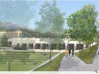
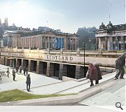
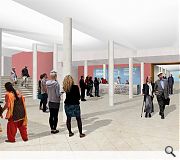
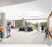
A £15.3m bid to redevelop the Scottish National Gallery at The Mound in Edinburgh has got out of the starting blocks running after the Heritage Lottery Fund awarded a first-round pass to a £4.94m grant application.Plans drawn up by Gareth Hoskins Architects would triple the gallery’s exhibition space to expand and improve the display of the galleries collection of Scottish art. Improvements will also be made to circulation and digital technology embraced to better engage a global audience with the gallery.
Colin McLean, head of Heritage Lottery Fund Scotland, said: “We are delighted to give our initial support to a project which will allow many more of these outstanding paintings to be displayed and accommodate many more visitors. We look forward to seeing the plans for the transformation of the Scottish collection galleries develop.”
Work on the project is set to get underway in 2016 with the creation of a landscaped public path and terrace from Princes Street Gardens for completion by summer 2018.
The existing galleries will remain open throughout the work.
|
|
8 Comments
#1 Posted by Big Chantelle on 30 Mar 2015 at 14:18 PM
And not a single doric column was seen that day.................
#2 Posted by Darth Vader on 30 Mar 2015 at 15:51 PM
Eh...seriously...why are Gareth Hoskins Architects not proposing to extend the garden façade to match the original extension which creates a heavy robust plinth for the original gallery buildings, but instead are choosing a different "minimalist" approach. Very rarely do I get angry at an architectural proposal, but this is architectural vanity of the worst order.
Just copy and paste please.
Just copy and paste please.
#3 Posted by Raeburn on 30 Mar 2015 at 16:38 PM
Perhaps because the original extension is absolutely howlin?
#4 Posted by Darth Vader on 30 Mar 2015 at 17:01 PM
And another thing....I think its very telling that 80% of the perspective features the existing extension with the proposal hiding in the distance.
So we can see it properly should the perspectives not be from the Old Town side?
So we can see it properly should the perspectives not be from the Old Town side?
#5 Posted by Raeburn on 30 Mar 2015 at 19:44 PM
The 2 external visuals are by the Landscape Architects Rankin Fraser. They were set up to show the landscape relationship to the gardens and Princes Street.
#6 Posted by The rollerbladin' minister on 31 Mar 2015 at 09:32 AM
HLF app is pretty early on in the project, I think there's still much design work to do...hardly fair to judge based on these initial visuals. The general idea of the project sounds great.
Also where, pray tell, would you put doric columns? The national gallery is Ionic for a start...
Also where, pray tell, would you put doric columns? The national gallery is Ionic for a start...
#7 Posted by neil on 31 Mar 2015 at 16:59 PM
There are plenty Doric columns in the RSA building (Greek Doric at that) and any self respecting classicist knows that you put Doric underneath Ionic anyway. However, having said that, I don't think there is any need for any columns of any order here.
Looking at what is there now, I don't think there is actually any extension of the external envelope (there may be extension underground but you can't see that from external images). Instead the external treatment is a recladding in stone of the 1970s lead clad elevation.
Looking at what is there now, I don't think there is actually any extension of the external envelope (there may be extension underground but you can't see that from external images). Instead the external treatment is a recladding in stone of the 1970s lead clad elevation.
#8 Posted by Darth Vader on 31 Mar 2015 at 17:31 PM
Neil
The force is weak in you. You are incorrect.
What is proposed is a considerable extension, bringing the building line forward several meters to the line of the existing fairly recent gallery extension. Common good land has been purchased to facilitate this project. I'm in favour of it. I just totally disagree with the architectural approach. It will look similar to that awful extension and jarring set of what looks like temporary railings that were carried out at the Bank of Scotland HQ a few years ago at the top of the mound.
The last thing this should do is compete for attention. It should be a seemless extension replicating the existing.
Post your comments
Read previous: National Theatre of Scotland HQ set for July start
Back to March 2015
Like us on Facebook
Become a fan and share
News Archive
Search News
Features & Reports
For more information from the industry visit our Features & Reports section.


