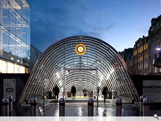
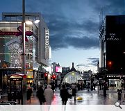
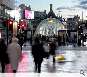
St Enoch station canopy heralds arrival of revamped subway network
January 20 2015
A revamped entrance canopy to St Enoch station subway station has taken its place at the foot of Glasgow’s Buchanan Street following redevelopment work carried out by AHR Architects and Graham Construction on behalf of Strathclyde Partnership for Transport.Part of a wider £288m upgrade of the subway network its completion will allow attention to switch to a twin canopy to the south of St Enoch Square, following earlier refurbishment of the concourse and platform levels, with full completion anticipated later this year.
It is one of seven station refurbishments on the network intended to modernise services and impart a unified design approach to the system, with Hillhead and Partick amongst the first to benefit from a makeover.
Erected over the course of a single night-shift the glasshouse inspired portal consists of rolled tee arches tied together by longitudinal steel rods.
|
|
14 Comments
#1 Posted by Paul Sweeney on 20 Jan 2015 at 11:38 AM
Shame that SPT have just ripped out the historic subway carriage from Buchanan Street station though.
#2 Posted by james on 20 Jan 2015 at 12:25 PM
Irrespective of the design, what is the point of the endless plethora of planning policy and guidance if consent is granted on the basis of whatever? I seem to recall there being something on p. 569 sub paragraph 2(b) about proposals not having 'an adverse effect on the setting of a listed building?' Eh? What listed building? I can't bloody see it! Well, no use crying, it's there, for now, until the next revamp...
#3 Posted by Rem Koolbag on 20 Jan 2015 at 12:40 PM
The new canopy is a disaster from start to finish. What was proposed originally was an elegant parabolic arch of curved glass where reality is the Value Engineered faceted boob canopy.
And make no mistake, a canopy is the sum total of what this is. There is no sense of procession from above ground to below with this. Some horrific junction details at street level as you go down the escalator break any sense of magic that may have been coughed up by the glass above.
And it obscures even further the building in the middle of the square.
Very poor.
#4 Posted by Stephen on 20 Jan 2015 at 13:37 PM
That this would be hopeless was obvious from the start. See the comments on the previous UR story about this (http://www.urbanrealm.com/news/5115/St_Enoch_Station_subway_canopies_take_shape.html). The only surprise is that people were ever convinced by it, let alone designed it. Another Glasgow Planning dept. aberration to sit alongside the river front.
#5 Posted by David on 20 Jan 2015 at 17:56 PM
The new canopy is not a 'disaster from start to finish,' what a joke! My main criticism is the fact that is blocks out the original sandstone station that sits in the centre of the square, otherwise it is light, sleek, clean lines and exactly the type of step we need to take our underground into the 21st century (obviously the network needs expanding to include new lines). I guess all of the above commentators preferred the 1970s brick canopies. I wouldn't say the absolute best but a good effort in my opinion.
#6 Posted by Gordon on 20 Jan 2015 at 19:06 PM
This looks fantastic - a great addition to Glasgow. Well done guys
#7 Posted by monkey9000 on 21 Jan 2015 at 10:21 AM
Considering the project is not yet completed, it would seem this article and the disparaging comments are a little unfair at this point in time.
#8 Posted by Stephen on 21 Jan 2015 at 19:00 PM
@ 7. The thing nearly finished. It doesn't take much imagination. All three pictures on this are the same, because there's really only one very important view of this scheme; the Buchanan St axis and its crescendo with the view of the listed old ticket office to the centre of the square. Well that's ruined. And if cheap system built facetted arches are your thing (and Gordon or David's above for that matter) then I find that pretty shocking. This canopy isn't even necessary, they could have totally freed up the square by putting a set of doors at the bottom of the escalator, assuming they need to internalise that below ground space at all.
#9 Posted by Cadmonkeys on 22 Jan 2015 at 00:12 AM
Well I used this when it was being built in December and I thought it was fine. So what about not seeing the original station from a distance. This is the city centre. It is now a Costa. So what?
I think it's a nice enough project that your average user will think is a massive improvement.
I think it's a nice enough project that your average user will think is a massive improvement.
#10 Posted by architecture? on 22 Jan 2015 at 15:00 PM
@8 could it not be all three pictures are the same because there is still hoarding around the rest of it?
#11 Posted by Der Kaiser on 26 Jan 2015 at 16:09 PM
I hope they get rid of the big metal information point that sits in front of the canopy (which hasn't been working for a long time). It takes up a ridiculous amount of space and looks cheap and nasty.
#12 Posted by Billy on 5 Apr 2015 at 07:52 AM
I like this . So much better than the 70s monstrosity. The main problem with Glasgow's 2nd main public square is the south side of it. The 70s horror that used to be a supermarket needs demolished. The shopping centre is better than it was but I feel the square should be restored to its original design. Rebuild the hotel and its arches and have the shopping centre behind incorporated into the hotel. France and Germany are great at restoring the past . We need to draw people back to this once majestic square and down to the neglected riverscape. The river should be celebrated not neglected at this central part of Glasgow. The other monstrosity bordering the square is the old Arnotts building. That needs pulled down too and and relaced with more sympathetic build to compliment the square and Frasers.
#13 Posted by Brian on 12 Jun 2015 at 08:58 AM
I remember the old Square Hotel arches etc etc.It was very elegant and quite a sight.Im not against modern or them trying to put things right,But I feel the square has just been swallowed up no space no sky just a wall on one side with glass cafes and Tesco,The south of square is shocking,The little Hootananny bar and building is very nicely done they have made an effort !,I feel the subway entrance for square should have bben the entrance to Bank of Scotland,But if not that .whay not just the same as the top entrance in Buchanan st.at least we could still have seen the Jacobean old subway building in the square.
#14 Posted by Billy on 12 Jun 2015 at 10:57 AM
Maybe just demolishing the south side of the square right down to the river to frame it with the river would be an option to bring the riverscape back into the city centre and it would open up the square especially for continental markets. There was talk of an archway similar to the ones at Royal exchange square to lead the pedestrian down to the river.
Post your comments
Read previous: Greenock orchard and community hall clears planning
Back to January 2015
Like us on Facebook
Become a fan and share
News Archive
Search News
Features & Reports
For more information from the industry visit our Features & Reports section.


