Loader Creative Design enter residential market with Strathaven farm steading
November 10 2014
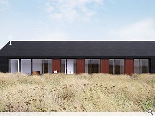
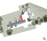
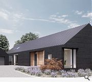
Loader Creative Design, founded by former Elder & Cannon architect Matt Loader, has submitted plans for a family home at Sidehead Farm, near Strathaven, South Lanarkshire – the practice’s first stand-alone house.Situated on green belt land the property is designed to reflect the local development pattern of clusters of 1.5 storey buildings and is clad in stained black timber horizontal rainscreen cladding with matching decking and an adjoining garage, built to mimic the house to which it connects via a glazed link.
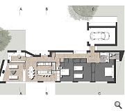
The three bedroom property centres on an open plan kitchen and breakfast bar, opening onto a living room with its own wood burning stove and oriented to the south to benefit from wider views.
In their design statement LCD said: “The design of the new house takes its scale and form from the original steading - that of a slender rectilinear plan form with the plan only a single room in width (plus access corridor).
“In terms of materials it is desired that the house contrasts with the existing white harled cottage, so that while it has a similar form, it marks its place in time. The proposed blackened timber therefore reflects this contrast, forming a uniform cladding material. The recesses to entrance and to wood store are proposed in western red cedar cladding, however, and the dead panels to the eastern elevation will be formed in ‘rust’ coloured PPC aluminium cladding, referencing the existing red barn on site.
“In summary, this is a house which is confident of its place and time. It seeks to be sensitive in both scale and siting in making a ‘place’ however it is formed in crisp contemporary materials. This duality of approach results in a building which echoes the agricultural location, while forming a building with low carbon footprint through the use of super-insulation and best use of passive solar gain."
Images produced by Ed Wright Visuals
|
|
16 Comments
#1 Posted by Art Vandelay on 10 Nov 2014 at 13:33 PM
Like.
#2 Posted by james on 10 Nov 2014 at 13:41 PM
Wouldn't mind a discussion on this as I am new to this business. I am sorry to come across as negative, but to me this is fairly typical for what passes as 'architecture' these days. I have difficulties with this. am I alone in thinking this way? 1. It's a straightforward crib of some Scandinavian or other doodah that I can't be bothered finding out exactly what it is, because by the time I've found it and can name it, whatever has become contemporary will have fashionably replaced it (the apparent long span is the giveaway) . 2. It's just typically pretty pretty, hence I think it's what is called contrived. An artifice.
3. Why are aesthetics so wilfully and grindingly perverse these days? Timber cladding as a flat-boarded rainscreen? Why? Why not use it lapped and derive some benefit from the material properties of resin rather than depend on the plastic behind it. Oh right, it wouldn't look as contemporary? Right.
4. Is it a Zinc or wid roof? If wid as a roof, then it's surely even more aesthetically perverse as it pishes down here. see point above.
5. and lastly, I doubt whether there'll be much in the way of passive solar gain when they'll have to triple-glaze the windows (0.6-0.7 U value) to compensate for the area of the openings > 25%.
Other than that what else can one say, other than it's nice, in a nice kind of way. Who cares. - and by the way what's super about insulation? it's just insulation.
#3 Posted by David Fletcher on 10 Nov 2014 at 13:51 PM
Looks great Matt, I'm sure the proposal will be well considered, detailed and appropriate for client and setting
#4 Posted by Art Vandelay on 10 Nov 2014 at 13:57 PM
Come back Kevin Toner, all is forgiven.
#5 Posted by alan dunlop on 10 Nov 2014 at 15:37 PM
Nice project Matt. Clever plan. Good luck
#6 Posted by CAD Monkey on 10 Nov 2014 at 15:53 PM
Why is there a wee green gap between the garage and the main building? It seems to add unnecessary cost into the project and will be difficult to mow.
#7 Posted by David on 10 Nov 2014 at 15:57 PM
Matt,
Great scheme. Clearly a lot of thought put in to the plan, and the choice of materials nicely bridges the traditional / contemporary gap.
With a small building the devil will obviously be in the detail, particularly wall to roof interfaces.
Post #2...you've totally lost me...
Great scheme. Clearly a lot of thought put in to the plan, and the choice of materials nicely bridges the traditional / contemporary gap.
With a small building the devil will obviously be in the detail, particularly wall to roof interfaces.
Post #2...you've totally lost me...
#8 Posted by boaby wan on 10 Nov 2014 at 16:26 PM
@CAD Monkey - I'd guess it's so that the garage element can be removed from the scheme by the time the project is fully costed and needs to save a few £££ and then built at a later date...
#9 Posted by Not Big Chantelle on 10 Nov 2014 at 16:58 PM
@ #2 James - You're going to fit in well here
#10 Posted by Iain Monteith on 10 Nov 2014 at 17:07 PM
Well done Matt, looks great. Looking forward to seeing the finished project! ;-)
#11 Posted by B on 10 Nov 2014 at 17:07 PM
Looks great and what a beautifully simple plan.
#12 Posted by CADMonkey on 11 Nov 2014 at 11:25 AM
Sorry, not sure this really is "great" or "beautifully simple". There are several questionable aspects to this plan.
1. Bathroom has an external wall, but no window, a rooflight instead?
2.Master ensuite os very pokey.
3. Utility room is open plan to dining/Living. That will be nice when the washing machine/dish washer is on.
4. Gable walls are inexplicably squit? Don't tell me it's just been generated as its the orthogonal East West in AutoCad. Looks like it from the site plan.
5. Front door opens directly into the main living space without a storm lobby. Seems odd for such an substantial house. Odd also that the entrance lobby is mean compared to the bedroom lobby.
6. Long walk with shopping from garage to kitchen.
7. Where would I store my golf clubs? Storage seems light.
8. And lastly that contemplative window seat in the garage lobby....hmmm...
#13 Posted by Walt Disney on 11 Nov 2014 at 12:33 PM
Its an OK 3 bedroom house. Try building a hundred of them.
#14 Posted by Diego Victorious on 11 Nov 2014 at 14:00 PM
I've always dreamed of an open plan utility 'room'.
Love the noise of that washing machine.
VROOOOOM!
Love the noise of that washing machine.
VROOOOOM!
#15 Posted by Ian Nairn Jr on 11 Nov 2014 at 21:38 PM
Nicest-looking thing I've seen in a while. Warmer & more interesting than the Dualchas equivalent (they don't do storage either).
#16 Posted by Gordon Fleming on 12 Nov 2014 at 09:56 AM
This looks simple and elegant but why a wood clad roof , other than fashion, and more importantly, why it is essentially a single aspect house facing solely North East. A free standing house could surely respond to orientation in a positive way
Post your comments
Read next: More student housing on the way for Townhead
Read previous: Dandara lodge plans for final phase of Glasgow Harbour
Back to November 2014
Like us on Facebook
Become a fan and share
News Archive
Search News
Features & Reports
For more information from the industry visit our Features & Reports section.


