Dandara lodge plans for final phase of Glasgow Harbour
November 7 2014
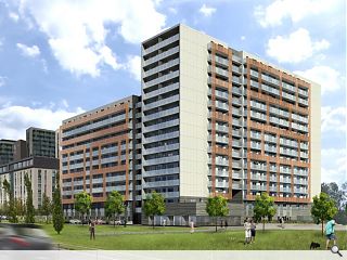
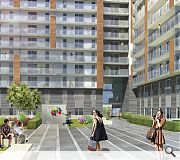
Dandara has submitted plans for the third and final phase of its long-stalled gh2o development at Glasgow Harbour, moving into the private rental market with 348 flats on the waterfront plot.Designed by Axis Mason Architecture the scheme will incorporate two commercial units and two levels of underground parking, arranged around a landscaped central courtyard and extended Clyde walkway – animated by a new retail unit.
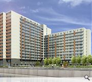
Taking the form of an L shaped block the scheme steps down from 16 to 12 storeys and affords east/west connectivity through a triple height passage.
Ground floor apartments will be given their own terraces as a defensive buffer from public areas with continuous balconies above designed to maximize river views.
A façade frame has been specified to offer visual interest with the main body of the elevations composed of acid etched concrete panels
In their design statement Axis Mason noted: “The north facade will feature framed modules improving the articulation to the streetscape. Obscured screens provide a contrast to the clear glass of the southern façades and help protect residents from potential noise and the natural elements. This façade also reflects the context on the north side by using colour panels, similar in tone to the fabric of the surrounding context.”
|
|
32 Comments
#2 Posted by SJF on 7 Nov 2014 at 12:23 PM
Sorry but have we arrived into Twilight Zone!?!?! Isn't this exactly the same as all the high rise estates that are currently being demolished? Anyone who approves this abomination should be ashamed!
#3 Posted by Every Cloud on 7 Nov 2014 at 12:59 PM
On the plus side, from certain angles it might block out the view of the Dandara Phase 2 site
Every cloud has a silver lining
Every cloud has a silver lining
#4 Posted by Nae lining on 7 Nov 2014 at 13:03 PM
I'm more worried about what's happening in the bottom left hand corner of Image 1.
They appear to have developed hover car technology.
They appear to have developed hover car technology.
#5 Posted by John on 7 Nov 2014 at 13:09 PM
Looks like they moved the old Sighthill flats here. Truly poor. Activity space? How about vortex activity! I would use the word 'design' very loosly for this dross.
#6 Posted by why did Jesus weep? on 7 Nov 2014 at 13:12 PM
i think Axis have created a design that instinctively you want to reach out and touch; its handrails, walls and exquisite joinery are all equally tactile. The concrete is good but never precious. However none of the elements shouts out, together they simply add to the whole, amplifying this exceptional piece of architecture.
#7 Posted by Gordon Matheson car park on 7 Nov 2014 at 13:17 PM
Nae lining, Glasgow city council have be collecting fastlink contributions for several years for the development of hover car technology
#8 Posted by Partick Bateman on 7 Nov 2014 at 13:42 PM
At the risk of sounding like a typical moaning Urban Realm commenter - this is abysmal.
However to add a positive - at least it is in keeping with it's surroundings.
However to add a positive - at least it is in keeping with it's surroundings.
#9 Posted by R on 7 Nov 2014 at 14:45 PM
Agree with majority, apart from #6 why did Jesus weep! Sarcasm...?
You know what they say, "you can take an Axis man out of Keppie, but you can't take the Keppie out of an Axis man."
You know what they say, "you can take an Axis man out of Keppie, but you can't take the Keppie out of an Axis man."
#10 Posted by Alf on 7 Nov 2014 at 14:51 PM
Just saying 'Axis' makes it sound like a team name off of The Apprentice.
I drive by the existing blocks every day and they look more and more shocking with every winter; the condition of the render is awful. I would hope that at least that particular building element is removed from the new scheme.
I drive by the existing blocks every day and they look more and more shocking with every winter; the condition of the render is awful. I would hope that at least that particular building element is removed from the new scheme.
#11 Posted by texeter on 7 Nov 2014 at 14:58 PM
General Secretary Stalin would have been proud. Monolithic Soviet realism at its finest.
#12 Posted by james on 7 Nov 2014 at 15:36 PM
Whit ye's aw moanin' aboot!?
Truth! Modernity! - Gary Cooper aka Howard Roark in Ayn Rand's The Fountainhead. That perspective's a pure belter!
However, the economics of it are simply that capital has to move out of the city state of London, where somewhere in some room in some computer there is a bottom line that will make faceless people happy because now they've got even more money that they don't need. What a farce. And we the architect-shit-eaters enable them to do this and is anybody who is going to work on this, going to be happy in anyway?
#13 Posted by James on 7 Nov 2014 at 15:39 PM
mebbes I should just have said, FFS!
#14 Posted by Neil C on 7 Nov 2014 at 15:58 PM
On the plus side:
1. It's in keeping with Dandara's previous efforts at the Harbour. I look forward to the inevitable swathes of bare concrete at ground level and missing external cladding.
2. If the flats are for rent rather than sale, I reckon it'll be pulled down in 30 years time.
3. It references Glasgow's heritage of building flimsy and unlovable Stalinist grot-boxes - the elevations are particularly reminiscent of the Hutchie Dampies.
4. That's about it, really.
#15 Posted by monkey9000 on 7 Nov 2014 at 16:10 PM
Something dodgy going happening, on the 4th floor balcony in that second pic, call the Polis!
Maybe they just couldn't take the monotony of living there anymore!
Maybe they just couldn't take the monotony of living there anymore!
#16 Posted by Toro rojo on 7 Nov 2014 at 16:16 PM
Well done GCC. The only city in Europe that has managed to destroy it's defining urban asset - the riverfront.
#17 Posted by The 'Modernist' brigade on 7 Nov 2014 at 19:44 PM
Where's Big Chantelle to tell us we're all ignorant muppets and we'd have designed it exactly the same if only we had the chance?
#18 Posted by Big Chantelle on 7 Nov 2014 at 19:55 PM
I quote the concrete loving modernists brigade's press release on this: "Glasgow harbour: where dreams are made is ready to become even greater with the realization of its final phase.This is proof that the key to happiness is white render, zinc cladding and rear motorway views."
No doubt it'll scoop some RIAS awards and be hailed for its supposed brilliance.
You know my views folks.Utter dross.
No doubt it'll scoop some RIAS awards and be hailed for its supposed brilliance.
You know my views folks.Utter dross.
#19 Posted by boaby wan on 8 Nov 2014 at 12:49 PM
just who are "the concrete loving modernists bridgade"?
Anyone who doesn't immediately disregard advances in construction for the last 150 years?!
Sometimes you might have a point hiding behind the ridiculous statements bc, but it's incredibly tiring when you don't seem to understand your own opinions
Anyone who doesn't immediately disregard advances in construction for the last 150 years?!
Sometimes you might have a point hiding behind the ridiculous statements bc, but it's incredibly tiring when you don't seem to understand your own opinions
#20 Posted by The 'Modernist' Brigade on 8 Nov 2014 at 17:25 PM
Right on cue BC. Right on cue. Would be nice if you could lower yourself to engage in a debate with the rest of us instead of just mud-slinging.
#21 Posted by Jon on 8 Nov 2014 at 19:28 PM
They certainly are Chantelle.
Depressing - just been at the IAA conference on Skye, and one of the talks was on the red elopement of Oslo waterfront. The Norwegians are achieving some fantastic large scale mixed use development with some genuinely intelligent landscaping/masterplanning. They are also encouraging design-led practices rather than the bland corporate firms we in Scotland seem to opt for on the larger scale, and actively engaging the architects design ambitions with developers, who are seeing the merits of well designed space.
Total contrast to Scotland sadly.
#22 Posted by the sultan of brooneye on 10 Nov 2014 at 12:25 PM
If you need to see a perfect example of how badly this approach fails - just look to the Granton/Western Harbour 'masterplan' in Edinburgh. It is a recently completed, template for this kind of terrible development.
#23 Posted by Craig on 10 Nov 2014 at 12:30 PM
just awful.
where is the architecture in two bland & grey square boxes??! How can we create commercial space like the armadillo, the Hydro and the transport museum that enhances the reputation of the city as an up and coming stylish city full of great architecture (old & new) yet when we get an opportunity to create new residential development Glasgow fails to deliver?
the architects should be ashamed to put their name to this work.
#24 Posted by Big Chantelle on 10 Nov 2014 at 14:33 PM
@Jon #21
Amen!
Amen!
#25 Posted by Tom Manley on 10 Nov 2014 at 15:48 PM
In many ways the design code ( or lack of ) for this area was set with some of the initial phases of the Glasgow Harbour development and the area's fate was sealed at the lack of vision in the sites potential. As mentioned by #2 these dangerously risk repeating the rapid fall from grace of 60s/70s developments.. yet as with the rest of this scheme the main problem (rather than architectural form or style) is lack of facilities and options at the lower levels for community, retail, workshops and other variety of interests that would help foster a sense of place...i wonder if post recession the bubble will finally burst and people will stop wanting to buy or live in new build developers boxes - marketed with urban lifestyle propaganda ... and return to well built, properties that perhaps have more than a 30 year life span.
#26 Posted by B on 10 Nov 2014 at 17:15 PM
This looks far too dense. I agree with all the comments on its aesthetics also but I won't repeat them, if you cross the Clyde into Govan the Architecture here is outshining the West End.
Given the poor public transport connections from the Harbour this may increase the parking problem that already exists there.
Such a shame.
Given the poor public transport connections from the Harbour this may increase the parking problem that already exists there.
Such a shame.
#27 Posted by Paul on 10 Nov 2014 at 19:10 PM
It looks like the old Western General Infirmary from some angles, 1960/70s designs all round!
#28 Posted by The Big Dog on 11 Nov 2014 at 17:53 PM
Building on the successes/failures of the previous phases by the looks of it. #9 Im assuming your a Keppie man/woman sounds like you have an 'Axis' to grind.
#29 Posted by Dong Wan on 11 Nov 2014 at 23:14 PM
in the second image it looks like there is a pretty intense conversation going , maybe involving unrequited love ..... also what is that woman wearing?!!
#30 Posted by Chris on 12 Nov 2014 at 12:19 PM
The is horrendous and if it gets planning looking like this serious questions need to be asked about the system and motivations behind granting approvals.
I lived in on the 8th floor of the original Murray Dunlop block and worked on the closing phases of the RMJM block next door. I fail to see how this is an improvement of any sort in terms of design.
The original scheme is not perfect but is far better articulated than what is shown here.
The area lacks variety and is rather cold, more green space is needed, and things for people to do, a gym, some shops and opportunities for local businesses would not go a miss.
At present its bit of a yuppie ghetto and with oppresive design like this it will only get worse.
Any further phases proposed here need to improve on the past, the only two semi working precendents here, in my experience of living there, that work are the GMA block (The orignal Dandara) and the RMJM Parklane block, the first and best.
#31 Posted by john doe on 19 Nov 2014 at 00:28 AM
oft-quoted observation by Marx that "history repeats itself, first as tragedy, second as farce"
#32 Posted by mervyn lang on 15 Feb 2021 at 11:42 AM
Ma! Horrendous. I am used to residing on Elbe and Rhone, vibrant rivers with heavy commerce. The river Clyde is utterly depressing, no ships, no ommerce, piers demolshed, proms empty, no refreshment facilties.
Post your comments
Read previous: Housing planned for former Govan tram depot
Back to November 2014
Like us on Facebook
Become a fan and share
News Archive
Search News
Features & Reports
For more information from the industry visit our Features & Reports section.


Reminds me of 1970's Benidorm...