Morgan McDonnell’s Advocate’s Close wins Andrew Doolan Award
November 5 2014
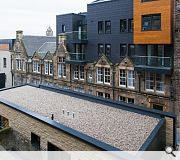
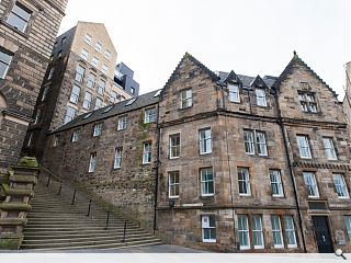
Morgan McDonnell Architecture has seen off competition from 13 shortlisted practices to secure the Andrew Doolan award for best building in Scotland for its Advocate’s Close development, Edinburgh.The practice picked up a gold medal and a check for £25k for their work to reconnect a series of buildings in the heart of Edinburgh’s Old Town, retaining no less than nine listed buildings to provide retail units, a restaurant, offices, a bar and serviced apartments.
RIAS president Iain Connelly said: “The RIAS Andrew Doolan Award has never been simply an architectural beauty contest. This year’s winner combines careful restoration with bold and uncompromisingly contemporary new additions in an idiom which is sensitive to its setting while avowedly ‘now’. The complexity of what has been delivered and the architectural self-assurance with which it is achieved makes this an extraordinary, truly special and very deserving winner.”
Four other projects received a special mention; namely: The Birks Cinema, Aberfeldy Robin Baker Architects; House No. 7, Isle of Tiree, Denizen Works Ltd; The Inn at John O’Groats, Caithness, GLM and Scottish Water – The Bridge, Stepps by Reiach & Hall Architects.

Advocate's Close won over judges for its sensitive treatment of historic fabric and clearly delineated modern interventions
|
10 Comments
#1 Posted by Anon on 5 Nov 2014 at 22:48 PM
Seriously? This?
#2 Posted by Egbert on 6 Nov 2014 at 09:34 AM
Lots to commend in this scheme but I can't help but think that faux-rustic crowstepped gable is a huge mistake. It's not actually replicating anything that was there before, so why do it in a sort of half-hearted 17th-century idiom? Plus the sash windows don't even match the original ones below. It's completely out of kilter with the approach taken in the rest of the development and just looks jarring and inauthentic. Was there pressure from certain quarters to do something 'historic' on the most visible part of the site? Looks like a clumsy compromise.
#3 Posted by Big Chantelle on 6 Nov 2014 at 10:26 AM
RIAS president Iain Connelly said: “The RIAS Andrew Doolan Award has never been simply an architectural beauty contest. This year’s winner combines careful restoration with bold and uncompromisingly contemporary new additions in an idiom which is sensitive to its setting while avowedly ‘now’.
So RIAS get to decide for all us lowly people what the architecture of 'now' is? 'Now' architecture has a style apparently. Thus anything which doesn't look like this 'now' architecture will be called 'pastiche'.
And here lies the problem. Buildings should obviously not compromise the environment. And all of the best technology which improves the human condition should be used in architecure. That's a truly 'now' approach. But institutions like RIAS are stylistically fascist just like most of the concrete lovin' modernists here. A beautiful building containing columns and arches with surface ornamentation which looks nice, makes people happy, allows so much feeling to be imparted into the architecture CAN be 'now' architecture.
But I digress. I think this scheme is terrible. The elevation which seeks to blend into the world heritage site does so partly -- if you ignore metal clad turd roofs beside the stone section. But then the architects have to go and act all weird with their 'now' stuff and where the building is not facing outword over cockburn street creating a wonky mess of modern mediocrity.
Facepalm to the max.
#4 Posted by boaby wan on 6 Nov 2014 at 11:58 AM
here's one for you Chantelle - http://www.archdaily.com/202783/casa-dos-cubos-embaixada-arquitectura/
What do you think of "preservation syndrome"?
What do you think of "preservation syndrome"?
#5 Posted by CADMonkey on 6 Nov 2014 at 13:59 PM
This prize is for "The Best Building in Scotland".
I think this therefore clearly demonstrates the current state of Scottish Architecture.
I think this therefore clearly demonstrates the current state of Scottish Architecture.
#6 Posted by Jon on 6 Nov 2014 at 14:40 PM
There were a number of projects on the shortlist that I feel were much more deserving of the accolade of "Best Building in Scotland" such as the fantastic R&H Scottish Water building.
The Advocates Close building is clearly visible from Princes Street and is the only "modern building" that really sticks out in that vista, in quite a jarring way. It may be a cleaver design on its site, but contextually it really is not well thought out.
The Advocates Close building is clearly visible from Princes Street and is the only "modern building" that really sticks out in that vista, in quite a jarring way. It may be a cleaver design on its site, but contextually it really is not well thought out.
#7 Posted by Dontlookup on 6 Nov 2014 at 15:35 PM
I’ m with CAD monkey on this one and find this rather alarming.
MM are a good practice but this is a very disappointing scheme- from the pastiche, ScandicCrown-esque crow step section to the oversized, jarring black boxes and odd little suspended shed-like elements. The colour of which are similar to the complexions of the cast of TOWIE…not nice…
Who the hell is judging this stuff??!
#8 Posted by Rabbie on 6 Nov 2014 at 16:14 PM
I agree that in photos this scheme doesn't look its best but I was very impressed with the transformation of the close on my last visit.
#9 Posted by David on 6 Nov 2014 at 16:36 PM
Jon,
I think you're right about it being a 'cleaver' design!
A very apt typo :D
I think you're right about it being a 'cleaver' design!
A very apt typo :D
#10 Posted by Snore on 7 Nov 2014 at 01:18 AM
@ 3. Alright Shanters, change the record. You don't know what Modernism means and you don't know what Pastiche means either. It's just ranting noise now.
Shame, because underneath all that bitterness and ignorance, you actually have a point. Maybe stop insulting everyone and it'll get through. Oh and read an architectural history book.
Not sure which side of this building is more embarrassing by the way. Neither has any subtlety. The planners must have designed the front.
Post your comments
Read previous: Revised Livingston health centre scheme put in for planning
Back to November 2014
Like us on Facebook
Become a fan and share
News Archive
Search News
Features & Reports
For more information from the industry visit our Features & Reports section.


