Revised Livingston health centre scheme put in for planning
November 4 2014
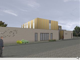
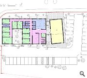
Revised plans for a replacement Murieston Medical practice, Livingston, have been submitted for approval to West Lothian Council by Aitken Turnbull Architects.Located at Hamilton Square the scheme will see a new medical centre and pharmacy built on behalf of its GP to replace temporary existing facilities, part of an £84m programme to meet the needs of an ageing and growing population across the Lothian region.
In a statement the architects wrote: “The new two storey building sits on the adjacent site to the existing practice and seeks to continue the building line from the adjacent vets practice.
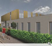
"The building is divided into three masses with the Pharmacy and Medical Practice expressed on the ground floor as brick volumes joined at first floor by a lighter perforated aluminium clad volume housing staff and administrative functions.
|
|
12 Comments
#1 Posted by Gggrrrr on 4 Nov 2014 at 13:30 PM
FFS- you can still see the Google streetview copyright lines in the sky.....I'm sure Aitken Turnbull Architects will have paid the proper licence for that though....
#2 Posted by james on 4 Nov 2014 at 13:39 PM
I wish architects would tell the truth. I notice that the previous note of an L-shape reference has now been omitted. This scheme was revised because the architects failed to notice a large sewer running through the site. So much for professionalism. Oh yes and the design is banal c**p.
#3 Posted by John Glenday on 4 Nov 2014 at 14:05 PM
This article was amended to remove confusion with a prior application.
#4 Posted by Frankie on 4 Nov 2014 at 16:37 PM
I wonder what Frank Gehry would think of this ?
#5 Posted by Jonathon on 5 Nov 2014 at 06:42 AM
Even by hub standards this is poor
#6 Posted by jack on 5 Nov 2014 at 10:43 AM
Banal...really? On what I imagine was a relatively tight budget it looks like they have achieved something quite elegant
#7 Posted by David on 5 Nov 2014 at 11:40 AM
@ Jonathon,
Any chance of some reasons why, in your opinion, you think it's poor? Might actually be a bit more stimulating debate if people cared to take some time to provide useful criticism, instead of a fairly mute response.
I actually think this scheme has potential. Admittedly the 3D renders are not very good, but it's all too easy to poke fun at poor quality CGI's as this forum (and the earlier posts above) all too often proves.
If there is care and attention taken by the architect's to provide well resolved detailing and good choice of brick / cladding then it could easily be a very visually appealing building.
And thank goodness Frank Gehry doesn't get let lose on too many schemes in Scotland given his tendancy to produce childlike lumps of garish coloured trash metal! Perhaps he should look at his own work before he criticises other so strongly.
#8 Posted by presumptive on 5 Nov 2014 at 12:13 PM
@5, Not a hubCo project - a direct commission from the GPs it seems..... http://www.hubsoutheastscotland.co.uk/projects/projects-in-development
It'd be good if the pharmacy could be a bit more open -looking, rather than a blank brick box.
It'd be good if the pharmacy could be a bit more open -looking, rather than a blank brick box.
#9 Posted by Big Chantelle on 6 Nov 2014 at 10:16 AM
"Any chance of some reasons why, in your opinion, you think it's poor? Might actually be a bit more stimulating debate if people cared to take some time to provide useful criticism, instead of a fairly mute response."
It's boxy, boring and devoid of character. It's a building of contemporary nothingness. It looks like nothing remarkable and was conceived to be nothing remarkable. Blank walls, no feeling. Pure and utter nothingness.
But saying that, I'm sure the Motherwell Polytechnic of concrete urbanist architecture will be creaming themselves over this.
#10 Posted by David on 6 Nov 2014 at 10:44 AM
Clearly your opinion BC which you are welcome too (although don't you get bored of repeating it monotonously every time you post?!). It's good that you are able to express it in some detail though, unlike some others.
I for one don't think that blanks walls a boxy architecture lacks feeling or character. Nor do I suspect a lot of architects generally.
We therefore agree to disagree.
I for one don't think that blanks walls a boxy architecture lacks feeling or character. Nor do I suspect a lot of architects generally.
We therefore agree to disagree.
#11 Posted by Big Chantelle on 6 Nov 2014 at 16:53 PM
@david
"Clearly your opinion BC which you are welcome too (although don't you get bored of repeating it monotonously every time you post?!)."
1. Thank you for acknowledging I'm allowed my opinion on an opinion comments section.And ofcourse it's my opinion -- who elses can it be? That's pretty self evident.
2. Nope, I don't get bored of repeating my opinion 'monotonously'. What other type of opinion is there and how should it be expressed? Should I change my view on architecture every day? I have an opinion, so do you.And I express it as such.
#12 Posted by David on 7 Nov 2014 at 08:45 AM
@ Chantelle
It's the way you come across though. You have a chip on your shoulder.
(hint - I wasn't arguing with you btw)
It's the way you come across though. You have a chip on your shoulder.
(hint - I wasn't arguing with you btw)
Post your comments
Read previous: Kirkintilloch community hall opens its doors
Back to November 2014
Like us on Facebook
Become a fan and share
News Archive
Search News
Features & Reports
For more information from the industry visit our Features & Reports section.


