Potterrow student housing and rehearsal space nears completion
August 22 2014
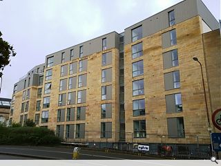
Ogilvie are completing work on a £6m student housing development at Potterrow, Edinburgh, built on behalf of the University of Edinburgh.Designed by LDN Architects the scheme consists of a range of 40 predominantly three and four bedroom flats together with a rehearsal space on land to the rear for the nearby Festival Theatre and in response to a planned road realignment to create a new public square by 2020.
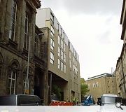
In their design statement LDN said: “The mass of the student housing is broken down by dividing it into two blocks so it better reflects the tenemental scale of the traditionally built flats in Edinburgh. The rehearsal space within the Festival Theatre Extension is punctuated by a large glass wall that projects forward of the building line.
“This interstitial space allows for attenuation of fresh air to naturally ventilate the rehearsal space and office below while screening traffic noise. It also allows provides the theatre with a presence to Potterrow and distinguishes it as a building of Public importance with in the surrounding residential blocks. Although the forms of the two buildings differ the use of a restricted palette of materials allow them to read as a holistic city block.”
The scheme is scheduled for occupation in September.
|
|
5 Comments
#2 Posted by Bingo Bongo on 22 Aug 2014 at 18:07 PM
Like it ?.......this is a shockingly poor quality build given its location and context.
#3 Posted by Stephen on 23 Aug 2014 at 15:36 PM
UR: "Depth has been introduced to the facades"
No it hasn't. Don't completely hate it though. Actually quite like the relative restraint. Not easy to tell from the poor pictures though. Colour of cladding looks a bit 'oversaturated' but again, may be the pics.
Doesn't add anything at all at street level though which is a major negative in my book.
#4 Posted by CADMonkey on 23 Aug 2014 at 15:39 PM
I think it looks quite polite and crisp..
It's clearly trying hard not to compete for attention with its historical neighbours. I like the lack of architectural gymnastics and also don't mind the top floor change of material. It looks fine.
It's clearly trying hard not to compete for attention with its historical neighbours. I like the lack of architectural gymnastics and also don't mind the top floor change of material. It looks fine.
#5 Posted by Robert on 23 Aug 2014 at 17:49 PM
A degree of restraint is no bad thing but this is simply dull and uninspiring.
The top floor material change would be more effective if it was also marked by a change of geometry. Changing the material alone suggests a rather half-hearted and ultimately ineffective attempt to reduce the visual mass of the building.
The top floor material change would be more effective if it was also marked by a change of geometry. Changing the material alone suggests a rather half-hearted and ultimately ineffective attempt to reduce the visual mass of the building.
Post your comments
Read previous: Work begins on Milngavie Waitrose store
Back to August 2014
Like us on Facebook
Become a fan and share
News Archive
Search News
Features & Reports
For more information from the industry visit our Features & Reports section.


*
Planners, will you please stop insisting on new buildings which look like they have roof extensions to satisfy an irrelevant building line.