Hackland + Dore unwrap Glasgow student housing
August 13 2014
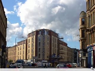
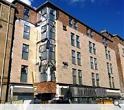
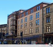
Hackland + Dore Architects have unwrapped a 117 bed student residential project with ground floor retail at the gushet of Argyle Street and Old Dumbarton Road.Clad in cast sandstone and brick the properties have been built on the site of a former petrol station, which itself replaced St Enoch’s United Free Church, terminating the vista along Argyle Street.
In a design statement Hackland + Dore said: “The elevational treatment is a simple and modern interpretation of the surrounding classical tenements. The elevations are sympathetic to the immediate context both in solid to void proportions and the proportions and grouping of window openings.
“A simple metal band separates the ground floor from the upper storeys, reflecting the shop signage zone on the adjacent tenements and providing space for future signage requirements for the ground floor commercial uses.”
Plans to incorporate a basement level and use natural sandstone and glazed brick were dropped following initial planning consent.
|
|
12 Comments
#1 Posted by Stephen on 13 Aug 2014 at 13:56 PM
Grim. I thought we'd finished this kind of rubbish in about 1996? No wonder I've never heard of Hackland and Dore.
#2 Posted by walshalyn on 13 Aug 2014 at 17:25 PM
grim to say the least.
They are as dull as dishwater. Why are'nt the planners enforcing more vibrant design...
They are as dull as dishwater. Why are'nt the planners enforcing more vibrant design...
#3 Posted by mullion on 13 Aug 2014 at 18:05 PM
i disagree stephen, i think this is a lot better than most of the schemes we've seen recently in a similar context and of a similar nature. The window proportions and elevational treatment work really well in the street. not a big fan of the brick vertical returns, they let it down. the corner feature rounded piece could be better, but then it could also be much worse..
#4 Posted by wonky on 13 Aug 2014 at 19:30 PM
Don't really get the grumbling here: positively adds to the urban fabric, presenting a more coherent connective curve between Argyle Street & Old Dumbarton Rd. Even the materials used are decent- the sandstone is contextually sensitive, as are the window sizes & the "elevational treatment" as Mullion alluded to- what's not to like? Aye okay it ain't Greek Thomson...but it ain't bad either.
#5 Posted by Charlie_ on 13 Aug 2014 at 19:40 PM
These work better in person than they do in these photos admittedly but, even still, the comparison with the bleak, undersized yellow brick tat going up in the early 90s took me by surprise. I think these are pretty good!
#6 Posted by Observor on 14 Aug 2014 at 09:10 AM
If you look at the red sandstone Islamic Centre to the left of Happy lets its clear they have actually referenced that, with their curved corner/step out approach - strange one.
#7 Posted by hum on 14 Aug 2014 at 12:07 PM
Given it's a cheap, developer-led student housing block, it's not bad. As said, it's a positive contribution to the street, I like that it builds up the corner, similar to how the po-mo tenement opposite does." Aye okay it ain't Greek Thomson...but it ain't bad either." Agreed.
#8 Posted by Egbert on 14 Aug 2014 at 14:49 PM
Flawed this may be but it's a welcome development - filling in the gap site and restoring the street edge and sense of enclosure has drastically improved the dignity of this meeting of streets. There are countless remaining gap sites in Glasgow that would benefit from this approach as a minimum.
#9 Posted by Tom Manley on 14 Aug 2014 at 16:14 PM
Are they going to put a dome on the top? Nice to see Glasgow's sandstone being referenced albeit with little articulation- there's been a few decent contributions to this area of Finnieston recently, returning solidity ,density, and continuity back to its place in lining Glasgow streets... better than so many 'kit of part buildings' that look like you could take them apart with a spanner! A step in the right direction - but the most basic Victorian tenements look more refined.
#10 Posted by Lee Ivett on 14 Aug 2014 at 17:55 PM
I find the brick to be pretty offensive, clumsy shifts in materiality, the building is okay but if this is what we begin to accept then that's quite sad. I much preferred the site when it was a petrol station, really handy so it was
#11 Posted by Chris on 14 Aug 2014 at 19:51 PM
For what it is it's fairly decent. It was only a few years ago that student housing was truly dire and unacceptable, for example the blocks on High street.
#12 Posted by Stephen on 16 Aug 2014 at 14:13 PM
Sorry, I'm just not seeing it. If even the architects think this is good enough then how could we complain about the planners having low standards? Clearly this building has been designed in 2D. As Tom (no 9) rightly points out there is no articulation in the stone facade. The stone has been applied in panels with no appreciation of how a masonry building differs from one built from sandwich panels. A cheap and careless solution which is only brought into sharper focus by its more dignified tenement neighbours. Brick might have been used on one or two nearby buildings but not this brick and not in a single (cheap) skin. I just don't think this is good enough and am sad that so many seem to think it is. Where is the ambition?
This is a key set-piece site and should have been a great building.
This is a key set-piece site and should have been a great building.
Post your comments
Read previous: T-AP launch rebranded practice with two new projects
Back to August 2014
Like us on Facebook
Become a fan and share
News Archive
Search News
Features & Reports
For more information from the industry visit our Features & Reports section.


