Grey Aberdeen hotel scheme hits planners desks
July 24 2014
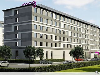
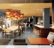
Marriott has submitted plans for a £15m Moxy branded hotel within the environs of Aberdeen Airport, Dyce, part of the ABZ business park.The six-storey scheme, designed by ICA Architects, will offer 200 bedrooms and is intended to create a ‘structured building line’ along Dyce Drive.
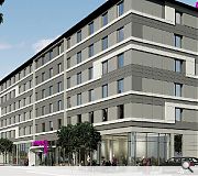
In their design statement ICA say: “A high quality aluminium cladding panel system has been selected which can offer varying levels of relief within the façade. This combined with a dynamic horizontal ribboned pattern offers a lively and varied elevational treatment.
“The ground floor is perceived as a plinth which contains both the hotels front and back of house areas. These areas are clearly identifiable through the use of solid wall panels in back of house areas and large areas of glazing to front of house spaces. These glazed elements help to activate the external seating areas while clearly demarcating the main entrance on arrival.
“The main public entrance is further emphasised with a projecting canopy and a large goal post projection that extends up the façade of the building to the eaves level.”
|
|
11 Comments
#2 Posted by monkey9000 on 24 Jul 2014 at 13:18 PM
The Poxy Moxy
#3 Posted by Granite on 24 Jul 2014 at 16:13 PM
Moxy: Ribboned for Her Pleasure
#4 Posted by Town Planner on 24 Jul 2014 at 18:37 PM
Oh dear God...
#5 Posted by David on 25 Jul 2014 at 09:11 AM
I don't think even local councils would have been proud of this as a 1980's overclad scheme.
#6 Posted by Gavin on 25 Jul 2014 at 13:58 PM
Aberdeen, the place of my birth but agree wit hfirst coment to a point. Very poor design that is becoming all too common place in Aberdeen. Welcome to 1960.
#7 Posted by neil on 28 Jul 2014 at 11:05 AM
I love how they explain the idea of using solid walls for service areas and glass for the entrance. I would never have thought of that idea...
#8 Posted by bear post please on 28 Jul 2014 at 11:55 AM
i have died a bit inside. Its almost as bad as its ugly sister on the Clydeside. Would love to have seen what justification they put in their design statement for planning
#9 Posted by A local pleb on 28 Jul 2014 at 13:13 PM
ICA claim to be hotel experts, don't make me laugh, this looks like nothing more than a Blue Peter exercise in colouring in an empty cereal box, and even that was done on the cheap hence the monochrome 'delights'. Dire!
#10 Posted by Kate Latto on 28 Jul 2014 at 14:10 PM
Isnt Moxy a protoype design though? One of those flat pack, screw together at the corner things? Not so sure the design is down to ICA.
#11 Posted by A local pleb on 29 Jul 2014 at 13:08 PM
The corporate sales spin of the brand image on Marriot's web site may aspire to something else but in reality its just the same old 'brand' rubbish concealed in new drab clothes
http://www.marriott.com/hotel-development/moxy-hotels.mi
No architectural merit what so ever...? Interior design led? Yuck!
http://www.marriott.com/hotel-development/moxy-hotels.mi
No architectural merit what so ever...? Interior design led? Yuck!
Post your comments
Back to July 2014
Like us on Facebook
Become a fan and share
News Archive
Search News
Features & Reports
For more information from the industry visit our Features & Reports section.


Jesus wept.
Aberdeen: where architecture goes to die.