Inverness Eastgate Centre unveils cinema extension plan
April 11 2014
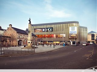
F&C Reit, the new owners of the Eastgate shopping centre in Inverness have submitted plans for a significant new leisure extension to the existing mall, incorporating an eight screen cinema overlooking Falcon Square.Designed by Threesixty Architecture, who have drawn up similar plans for Dundee's Wellgate Centre, the extension would house a new cinema on upper levels whilst the ground floor is given over to a range of restaurant and café spaces to better engage with the public realm.
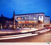
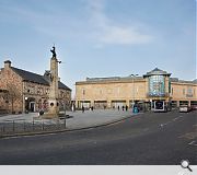
In a statement the practice said: “The existing façade is monolithic and does not celebrate the inner functions of the building and a cinema use obviously limits opportunity to enliven the elevation. To counter this, the design response creates a dynamic façade of a golden hued preformed metal panel that will change with the varying light and seasons. The panels are textured through varying perforation sizes and etched polished finishes that will counter the monotony of a consistent material finish and, being back-lit, offer a dramatic back drop to Falcon Square in the evening.”
F&C asset manager Spencer Gower added: “The face of shopping centres are changing, with so many people shopping on line it is important that centres have a fusion of retail and leisure to attract customers. The visitor experience is becoming more and more important particularly in inverness where tourism is so important.”
Work on the scheme is expected to begin in the ‘next few years’.
|
|
5 Comments
#1 Posted by Colin Deans on 14 Apr 2014 at 22:20 PM
Worthwhile project but building design completely out of keeping with historic Highland City and unsympathetic with listed buildings adjacent in Falcon Square
#2 Posted by Donnie on 7 May 2014 at 10:20 AM
I don't know, I think the listed buildings actually stand out more in the rendered shot. The existing façade is pretty horrific and in need of a contemporary lift which isn't straight out of a contractors handbook of façades. I think a big problem is often trying to tie in with what is existing. Agreed it has to be clever but here it's a convincing argument that 'compare by contrast' is lifting the old and the new together. Please update the Eastgate logo before ramming it into the new façade at a ridiculous scale!
#3 Posted by Norma on 7 May 2014 at 18:41 PM
We don't want another monstrosity similar to the one below the Castle which will completely detract from the listed building next to it.
#4 Posted by Black Feathers on 22 Oct 2015 at 12:39 PM
I don't think it's in keeping with the surrounding buildings. Inverness is a historic city, and a lot of its tourism is based around people looking to connect to that history. This very modern design, while interesting in itself, does not seem suited to its context. Yes, the current façade on that wing is pretty monolithic - partly because it mostly houses storage for the upper floors of retail - and could do with more to enliven it, but at least the stone cladding and narrow rectangular windows are a nod to the architecture of the rest of the city. If a vertical extension is added, it's even more blank wall, and however interesting the cladding, will still seem monolithic if there are no variations in form to break it up.
I also wonder what epileptic residents of Inverness, and those who suffer from sensory issues, will think of the back-lit perforated cladding and animated adverts... The Christmas tree's flashing lights each year already mean one friend of mine has to completely refigure their daily commute during the festive season to avoid Falcon square. This would be a permanent addition.
Inverness is not New York or London, and whatever new façade is built, I feel it should speak of a sense of place, especially in a city where tourism is such a big part of the economy.
#5 Posted by Leah on 1 Dec 2015 at 00:07 AM
HORRIBLE! the branding of Inverness is so confusing and the architectures are continuously getting it wrong over and over waste of money
Post your comments
Read next: Princes Street Motel One opens its doors
Back to April 2014
Like us on Facebook
Become a fan and share
News Archive
Search News
Features & Reports
For more information from the industry visit our Features & Reports section.


