Yoker Medical Centre to move on-site
March 28 2014
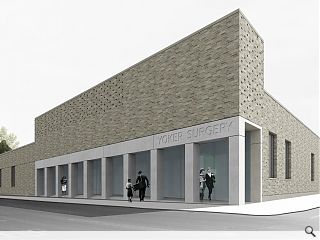
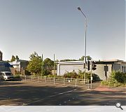
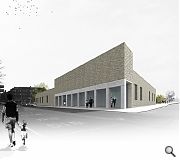
Work to build a new medical practice in Yoker is to move on site following the appointment of Keppie by Medical Centres Scotland to design a modest brick and concrete surgery.Situated on the junction of Dumbarton Road and Ellerslie Road the scheme will provide premises for both a GP and dental surgery and will incorporate a range of consulting rooms and treatment facilities.
Both occupiers will share a collonaded enclosure to lend civic presence to the main frontage whilst sharing a single entrance space.
David Ross, design director at Keppie, commented: “This is an important project for the community and one that we’re very pleased to be involved in. We’ve got a lot of experience in the medical sector so we know exactly what works in terms of the design. We’ll be using this know-how throughout the construction phase to bring our creation to life.”
Yoker Medical Centre is scheduled to open its doors to patients in autumn 2014.
|
|
18 Comments
#1 Posted by Stephen on 28 Mar 2014 at 13:02 PM
This is EASILY the most promising thing I have ever seen coming out of Keppie's office (Charles R.M. not included). Would like to see more images but congratulations may be due.
#2 Posted by D to the R on 28 Mar 2014 at 13:21 PM
The caption for Image 2 should read 'Keppie have adopted the same materials most contemporary architects have been using for the last decade ... gone are the Kingspan cladding panels (other suppliers are available)'
Not sure two images deserve such potentialled praise?
Not sure two images deserve such potentialled praise?
#3 Posted by Neil C on 28 Mar 2014 at 15:21 PM
Looks like a Brutalist shed designed with a set square, and it even has concrete walls and aluminium-framed windows. Welcome to the 1960s, people of Yoker. You poor sods.
#4 Posted by Bloods Man on 28 Mar 2014 at 16:01 PM
Looks great to me
Well done David and Keppie
Well done David and Keppie
#5 Posted by robert on 28 Mar 2014 at 23:05 PM
Hmmm - perforate brick, precast colonnade, orthogonal form... would I be wrong in seeing this as a text book example of Keppie copying Reiach and Hall copying Zumthor and others?
Decent by Keppie's standards but maybe time for others to change their game.
Decent by Keppie's standards but maybe time for others to change their game.
#6 Posted by Lee Ivett on 28 Mar 2014 at 23:28 PM
derivative and faddish
#7 Posted by Art Vandelay on 29 Mar 2014 at 15:43 PM
Jeezo. Half the time this place could pass for a less-balanced version of the Daily Mail website.
For what it's worth, I like this. Certainly better than the mess that's there at the moment. Although I'd give that recess about ten minutes before it becomes a litter/fag butt magnet.
Just out of interest, can you honestly name me one scheme that isn't derivative, even just a wee bit?
For what it's worth, I like this. Certainly better than the mess that's there at the moment. Although I'd give that recess about ten minutes before it becomes a litter/fag butt magnet.
Just out of interest, can you honestly name me one scheme that isn't derivative, even just a wee bit?
#8 Posted by lee ivett on 30 Mar 2014 at 09:16 AM
The comments on this website are often unbalanced and pitched at a level of critical enquiry that would seem to be a little pre-school. I try very hard to make sure any comment I make is not laced with nastiness and I always use my real name so as to ensure I can be found and my comments be countered. In this case I do not know whether the design is successful because there are no plans or sections or information that allows me to fully understand or appreciate the workings of the building so I can only comment on the images provided. I therefore do not state whether the building is good or bad but can only make comment on it's aesthetic. There may well be a considered and nuanced process of critical enquiry at play here that has generated the aesthetic following a creative understanding of people, place and the needs of the brief and client... or someone may have opened up some architectural wank mags and thought 'oooooh I like that brick pattern thing that every ones been doing lets slap it on that scheme in Yoker'.
I think that the comment on this website from the public, whilst generally on the wrong side of shite, exists to fill a gaping critical void that is evident in much of the news items
oh and I never saw anything quite like this before http://www.ruralstudio.org/projects/glass-chapel
I think that the comment on this website from the public, whilst generally on the wrong side of shite, exists to fill a gaping critical void that is evident in much of the news items
oh and I never saw anything quite like this before http://www.ruralstudio.org/projects/glass-chapel
#9 Posted by Georth on 31 Mar 2014 at 08:39 AM
Nice concept, simple materials pallete, subtle detailing. Why don't Keppie design more buildings like this?
#10 Posted by Rem Koolbag on 31 Mar 2014 at 10:29 AM
As a series of design intent images, these look great. Attention to materials and massing, and some nice little brick details too.
As others have said above, without plans or sections etc then it is a little more difficult to tell what impact the building might have on the site and surrounding area, but then that is more an issue for Urban Realm than Keppie. As it stands, this building looks like it could be a great development for the area, which I think could really use some high quality street fronting buildings of a smaller scale like this.
Lee - on your point about lack of critical evaluation from the actual UR articles, I am sure this has been asked before and the response from UR was that it is a news outlet and not a commentator. IMO this makes for the website to be nothing more than press release and sniping comments, but there you go.
#11 Posted by John Glenday on 31 Mar 2014 at 11:10 AM
Hi Rem/Lee - editorial is valued at UR and this is reflected in the work of our regular columnists and features. Our news output is punchy and focussed on the facts but is broadened out to deeper analysis where topicality and public interest demand it.
I have requested plans/sections to go with the article.
I have requested plans/sections to go with the article.
#12 Posted by Stephen on 31 Mar 2014 at 11:31 AM
What's wrong with being derivation?! Cohesive architecture often successfully relies on some element of copying. Perhaps if more architects were happy not to reinvent the wheel on every scheme we might end up with a unified building stock, not a shameful exposition of look-at-me forms from an ego fuelled profession. What is ‘vernacular’ if not a form of derivation?
I can’t see an issue with styles developing, especially when they reference a history of other styles – as here with a colonnade of roughly ‘classical’ proportion. This scheme appears rational, formed in materials with history and permanence. That there is detail in the brickwork demonstrates a level of care and craft.
Whether the building fails in other ways, we don’t know. Perhaps it’s too low, or the blank facades don’t give enough back to the street and perhaps brick is alien to the context. But given we can only see one image (and little context) I’m prepared to say I think it’s promising – especially for an office which hasn’t produced anything I’ve liked for a long time.
#13 Posted by Egbert on 1 Apr 2014 at 08:31 AM
Erm, late to the party on this one but I'd just like to add my weight to the list of people making positive noises about this - looks good from the information available thus far, and definitely a nice surprise coming from Keppie.
#14 Posted by Egbert on 1 Apr 2014 at 08:34 AM
#3 Neil C - you're assuming 'Brutalist', 'concrete' and '1960s' are pejoratives. As it's no longer 1987 I suspect others will have a slightly more nuanced view...
#15 Posted by Art Vandelay on 1 Apr 2014 at 10:14 AM
Couldn't agree more Egbert. At present, this area of Dumbarton Rd has a distinct borderlands feel, and lacks any of the activity or cohesion that you get further towards the centre of town. Personally I see little wrong with a building that (formally at least, for once I agree with Lee in that we need to see some drawings to get a sense of how it really works) asserts itself and tries to add a bit of definition to the streetscape.
No bad thing at all if you ask me.
No bad thing at all if you ask me.
#16 Posted by Bill on 1 Apr 2014 at 11:14 AM
I understand that this is a link to the approved planning drawings for those requesting additional information to help make an informed comment: https://publicaccess.glasgow.gov.uk/online-applications/applicationDetails.do?activeTab=documents&keyVal=MO87DVEX0FZ00
(Search the Glasgow planning portal for "Dumbarton Road" or 13/01376/DC if the link does not work).
(Search the Glasgow planning portal for "Dumbarton Road" or 13/01376/DC if the link does not work).
#17 Posted by PICKLES GRICE on 2 Oct 2014 at 12:42 PM
On 13/14th March 1940, Mr Hitler dropped a 250kg HE bomb on this very spot. It appears Adolf Keppie is attempting to recreate that scene by erecting an abomination called the Yoker Medical Centre. In the words of big chic (Prince Charles) it will be a carbuncle on the face of humanity!
As for you pretentious poseurs who say its a work of art, you dont have to wake up to see that pile of s**t from your window every morning, (I do)!
Quote "I do not know whether the design is successful because there are no plans or sections or information that allows me to fully understand or appreciate the workings of the building".
For Pretentious bulls**t see above quote!
Answer: Just look at the bloody end result and that will answer your concerns. Poseur!
#18 Posted by hingwy on 2 Oct 2014 at 12:58 PM
If you think that the quote about plans and sections is pretentious, you're setting a new low bar. Luckily the new medical centre has a treatment facility for Zoomers.
Post your comments
Read previous: Fantasy Edinburgh skyline promotes new sci-fi flick
Back to March 2014
Like us on Facebook
Become a fan and share
News Archive
Search News
Features & Reports
For more information from the industry visit our Features & Reports section.


