GSA’s £50m Reid Building officially unveiled
March 2 2014
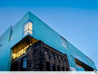
Glasgow School of Art has officially unveiled the first phase of its campus master plan, the £50m Reid Building opposite the Mackintosh building.Commissioned to provide a more focussed campus environment the building was commissioned to provide a broad range of studios and teaching facilities for the School of Design, as well as workshops, lecture facilities, communal spaces and a visitor centre.
Delivered by Steven Holl Architects in association with JM Architects and Arup Engineering The Reid Building is finished in translucent glass – a contrast with the masonry opposite.
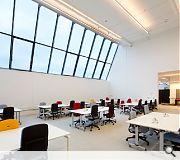
Studios are positioned on the north façade with large inclined north facing glazing to maximize access to the desirable high quality diffuse north light.
Refectory and office spaces meanwhile are located on the south façade where access to sunlight can be balanced with the occupants needs and the thermal performance of the space through application of shading.
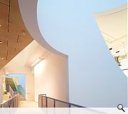
“Driven Voids of light” deliver natural light throughout the building providing direct connectivity with the outside world as well as providing vertical circulation and eliminating the need for air conditioning.
A landscape loggia in the form of a Machair provides an exterior social space overlooking the Mackintosh and a “Circuit of Connection” of ramps and lobbies provides vertical connection.
The Reid Building will be reviewed fully in the March edition of Urban Realm, photography by McAteer.
|
|
8 Comments
#2 Posted by MR on 3 Mar 2014 at 11:23 AM
I walk by this building everyday, and get the feeling of a glorified office block, a retail block perhaps. A 'place for learning', .... i am not entirely sure. The gigantic glass box feels cold, and uninviting and extremely unsympathetic to the Mackintosh building across the road.
Besides, it will be interesting to see how they get around the translucent glass facade panel problem. They seem to keep cracking (at their pin anchor points) as soon as they are installed and are continuously being replaced, only to crack again.
Besides, it will be interesting to see how they get around the translucent glass facade panel problem. They seem to keep cracking (at their pin anchor points) as soon as they are installed and are continuously being replaced, only to crack again.
#3 Posted by really?? on 3 Mar 2014 at 12:22 PM
And after all that effort to bring in a perfect balance of north and south light, it seems odd that the photography studio should only be lit by a green-tinted window, which casts a sickly pallor across the entire room. I ask Holl about such practical considerations: was enough thought given to the specific needs of an art school?
"My job is to provide great spaces, with great proportions and great light," he says. "The function of these spaces will inevitably change over time, so as an architect you shouldn't pay too much attention to whether the room is for making jewellery or printing, or whatever. If you get too myopic, you lose sight of the bigger picture and do terrible architecture."
"My job is to provide great spaces, with great proportions and great light," he says. "The function of these spaces will inevitably change over time, so as an architect you shouldn't pay too much attention to whether the room is for making jewellery or printing, or whatever. If you get too myopic, you lose sight of the bigger picture and do terrible architecture."
#4 Posted by reall?? on 3 Mar 2014 at 12:50 PM
^ from a review in the independent.
#5 Posted by Pleasantfield on 3 Mar 2014 at 13:03 PM
Functional but hardly artistic. I will wager it will last only just about as long as its predecessor, which was again not a thing of beauty.As MR says above: it could be a glorified office block from the outside wholly lacking in external detailling like most buildings these days.
Ps I did some of my course in its predecessor and the overwhelmed original building "underneath " in the corner.
Ps I did some of my course in its predecessor and the overwhelmed original building "underneath " in the corner.
#6 Posted by Stephen J Hall on 4 Mar 2014 at 13:07 PM
DELIVERED by Sir Robert McAlpine DESIGNED by Steven Holl Architects ..... I think you should acknowledge the key role of the contractor without them the architect's flight of fancy would never get off the ground!
#7 Posted by stephen on 4 Mar 2014 at 14:15 PM
Possibly the least subtle or appropriate giant green shoebox of a building that it was possible to build on the site. I wonder if the competition jury are pleased with themselves. I'm not pleased with them.
Some of the internal spaces and framed views are (IMO) great, but others are just an ill-considered clash of volumes with random and various details (eg. balustrades, staircases, doors etc) and all-sorts going on. Holl and McVoy's nonsensical and flowery descriptions of the thing don't exactly help architects revise the 'aloof megalomanic' tag either.
Some of the internal spaces and framed views are (IMO) great, but others are just an ill-considered clash of volumes with random and various details (eg. balustrades, staircases, doors etc) and all-sorts going on. Holl and McVoy's nonsensical and flowery descriptions of the thing don't exactly help architects revise the 'aloof megalomanic' tag either.
#8 Posted by lenny on 5 Mar 2014 at 14:54 PM
green tinted glass?
Well that will ensure half of Glasgow don't like it!
Well that will ensure half of Glasgow don't like it!
Post your comments
Read next: Arc Architects win Island Home design comp
Read previous: NHS Tayside begin work on Dundee healthcare facility
Back to March 2014
Like us on Facebook
Become a fan and share
News Archive
Search News
Features & Reports
For more information from the industry visit our Features & Reports section.


Still Holl's done a far better job than any Scottish architects could have done eh?