George Square re-opens following facelift
September 30 2013
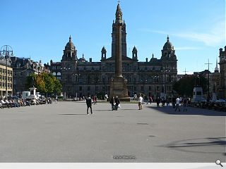
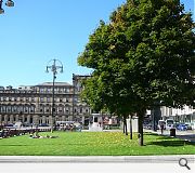
Glasgow’s revamped George Square has been opened to the public by the city council, culminating an ignominious renewal process.The £500k project has seen the reinstatement of two grass beds ripped out in the 1990s and removal of a red asphalt surface in favour of a grey resin alternative which can accommodate outdoor events.
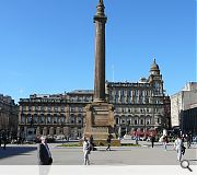
It has also seen the square’s complement of statues and memorials cleaned and repointed and the number of public benches more than doubled while a number of conifers have been cut down around the Cenotaph.
Liz Cameron, the council's executive spokesman for jobs and the economy, said: "The grey surface drastically improves the look of the square and I am confident everyone will be glad to see the back of the red Tarmac.
"We have taken the opportunity to cut back some of the trees around the Cenotaph, as they were in danger of encroaching on to the monument.
"We have now introduced more attractive looking plants to the side and also around the Sir Walter Scott Monument. The two grass beds on the western side of the square have also returned, ensuring a greener square at the very heart of our city.”
Designed to tart the area up ahead of the 2014 Commonwealth Games the works presage implementation of a £15m package of works in the immediate aftermath of the sporting jamboree.
|
|
16 Comments
#2 Posted by Ford Prefect on 30 Sep 2013 at 11:48 AM
They seem to have forgotten to white line the centre of the square to mark the parking spaces.
#3 Posted by Pierced Brosnan on 30 Sep 2013 at 12:35 PM
Nice one Goggs Matheson and all at GCC. This was worth every penny spent on the international design competition to reach this solution. I can't wait for the rest of the Commonwealth to come and be dazzled by this.
It will also look great for any Zombie sequels, particularly those scary night scenes.
Hopefully the comrades at Aberdeen City Council can take some inspiration from this "Minimal Tarmac Chic" for the revised Union Terrace Garden proposals.
It will also look great for any Zombie sequels, particularly those scary night scenes.
Hopefully the comrades at Aberdeen City Council can take some inspiration from this "Minimal Tarmac Chic" for the revised Union Terrace Garden proposals.
#4 Posted by Lee Ivett on 30 Sep 2013 at 13:24 PM
Ha ha ha ha ha, it's a joke right. It must be, surely. Or maybe it's just a bad dream and I'll wake up soon. Glasgow City Council are piss poor. Why can Kings Cross have one of these but we can't http://www.kingscross.co.uk/open-space-granary-square
#5 Posted by Big Chantelle on 30 Sep 2013 at 13:32 PM
It's not tarmac but rather resin. So what happens when big Sheena fae Easterhouse is doing a bit of city centre Primark shopping, frequents the square for a wee break to have her lunch and drops her chewing gum on it? How easy will it be to clean? How tacky will it look?
This is meant to be temporary. They should have just paved the whole bloody thing.There was enough time -- £500,000 was spent for this temporary solution. Oh, and why is one of the grass beds smaller than the others? That bugs me. Symmetry people!
Now all they need to do is get rid of that dump of a college building which overlooks the square and give a classical makeover to the 70s building on the north side to bring it into keeping with the rest of the square. Also, ban ALL cars. Nope, you're not getting tae park here.
Then the square will be spectacular.
#6 Posted by Derek on 30 Sep 2013 at 15:05 PM
'...big Sheena fae Easterhouse is doing a bit of city centre Primark shopping'
Shame on you. What a shocking example of social snobbery. Go stick your head in Bearsden's hallowed turf, you are an embarrassment to Glasgow.
Shame on you. What a shocking example of social snobbery. Go stick your head in Bearsden's hallowed turf, you are an embarrassment to Glasgow.
#7 Posted by Graham on 30 Sep 2013 at 20:26 PM
Aw I don't know, "big Sheena fae Easterhouse" reminded me of my time living in Glasgow. It seemed more like social commentary than social snobbery, to me. Anyway... moving on.
From the photos, this does seem quite dismal. "The grey surface drastically improves the look of the square". Grey! Of course! Exactly what an often-grey-skied city needs.
From the photos, this does seem quite dismal. "The grey surface drastically improves the look of the square". Grey! Of course! Exactly what an often-grey-skied city needs.
#8 Posted by Partick Bateman on 1 Oct 2013 at 09:05 AM
Well done Glasgow, you've got the city centre public space you deserve; a soulless, design-free piece of blandscape.
#9 Posted by Sven on 1 Oct 2013 at 09:50 AM
Is there before and after pictures? I can only see the before...
#10 Posted by Andy on 1 Oct 2013 at 12:27 PM
Absolute farce from start to (supposedly temporary) finish. Appalling lack of vision from GCC.
#11 Posted by Jim Opfer on 1 Oct 2013 at 15:07 PM
Dross and despair!!
#12 Posted by Neil C on 1 Oct 2013 at 16:43 PM
1. George Square is red and Spartan - it's a disgrace to the city, according to absolutely everyone.
2. The council launch a design competition - every single design gets remorselessly and incessantly panned on pretty much every website you can think of.
3. The council smarten up the square by covering the reviled red tarmac, adding better lighting and installing the grass beds everyone claims to have missed - and they get comments like "appalling", "dross", soulless" and "dismal" thrown at them.
I am no fan of GCC (far from it), but I honestly think they'd be pilloried and sneered at whatever they did to George Square. Personally, I think it looks a damn sight better than it did before, and I'd be quite happy for tourists to see it now. Am I the only one who thinks this facelift is a fair compromise?
#13 Posted by Big Chantelle on 1 Oct 2013 at 17:03 PM
@Neil C
1. George Square is red and Spartan - it's a disgrace to the city, according to absolutely everyone. ---> I agree.
2. The council launch a design competition - every single design gets remorselessly and incessantly panned on pretty much every website you can think of.----> Not true. People had varying views of what the square should look and function like. Naturally, of the proposed designs, differing opinions occured.
3. The council smarten up the square by covering the reviled red tarmac, adding better lighting and installing the grass beds everyone claims to have missed - and they get comments like "appalling", "dross", soulless" and "dismal" thrown at them.----> The council smarten up the area AFTER Mathieson throws a hissy fit because the design HE LIKED wasn't chosen by the jury who preffered another design. The 'cooncil' then spend £500,000 grand on a temporary surface with a view to replacing it with stone in a year and half's time. In the meantime, Glasgow's reputation takes a hammering over the whole debacle and architecture firms are out of pocket all because Mathieson threw a tantrum.
#14 Posted by Ian Nairn Jr on 2 Oct 2013 at 09:07 AM
All gripes about the design competition aside, it does look better than before, and it is indeed nice to have the grass back.
#15 Posted by Christian Grey on 2 Oct 2013 at 10:19 AM
Well maybe not 50, but it's a lot of grey. I wonder how it looks today in the rain. Grey.
#16 Posted by Dandelion on 2 Oct 2013 at 10:26 AM
I like the look of that new grass can't wait to move in
Post your comments
Read next: CDA submit plans for new Edinburgh homes
Read previous: Duke Street student residential plan submitted
Back to September 2013
Like us on Facebook
Become a fan and share
News Archive
Search News
Features & Reports
For more information from the industry visit our Features & Reports section.


That grey tarmac sure has brightened the place up. Well done GCC!