mast architects lodge Forth & Clyde canal housing plans
March 7 2013
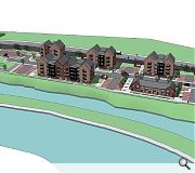
mast Architects have lodged plans to build 108 homes at Panmure Street, Glasgow, on behalf of Queens Cross Housing Association.Situated on a brownfield site adjacent to the Forth & Clyde canal the scheme will offer mixed tenure one to three bed apartments, around half of which would be for social rent with the remainder offered for private sale or shared equity.
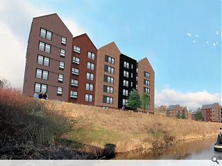
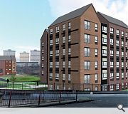
The proposed scheme is split into three main elements, principally a six-storey ‘tower’ marking the corner of Firhill Road and a series of four storey ‘pavilion’ blocks along Panmure Street and a terrace fronting the canal.
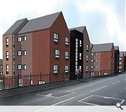
These maintain perpendicular views to the south through the site and employ three types of facing brick broken by panels of fibre cement.
In their design statement mast wrote: “Discussions with GCC DRS and Scottish Canals have led to the development of an ‘industrial’ aesthetic, which offers a link to the historical use of the site - this theme is manifested in the adoption of a steeply-pitched roof form, located so that the ‘gables’ of these buildings face the main frontages of the site. This form is carried across all blocks to provide a clear and legible built form across the entire development.”
Subject to approval work will commence on site in autumn 2013 for completion by March 2015.

Designers have had to contend with challenging topography, including a 5m level change across the site
|
14 Comments
#2 Posted by Egbert on 7 Mar 2013 at 14:16 PM
The buildings look fine but it's a shame that less effort seems to have gone into the spaces between - the parking and (standard development) roads dominate, leaving little to connect or unify the blocks or much decent amenity space. In particular the 'tower' building looks rather out on a limb - a pity given the strong urban structure of the surviving Victorian tenements at that end of the site.
#3 Posted by the view through the car park? on 7 Mar 2013 at 14:45 PM
spaces feel a lot like the new brick tower development in South Harbour Street in Ayr (you can see the blocks and carparks between them on street view on google).... very sad making...
#4 Posted by Art Vandelay on 7 Mar 2013 at 15:23 PM
Wonder if GCC's Roads Department have got their hands on this? When you have roads engineers sitting in meetings telling you 'we don't do Designing Streets', things are already a bit limited.
Built form looks promising, as with everything the success of the spaces between blocks will have to come out in the detail - I'm assuming the dodgy mint green colour shown in the model isn't representative of the landscape proposals!
Built form looks promising, as with everything the success of the spaces between blocks will have to come out in the detail - I'm assuming the dodgy mint green colour shown in the model isn't representative of the landscape proposals!
#5 Posted by wonky on 7 Mar 2013 at 17:26 PM
It always amazes me what strong gabling does for a building- the Scandinavians in particular use it to their advantage- but greater density would have been desirable in this development. The problem is that so many people come out in a rash at the thought of sharing space with other people...even the thought causes an anxiety in the Thatcher generation. These spaces between buildings are like a symbolic compromise to such types. But still its good to see development coming to this part of the city. It would be great to see the Garscube Road area increasing density, when you consider its potential and proximity to central Glasgow.
#6 Posted by Baxendale on 7 Mar 2013 at 20:24 PM
This is probably my favourite vacant site in Glasgow and this scheme is a truly horrid waste of an opportunity in a wonderful location. Panmure Street needs a animated and accessible street elevation and frontage, not a cheap looking black railing. And there is no attempt to engage meaningful with the sites greatest asset which is the basin. Don't know why everyone is excited by the gables because they really do nothing for this scheme and create horribly proportioned disparate massing elements.
#7 Posted by Scarpa's Set Square on 7 Mar 2013 at 22:14 PM
I like it. The corner block seems to relate pretty well to the tenements adjacent and I think the gables, especially on that block, are actually pretty well scaled when you take the level change into account, coming up from Firhill. It certainly has a bit of vertical emphasis which is no bad thing.
I'd agree about the apparent dominance of parking etc. within the scheme, but if it's sitting at under 100% provision then you have to applaud the designers for getting that approved in Glasgow - the potential impact could have been a lot worse.
Let's be honest, the site has been an eyesore for years - good to see something with merit happening with it at last.
#8 Posted by is this is it? on 7 Mar 2013 at 23:52 PM
Theres been talk of relaxing planning applications - i hope nothing comes of it for likes of projects like this will become ever popular... Planning needs if anything to get stricter to protect urban environments becoming homogenous .. is this not the sort of urban aesthetic that ruined many neighborhoods in the 90s. Lets have more of a relationship with the canal, than parking lots!
#9 Posted by carbunkle.com on 8 Mar 2013 at 13:56 PM
Unsure whether or not this is an Amsterdam homage, a Lowry inspired woolen mill or just someone to lazy to adjust their set square
#10 Posted by Don Diamante on 13 Mar 2013 at 14:40 PM
This looks awful.
Industrial homage, or lame effort? The latter I suggest.
21st century Scottish planning is leaving a (temporarily) horrendous legacy.
You know those websites that record where buildings are demolished before the Architects demise/retirement......?
Industrial homage, or lame effort? The latter I suggest.
21st century Scottish planning is leaving a (temporarily) horrendous legacy.
You know those websites that record where buildings are demolished before the Architects demise/retirement......?
#11 Posted by Scarpa's Set Square on 13 Mar 2013 at 17:14 PM
Out of interest, what do you find so objectionable?
#12 Posted by Cabo on 14 Mar 2013 at 15:18 PM
Think it could be nice if detailed neatly...although the images are doing it no favours at all. You have to look past the terrible 3Ds and try and see the thought behind the design. Which would fail any uni crit.......just sayin'.
#13 Posted by El Gato on 15 Mar 2013 at 10:32 AM
Just as well we're in the real world and not uni, isn't it? (And no, I don't work for Mast!) Agree with you re. the detailing, but sadly the fact you've used the phrase 'just sayin' and the word 'nice' dilute your argument somewhat.
#14 Posted by tennent on 25 Nov 2013 at 16:06 PM
looks good, could do with part time traffic signals during school hours about 50-100meters away from FirhillRd@PanmureSt as there is heavy build up of traffic at this time and this also would help with the children crossing at this area & easing of traffic presure @ Murano st & Benview st. also plz crop tree's at Firhill rd @ Nolly Bridge.
Post your comments
Read next: Portobello kindergarten wins approval
Read previous: ASA13 best buildings hunt kicks off with a call for entries
Back to March 2013
Like us on Facebook
Become a fan and share
News Archive
Search News
Features & Reports
For more information from the industry visit our Features & Reports section.


Image 4 of 4 shows the contrast with recent residential buidlings in the area, the wavy roof haircut is so 90s.