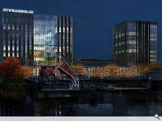
City of Glasgow College Riverside Campus - in depth
January 31 2013
Further to our look at the City of Glasgow College’s new look Cathedral Street campus we’ve returned from the public consultation of the Riverside Campus with additional details on what is proposed.Designed in tandem with the city centre college by the same architects; Michael Laird & Reiach and Hall, the riverside campus will take the form of two tower elements at opposing corners of a college quad, one housing 5,000sq/m of space for the schools of nautical studies, engineering and energy and the other an 11 storey, 180 bedroom halls of residence.
This will necessitate demolition of the existing accommodation over the period July-December 2013, following the decant of students and staff to temporary accommodation to the immediate south.
Work will then commence in earnest from November 2013 through to August 2015 whereupon demolition of an engineering workshop and temporary accommodation to the rear will take place to allow new landscaped grounds to be built.
Michael laird Architects and Reiach & Hall have been collaborating on the project since March 2012 in a consortium led by Sir Robert McAlpine and including FES, Arup, Hulley & Kirkwood, Rankin Fraser and Graven Images.

Occupants will be able to keep an eye on colleagues at Cathedral Street from the upper floors thanks to the elevated position of the latter
|
9 Comments
#1 Posted by wonky on 31 Jan 2013 at 13:44 PM
The use of glass comes as no surprise, but it has to be better than the garbage architecture that is there now.It should create a sense of verticality on a street that has lost much of its sense of urbanity. Crown Street and the surrounding streets have a tremendous sense of wideness, granduer and urbanity that is in no way reflected in most of the built enironment. A bit disappointed about the empty 'green' space at the junction with Ballater Street, it adds nothing to the urban grid, it looks to me like a complete waste of space.
#2 Posted by RM on 31 Jan 2013 at 13:57 PM
Glasgow seems to be shooting itself in the foot recently with some of the proposed and 'promised' additions to our urban environment. This should have been great for the city, showing that money is being invested into creating new educational buildings. However the two schemes shown for the COGC scheme conjure up another development showing no sense of place and featureless and characterless buildings. I wish i could be positive about these designs but it is a struggle.
#3 Posted by Egbert on 31 Jan 2013 at 14:26 PM
The proof as ever will be in the detail, but for the time being this looks quite encouraging. With this scheme and the likes of the proposed Scottish Power HQ up on St. Vincent Street, are we seeing a return to strong and rational forms that reinforce the city's urbanity rather than detract from it? I do hope so - a good antidote to a decade of empty form-making and flimsy shiny tat.
#4 Posted by Egbert on 31 Jan 2013 at 15:53 PM
If nothing else it's an elegant riposte to the prevailing orthodoxy that tall buildings should have jolly raked hats and recessed 'penthouses' (especially in riverside locations like this) and that elevations need 'enlivening' with shuffly barcode windows and/or every contrasting cladding treatment under the sun.
#5 Posted by @wonky on 31 Jan 2013 at 16:27 PM
The use of glass comes as no surprise? I think anything to the contrary would have resulted in a BREEAM rubbish rating!
#6 Posted by wonky on 31 Jan 2013 at 19:52 PM
I am in way against the use of glass- when used "rationally" ergo Van der Rohesque- then yes, I'm all for it. I just hate all the weak lined cheap alternative imitations that we so often get saddled with in Glasgow. This particular collaboration certainly looks to have quality and solid rational lines that will hopefully be delivered in the finish. We can hope. The architects involved looked to have have avoided current poor designs of the skin and bones style- they have went back to the root. This area of the city with its expansive streets desperately needs verticality to reinvigorate the urban ambience...our urban corridors on the central periphery need to be revitlised, both in improved verticality and quality...I want to feel as though I'm about to enter a major European city...that's why I was a little disappointed by the "negative" space at the corner junction with Ballater/Laurieston Rd.
#7 Posted by wonky on 31 Jan 2013 at 20:07 PM
Personally I would love to have seen an Alvar Aalto style ala (the brick built baker house house dormitory) at six to seven storey's in scope at the new Laurieston development- specifically at the Gorbal's cross junction, reinvigorating that previous urban school- the proposed design looks a little lowfi for such a crucial axis. Laurieston and Tradeston ( with many fine buildings) have the potential to be amongst the best districts in the city, particularly when you look at the infrastructure, location and surviving architecture.
#8 Posted by Monkey9000@wonky on 31 Jan 2013 at 21:52 PM
Perhaps the land is left free for future development, or to be sold off? All may not be lost as you worry.
#9 Posted by Brian on 2 Feb 2013 at 10:38 AM
The City union line runs next to it.the potential of the area again is great.
Post your comments
Back to January 2013
Like us on Facebook
Become a fan and share
News Archive
Search News
Features & Reports
For more information from the industry visit our Features & Reports section.


