Waverley Station roof finally uncovered
January 16 2013
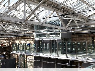
Waverley Station’s dungeon-like atmosphere has finally been lifted with the completion of large parts of its refurbished glass canopy, part of an ongoing £130m upgrade of the fifth busiest station outside London.This is seeing 34,000sq/m of strengthened, clear glass roof panels fitted to the original Victorian ironwork frame of the station to allow more natural light to flood into the interior.
Internal spaces are also to be de-cluttered through removal of unused furniture, buildings and high-level walkways.
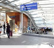
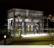
Network Rail has already improved access to the station through installation of a new covered entranceway at the Waverley Steps and a Stannah designed passenger lift.
The new-look station is scheduled to be fully complete by June 2014.
|
|
4 Comments
#1 Posted by Trombe Wall on 16 Jan 2013 at 13:08 PM
The new glazing makes a phenomenal improvement on the spaces. Improvements to the pedestrian entrances area also very successful and I would love these become a catalyst for redesigning the roof terrace of Princes Mall.
#2 Posted by Egbert on 16 Jan 2013 at 14:18 PM
I've long thought Waverley Market/Princes Mall was an astonishing missed opportunity to give the station a proper presence on Edinburgh's main thoroughfare. The recent upgrade to the Waverley Steps is a belated step in the right direction, but I can't help but feel much more meaningful improvements could have been made if the shopping centre (which I believe is majority Council-owned) had been brought into the scheme. The half-hearted doorways connecting into the malls feel like a bit of an afterthought and frankly the centre adds very little to the city either shopping-wise or urbanistically. Surely a decent front door to the city's main station would be more than worth the loss of a third-rate sunken bunker full of low-end chain stores.
#3 Posted by Neil on 16 Jan 2013 at 14:21 PM
All a big improvement no doubt, but those wood effect panels do look for all the world like leftovers from some Ikea flat pack assembly mishap.
#4 Posted by Bill Simpson on 16 Jan 2013 at 15:58 PM
The quality of the Trespa looking panels is only matched by the ridiculous decision to choose a sandy coloured floor tile. It took, I reckon, all of 5 minutes for this new surface that covers almost all of the lower concourse to look dated, muddy, cheap and naff. Was the designer that much a slave to the the planners / UNESCO / Cockburn Association that they had no feasible alternative? Also, what is happening in the internal space which used to be served by Costa?
The natural light spilling through the fine filigree of the Victorian structure looks fantastic, though they would have to be pretty special to get that wrong.
The natural light spilling through the fine filigree of the Victorian structure looks fantastic, though they would have to be pretty special to get that wrong.
Post your comments
Read previous: George Square survey results revealed
Back to January 2013
Like us on Facebook
Become a fan and share
News Archive
Search News
Features & Reports
For more information from the industry visit our Features & Reports section.


