Rosslyn Chapel visitor centre completes
December 18 2012
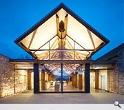
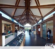
The finishing touches have been made to a £7m visitor centre at Rosslyn Chapel, the architectural confection famed for its Knights Templar associations.The global success of Dan Brown’s novel The Da Vinci Code has led to a ballooning of visitor numbers in recent years, necessitating an expansion of existing visitor facilities with new reception and exhibition space alongside a café without negatively impinging on the Scheduled area of the Chapel itself.
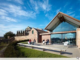
Page\Park architects have adopted a green oak frame with pitched roof and side aisles the central framed volume steps to the south in a parallel form to the existing adjacent 18th century stable outbuildings. Expansive glazing at either end can be opened up, weather permitting, with sliding doors to frame views across the Esk Valley to the Pentland hills and Roslin village.
A palette of materials including a copper roof and coursed Clashach stone to the north enclosing wall have been employed to echo in contemporary form the rustic stonework of the Chapel precinct wall and roof of the stable buildings.
Heating and hot water to both the visitor centre and the Chapel are provided by a new biomass boiler coupled with rainwater recycling.

It has taken five years to deliver the visitor centre since funding was first awarded by the Heritage Lottery Fund & Historic Scotland
|
4 Comments
#1 Posted by dalrylama on 20 Dec 2012 at 12:33 PM
an overly complicated structure for such a small building; not entirely sure what it achieves. although i gather it was among the most disaster prone projects in the history of architecture - so well done for getting it finished, that said perhaps a simpler solution would have provided benefits all round....
#2 Posted by Johnny on 24 Dec 2012 at 18:09 PM
@dairylama - ******
it looks like a smart,complex yes but tidy piece of modern architecture to me. i like it a lot when you compare it to some other visitor centers especially.
it looks like a smart,complex yes but tidy piece of modern architecture to me. i like it a lot when you compare it to some other visitor centers especially.
#3 Posted by Scott on 4 Feb 2013 at 12:24 PM
I agree entirely with Dalrylama post. Johnny (and Page Park) could look at Cowper Griffith's Stowe visitor centre for a more uplifting roof, or Hooke Park's grid shells or Stanton William's restrained Whitby Abbey visitor centre. There are lots of examples of accomplished roof designs that are less unsettling. How did this monster get past CDM design review anyway?
#4 Posted by tim on 31 Jan 2014 at 12:12 PM
WOW! its so beautiful
Post your comments
Read previous: National Museum plaza plan to go before planners
Back to December 2012
Like us on Facebook
Become a fan and share
News Archive
Search News
Features & Reports
For more information from the industry visit our Features & Reports section.


