Pacific Quay De Vere hotel plans submitted
November 28 2012
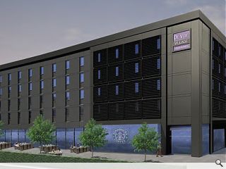
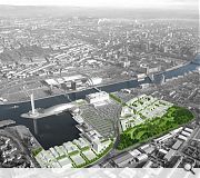
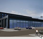
Plans have been submitted for the construction of a new 120 bed hotel at Pacific Quay by De Vere Village Hotels and Scottish Enterprise, part of moves to redevelop the former Glasgow Garden Festival site.Designed by Curious as part of a wider 7N masterplan, subsequently adopted by BDP, the scheme will consist of a five storey bedroom block fronting Pacific Drive and an adjoining two storey leisure structure to the rear, including a 20m pool.
Clad in blue tinted glass and black metal composite panels the scheme is intended to display a horizontal emphasis to reduce its apparent bulk.
A ground floor terrace has been included to provide street level interaction via a new pub, restaurant and outdoor seating.
A 264 space surface car park will also be built.
De Vere is the second hotel proposal for the area following the submission of plans by Lawrence McPherson Associates for a 180 bed Premier inn adjacent to the BBC.
|
|
9 Comments
#1 Posted by Bill Simpson on 28 Nov 2012 at 11:02 AM
Quite apart from the design which looks like the standard block concept with a bit of grey cladding, why is that these large Architectural Practices tend to use such shoddy and depressing images to showcase their projects? This, and the recent police station scheme in Aberdeen, seem both soulless and lacking in any contextual awareness and this is emphasised by the naff imagery presented to the public.
#2 Posted by Neil on 28 Nov 2012 at 11:30 AM
Grey is the new black, apparently. And 'grey box in a sea of car parking' is the new sustainable urbanism.
#3 Posted by Egbert on 28 Nov 2012 at 11:38 AM
This makes me despair. This is close to the heart of Scotland's biggest city in what was meant to be an exemplary regeneration quarter - but what we're getting is another disjointed exurban block surrounded by surface parking. BDP's masterplan does absolutely nothing to to tackle the dominance of the out-of-town style roads that carve up the area and doesn't even provide cohesion between its own two elements, let alone with the surroundings, leaving yet more isolated clumps of development in lieu of meaningful townscape. Surely we can do better than this?
#4 Posted by Neil on 28 Nov 2012 at 11:39 AM
On the plus side, that Starbucks logo is nice and big.
#5 Posted by Cheap as Chips on 28 Nov 2012 at 12:33 PM
This is bland and unimaginative. A cheaper looking version of the 'Dakota' brand. Geared perhaps towards rapid modular construction!
#6 Posted by Robin Webster on 29 Nov 2012 at 11:50 AM
It is disappointing that nothing is acknowledged regarding the pedestrian link to Cessnock Underground Station which was part of the original master plan, and a really significant issue to help join together the existing retail and community in Paisley Road West to Pacific Quay. Why is this being apparently shelved?
#7 Posted by wall on 29 Nov 2012 at 17:55 PM
jings - big black wall of doom...
#8 Posted by DiscoD on 2 Dec 2012 at 02:06 AM
Wasnt designed by Curious...they copied and pasted, at clients request, design from another site...
#9 Posted by Martin L on 3 Dec 2012 at 11:55 AM
Looks a lot better than any Travelodge, Premier Inn or other mid market hotel I have seen. Yes it looks quite like a Dakota but that's really not a bad thing.
Post your comments
Read previous: Clyde Blowers extension secures planning approval
Back to November 2012
Like us on Facebook
Become a fan and share
News Archive
Search News
Features & Reports
For more information from the industry visit our Features & Reports section.


