Kelvindale home extension completes
November 7 2012
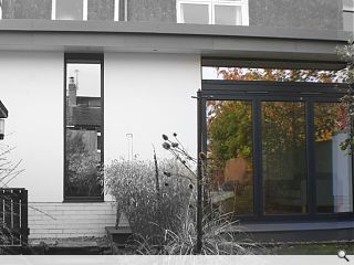
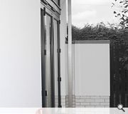
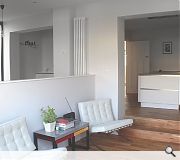
ellson | buchanan architects have announced the completion of a contemporary domestic extension at Hertford Avenue, Kelvindale.Conceived by the clients as a means to better connect social spaces within the home and better connect these with the garden the extension adopts a contemporary aesthetic, introducing a new kitchen space.
Practice partner Emma Ellson said: “By using a limited palette of durable and high quality materials, the extension creates a successful modern addition to this 1930’s built dwelling. The use of zinc standing seam roof provides a naturally pleasing aesthetic when viewed from the upper floor which will eventually weather to a matte grey over time, complementing the existing slate roof.
“The use of a crisp white render, allows a sharp, contemporary aesthetic to the new extension directly contrasting the dry dash finish of the existing property, with the white glazed brick providing a robust highlight as a plinth. The use of high performance, full height glazing was promoted to maximise natural daylight within the extension, with sleek powder coated metal frames, specified to enhance the crisp lines and detailing of the extension.”
ellson | buchanan were formed in February 2011.
|
|
2 Comments
#2 Posted by Lloyd Wrong on 9 Nov 2012 at 10:33 AM
I would disagree with some things Sven - I think the extension looks a success - and I don't mid the white render against the grey harling. I don't think it is anything amazing though - it looks fairly standard. I do think the photos do it no favours and the half grey/half colour is just nasty!
Post your comments
Read next: Steelcase Solutions open Glasgow HQ
Read previous: Johnstone Sports Hub makes its mark
Back to November 2012
Like us on Facebook
Become a fan and share
News Archive
Search News
Features & Reports
For more information from the industry visit our Features & Reports section.


Also, why are the photos rendered in grey in parts?