Planners reject faux Georgian New Town plans
August 20 2012
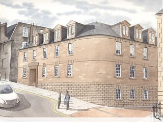
Designers of a £2.5m ‘imitation Georgian’ infill on Edinburgh’s Union Street, at the heart of the New Town, may have to go back to the drawing board after city planners let it be known they were minded to reject the proposalsD2 Architectural Design were commissioned by retail technology firm Zonal to to produce the pastiche proposal - but the applicants have made it clear they are prepared to be flexible on the design.
James McLean, property director at retail technology firm Zolan, told Urban Realm: “If it was to be developed in a different style we’d be happy to do that so long as we could have the number of staff that we need in the building.
“We are an owner occupier, not a property developer, which wishes to expand our business to enable us to house more office staff. We already own six Georgian townhouses in neighbouring Forth Street.
“The council rejected the idea of imitation Georgian and more than two storeys at the pre-planning phase but we need the extra space a taller building will have. Our plans are of a similar nature to two other recently built offices in Union Street.”
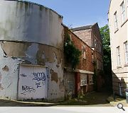
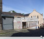
In their design statement D2 said of their proposal, which will be built on the site of an existing derelict print workshop and housing: “The development was designed taking into consideration the surrounding properties and the fact the site is located within the New Town conservation area and constitutes part of the world heritage site.
”As a result, the design takes cognisance of and similarly reflects the style, character, scale and proportion of the architecture merits apparent in the immediate vicinity incorporating the use of similar material finishes.
“We have proposed the use of a sandstone external wall finish with varied coursing and features typical of the fenestration apparent in the typical Georgian architecture of the area, white UPVC sash and case windows with traditional astragals, natural slate roofing finish with a single ply membrane to the flat roof section and grey/black metal rainwater goods also to match the existing.”
Marion Williams, director of the Cockburn Association, digressed however, telling the Scotsman: “such ill-informed use of the classical language of architecture will result in a second-rate building within Georgian Edinburgh.
“The poor quality of the site at present is not an argument for accepting development that compromises the townhouses of Forth Street or an excuse for subpar classicism.”
|
|
8 Comments
#1 Posted by Egbert on 21 Aug 2012 at 10:05 AM
Quite right - for once the Cockburn are spot on with their 'sub-par classicism' comment. It's not just pastiche, it's bad pastiche - clumsy massing, awkward proportions and embarrassingly bad attempts at 'period' detail. It's also good to see the bluff called on an applicant's thinly-veiled threats to leave town if they can't have their way - good on CEC for standing up to them.
#2 Posted by Egbert on 21 Aug 2012 at 10:07 AM
Also - 'traditional' uPVC sashes? Says it all about the standard of design.
#3 Posted by wonky on 21 Aug 2012 at 10:23 AM
Am I the only one who thinks this is more than acceptable?
"...the development was designed taking into consideration the surrounding properties...
”As a result, the design takes cognisance of and similarly reflects the style, character, scale and proportion of the architecture merits apparent in the immediate vicinity incorporating the use of similar material finishes...we have proposed the use of a sandstone external wall finish with varied coursing and features typical of the fenestration apparent in the typical Georgian architecture of the area, white UPVC sash and case windows...natural slate roofing finish...and grey/black metal rainwater goods also to match the existing.”
What is the problem? It has to be better than the rat infested weed strewn health and safety disaster of a hovel extant on the present site?
#4 Posted by wunderkind on 21 Aug 2012 at 11:28 AM
Planning decisions aren’t, and most definitely shoudn’t, be made on ‘something similar down the road was allowed previously’, or ‘it’s better than what’s there at the moment’. For this reason, Wonky, I think this decision is spot on. And seriously, when have you heard of or seen white uPVC windows as in keeping with a conservation area?
#5 Posted by Trombe Wall on 21 Aug 2012 at 13:20 PM
This is a tough gig. Designing a scheme for a gap site within the New Town is a tricky business, I agree with comments above. However, surely D2 are on the right track and using typical Georgian rules should result in a balanced design. As ever there are a variety of approaches. Pastiche or modern intervention? On the Royal Mile there is the Radision and the Missoni, two different approaches and each have their merits.
#6 Posted by For the people on 21 Aug 2012 at 19:37 PM
It would be interesting to note what the local residents would like - modern or traditional pastiche. I suspect the latter. It would seem that Zonal have no preference as long as they can build something that can accommodate their staff in their existing location rather than relocate to some out of town shed with no planning constraints. Everyone with a contrary opinion to the current proposed design feel fee to submit their alternate offering to Zonal - but I suspect that any alternate design will be met by as much reflection of personal preference as this one!
#7 Posted by Neil on 22 Aug 2012 at 10:18 AM
#3, #5 and #6 - this isn't about the merits of one style or other, it's about whether the proposals are of sufficient quality for the New Town (a conservation area and World Heritage Site). It seems pretty clear from the images and portal documents that they aren't. It's misleading to suggest the designers (note that they call themselves 'architectural designers') have used typical Georgian rules - there seems little understanding of basic proportions and balance and I can't think of a Georgian building that deals with a corner or slope quite so clumsily, or that employs such heavy (and mis-aligned) dormers. Evidently the planners have concurred.
#8 Posted by Everyone hates bad quality! on 22 Aug 2012 at 12:26 PM
Neil, you have hit the nail on the head. A reason this has been rejected in quality. The design lacked it! uPVC in a conservation area is not approrpiate quality, mini georgian 'proportions' is not quality and natural slate (spanish or chinese) isn't good enough quality for the new town. There loads poor quality similar developments which have been built in recent times and not aged well at all. Well done for CEC for standing up to poor quality design and demanding better!
Post your comments
Read previous: Silverburn expansion plans submitted
Back to August 2012
Like us on Facebook
Become a fan and share
News Archive
Search News
Features & Reports
For more information from the industry visit our Features & Reports section.


