Dundee Station redevelopment plans unveiled
April 16 2012
Nicoll Russell Studios have unveiled plans for a £14m redevelopment of Dundee Station, entailing demolition of the existing booking hall and its replacement by a hotel.Ken Guild leader of Dundee City Council said: "The weight restricted bridges in front of Dundee Station are due to be replaced as part of the Central Waterfront work, which will create a new public square and attractive arrival space outside the station.
"This work provides a perfect opportunity to cost-effectively tackle the station concourse itself within the same timescale, because doing nothing is simply not an option.
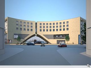
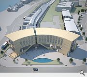
"We have already spoken with local architects Nicoll Russell Studios who have created a sweeping crescent shaped five storey design, which has an imposing double height ground floor. The design has also taken account of the proposed V&A at Dundee building to the south and the proposed Malmaison Hotel to the north east.
"I believe it will be the fitting arrival point for visitors that we need to properly complement the V&A building and its magnificent setting."
Subject to approval by councillors this week a funding package will be put together including £8.6m from Dundee City Council, £2m from a European Regional Development Grant and £1m from the Scottish Government.
The remainder of the financing will be sought from Network Rail.
|
|
25 Comments
#1 Posted by SAndals on 17 Apr 2012 at 08:50 AM
Facist PoMo hits Dundee with symmetrical, no it's not, yes it is, no it's not, slab of mediocrity blocking view of Tay Bridge. Still, everyone likes a curve and a water feature...
#2 Posted by sultan of brooneye on 17 Apr 2012 at 10:02 AM
superbland! NR - you can do better! If ever proof was needed that a firm that does good medium sized work can't just 'pour water on their ideas' and watch them grow into larger schemes - then this may be it.
#3 Posted by Marksss on 17 Apr 2012 at 10:32 AM
Anything is better than what is there now.
#4 Posted by David on 17 Apr 2012 at 12:56 PM
That is truly awful. Thank goodness I don't live in Dundee.
#5 Posted by Jamie on 17 Apr 2012 at 14:22 PM
How many chances to benefit from it's potentially world class waterfront will Dundee throw away? From the images shown this appears to be a profoundly appalling, childish, ill-concieved mess - and we'll thinking about replacements before long.
#6 Posted by urbanrealm on 17 Apr 2012 at 14:36 PM
As has been stressed before this is a platform for constructive criticism and comment - not abuse.
If you wish to critiicise a project please explain why.
If you wish to critiicise a project please explain why.
#7 Posted by John Glenday on 17 Apr 2012 at 14:45 PM
Dundee Station has the dubious distinction of being the worst of Scotland's main railway stations so this development is long overdue.
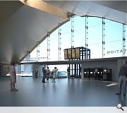
The nod to the great Victorian terminals in the hollowed out interior of the hotel seems to me an appropriate contemporary response. The use of flowing curves to draw passengers down to the restored original station below is also something I welcome.
That said the hotel above could perhaps do with more glazing or detailing to break up the expanse of stone/brick. Something which I'm sure will be borne through in the detailed design - should Councillors decide to give it the nod.
#8 Posted by Jamie on 17 Apr 2012 at 14:56 PM
In reply to urbanrealm... Obviously mine is not the only negative comment, but I'm happy to explain my criticism in more detail.
In my opinion (based on what I've seen) this scheme presents a very clear and robust sense of 'entrance' and therefore arrival - which does not appear to form a coherent connection to the V&A site, or a view to the river (which is clearly the greatest virtue available to the site).
I think the treatment of the facade is static and dull, and offers nothing to the space. The arch-like entrance may be reminiscent of the triumphant Arch on the docks which was demolished during previous 'improvements' to the area, but it sets up an axial relationship with a charmless (non-existent) street, as opposed to that which could connect the V&A site to the City centre through Union Street.
In the context of 30 years spent spoiling a potentially wonderful urban waterfront, and a masterplan which apparently will make no significant improvement, I just find the images above terribly sad.
#9 Posted by Roger Emmerson on 17 Apr 2012 at 14:57 PM
Fear not. They've started work already. I was in DUndee station at lunch time today and they were scraping off the Tay Bar signs on the platform glazing. Onwards and upwards.
#10 Posted by Urban Designer on 17 Apr 2012 at 15:48 PM
Urban Realm, I find it somewhat hypercritical that you have instructed posters to make constructive criticism here. Many of your own articles are very insulting to the city of Dundee with outdated descrptions such as 'juteopolis' used to mock the place, with little fairness or constructive criticism used in your reports regarding the city's regeneration.
#11 Posted by urbanrealm on 17 Apr 2012 at 16:26 PM
Hi Urban Designer, The term 'juteopolis' does not sound like something we would write and does not appear to be written on this website. Not being familiar with the article you reference, or its context, I am unable to comment.
What I can say is that where the 'jam, jute and journalism' cliches have been voiced they have been used in self conscious contrast to the present day transformation of the city - be that the V&A, Alliance Trust HQ or new Council chambers.
What I can say is that where the 'jam, jute and journalism' cliches have been voiced they have been used in self conscious contrast to the present day transformation of the city - be that the V&A, Alliance Trust HQ or new Council chambers.
#12 Posted by SAndals on 17 Apr 2012 at 16:34 PM
I meant it was fascist and PoMo in a positive way...
OK I didn't but will gladly expand the critique of the oppressive and solid formal slab of a facade, which sets up an elevation symmetry that it then ignores - and compounds by missing the vista in the image - which as #8 states is a non-descript street. Sigh.
I would like to see the curved form in it's urban context but fear it may be too much for me to bear...
I do like the tiny, tiny toilet(?) windows that face the V+A. OK, I don't - but that's what happens when you shoehorn a standard hotel bedroom layout onto an arbitary form which does not address it's context.
But, folk still like water features tho, eh?
#13 Posted by Urban Designer on 17 Apr 2012 at 17:31 PM
Hi Urban Realm, you will note that on 'Wilson's Weekly Wrap Nov.12 2010' Dundee was referred to as 'Jute City', it took me all of five minutes to find this, and believe me there are others. http://www.urbanrealm.com/news/2612/Wilson%27s_Wrap.html
Im glad that however that you recognise that such reporting is insulting and that you are aware just how forward thinking the city has now become.
Im glad that however that you recognise that such reporting is insulting and that you are aware just how forward thinking the city has now become.
#14 Posted by Urban Designer on 17 Apr 2012 at 17:44 PM
Dundee is referred to here as 'Jute Town'...http://www.urbanrealm.com/news/2620/Astronomical_cost_of_paper_thin_budget.html
#15 Posted by Urban Designer on 17 Apr 2012 at 17:51 PM
Here it is 'the jute city of dundee' http://www.urbanrealm.com/news/712/Dundee_Waterfront_rides_crest_of_a_wave.html
Did you actually try to find the articles I was referring to Urban Realm ?
Did you actually try to find the articles I was referring to Urban Realm ?
#16 Posted by Urban Designer on 17 Apr 2012 at 18:01 PM
Do you think there might be an insulting play on the word 'junket' with this article http://www.urbanrealm.com/news/1354/Jam%2C_jute%2C_journalism_%26_junkets.html
Will Urban Realm apologise publicly for this outrageous reporting ?
Will Urban Realm apologise publicly for this outrageous reporting ?
#17 Posted by urbanrealm on 17 Apr 2012 at 18:17 PM
Hi Urban designer. Most of the articles you cite are by an UR blogger well known for his satirical and critical views. Whilst Dundee does indeed receive a verbal pounding in these pieces it has by no means been singled out unfairly. Glasgow, Edinburgh and indeed Scotland at large are all subject to similar coverage.
We have long recognised the strides being made by Dundee and these are represented in numerous articles published elsewhere on this site.
We have long recognised the strides being made by Dundee and these are represented in numerous articles published elsewhere on this site.
#18 Posted by Tru Don on 17 Apr 2012 at 18:58 PM
Be thankful, it is a wonder that Dundee rates any mention at all.
#19 Posted by Urban Designer on 18 Apr 2012 at 12:40 PM
Go back to your football forum
#20 Posted by Ryan211188 on 18 Apr 2012 at 13:31 PM
why are scottish people so negative?
Dundee great small city, emphasise on the 'small..' because when any new ideas or buildings are advertised or built, you moan. if something is old and needs 'done up' you moan! Dundee will never have happy people because you all moan! i like it, better and a massive improvement to the railway. Dundee is starting to become brighter with unique designs. Im a visitor to scotland and Dundee and if dundee keeps this up im sure more people will come to visit your city = more jobs! = happy people.
Dundee great small city, emphasise on the 'small..' because when any new ideas or buildings are advertised or built, you moan. if something is old and needs 'done up' you moan! Dundee will never have happy people because you all moan! i like it, better and a massive improvement to the railway. Dundee is starting to become brighter with unique designs. Im a visitor to scotland and Dundee and if dundee keeps this up im sure more people will come to visit your city = more jobs! = happy people.
#21 Posted by Helen Gray on 18 Apr 2012 at 14:10 PM
There was nothing remotely 'abusive' in comments 1-5. When commenters leave positive one liners (although I have to say, about other featured news items), such as "I like it", you don't challenge them to explain why. I agree, it makes the comments more interesting to get more detail, but that's not for you to police.
You were overly sensitive and out of line on this one, Urban Realm.
You were overly sensitive and out of line on this one, Urban Realm.
#22 Posted by Trombe Wall on 18 Apr 2012 at 14:38 PM
Why face the arrival to the city at a pond, when there is an entire river 90 degrees away? The building is a beast. I'd prefer to see further images which hopefully provide some confirmation that bedrooms take advantage of river, not roundabout views.
I think Dundee is a fantastic city and so is it's context. There is plenty to work with, this local practice will hopefully get it right.
I think Dundee is a fantastic city and so is it's context. There is plenty to work with, this local practice will hopefully get it right.
#23 Posted by Sven on 23 Apr 2012 at 15:56 PM
Been a long time since I have used Dundee railway station and some photos of the current building would be useful. I can accept any building design if the context is right. I remember a building with some attractive Victorian parts (a lot of it unused) (coloured Blue in pic 3) mashed with the worse of 1970-1980's utilitarian local government design. It looked tired but it worked - quick to get to the few platforms and there was a central part to stay warm and dry (the glass bit between the new build and Victorian part in pic 3). Will the new 'square' not be in shade most of the day as the building faces east? There is also no cover from the rain - you will get wet crossing the roads and trying to get access to the hotel and station! The public space will hardly be usable, so is more of a 'walk through quickly' most of the year. I would like to see a covered arcade added to benefit commuters and hotel guests and to make the 'square' work.
#24 Posted by Neil on 9 Jun 2012 at 09:46 AM
Ahhh! Another concrete monstrosity for the approaches to the city centre. Dundee has the whole of the Silvery Tay as a water feature so does it need another? And beware of the artists impression. I live in Newport, S Wales and we were "treated" to a new station building in time for the Ryder CUp. We now have a station which would't look out of place in a Jetsons cartoon.
#25 Posted by lala1991 on 20 Jun 2012 at 23:33 PM
I don't like it...But I love the old Victorian station's tho..Any thing will be better than the one we have tho, I don't think there is any need for the hotel I Just think the station needs a bit of a face lift it looks dire at the moment.
Post your comments
Read previous: Hypostyle submit Strathclyde University refurb plans
Back to April 2012
Like us on Facebook
Become a fan and share
News Archive
Search News
Features & Reports
For more information from the industry visit our Features & Reports section.


