Arch Henderson detail Kelpie runner-up
March 27 2012
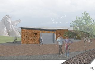
Fresh from publication of ZM Architecture’s shortlisted entry in the competition to design a new visitor centre to sit alongside Andy Scott’s Kelpies structure Arch Henderson have chipped in with their own oh so nearly plans.Senior Architect Andrew Parker told Urban Realm: “Our approach was very much a direct response to the context of the brief, with an emphasis on the notion of ‘equine architecture’. Developing an industrial narrative we looked to create a visitor centre that acknowledged the factories and boathouses that line the canal without mimicking, yet embracing the innovation of the Kelpies.”
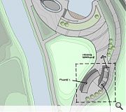
This approach adopts the form of two interlocking horseshoes, allowing a pedestrian route to flow around, between and over the visitor hub, part of a wider “journey” through the landscaped environment with viewpoints to the Kelpies considered throughout.
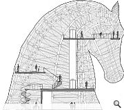
A separate enclosed lift was also designed to whisk sightseers 20m up into mane of one of the giant equine heads, a deliberate attempt to build anticipation during the surreal ascent.
Parker added: “…a glazed walkway extends out over the head of the Kelpie allowing those brave enough to venture out over the 4-storey drop and experience a sculpture like never before.”
Ultimately however it was Nicoll Russell Studios who swayed jurors with their ‘dynamic’ response.
|
|
5 Comments
#2 Posted by Wonky Walloper on 28 Mar 2012 at 00:11 AM
I'm sorry urban realm, but why is so much coverage being given to the runner up of this publicity event? I appreciate seeing the entrants acknowledged but would love to see more of the (very worthy I'm sure) entry from Nicol Russels.
#3 Posted by ... on 28 Mar 2012 at 10:02 AM
Er why does the lift start on the first floor?
#4 Posted by David on 29 Mar 2012 at 11:20 AM
I suspect the judges asked the same question.
Certainly the best use of the sculpture from the 3 schemes posted so far.
Certainly the best use of the sculpture from the 3 schemes posted so far.
#5 Posted by Andrew on 29 Mar 2012 at 11:49 AM
There is a separate lift from ground to first floor not visible in the section. Due to the shape of the Kelpie head the space where a lift can run full height is limited. Where it then meets the ground floor takes up a significant amount of space. Starting the main lift at first floor maximises the useable function space at ground floor.
Post your comments
Read next: Bridgeton office scheme nears completion
Read previous: Barnton Hotel redevelopment in the works
Back to March 2012
Like us on Facebook
Become a fan and share
News Archive
Search News
Features & Reports
For more information from the industry visit our Features & Reports section.


Great to see 3 of the entries for the competition.