Reiach & Hall detail Commonwealth Games regeneration plans
March 16 2012
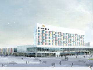
Reiach & Hall have released further details on their design for a £44m retail and leisure park in Glasgow adjacent to the National Indoor Sports Arena, centrepiece of the 2014 Commonwealth Games.The development will be dominated by a 150 bedroom hotel clad in white ceramic tiles, enlivened by a series of decorative windows to inject a splash of colour into the east end.
Alongside the hotel will be built a health centre faced with translucent glass bricks, 1100sq/m of retail and five restaurants.
Lyle Christie, director at Reiach and Hall, said: “The vibrant colours of the hotel are an abstraction of Holland’s Tulip fields. The colour palette is informed by the work of the Dutch artist Steven Aalders, who showed some work in our gallery, Sleeper, a few years ago.”
Work on the scheme could commence as early as July if approved.
6 Comments
#1 Posted by Academic on 16 Mar 2012 at 16:55 PM
Euro hostel on Jamaica Street superimposed on Potsdamer Platz......
#2 Posted by Neil on 19 Mar 2012 at 09:30 AM
#1 Exactly! I knew it looked familiar!
The logo is horrid too.
The logo is horrid too.
#3 Posted by Tom H on 19 Mar 2012 at 13:25 PM
Horrific design. Looks like a cold war airport and the fact that garnish colour panels are hyped up because they are the only slightly non-standard architectural element is really tragic. Regeneration of the East End will fail with anti-placemaking designs like these.
#4 Posted by Walt Disney on 19 Mar 2012 at 14:50 PM
Now don't get me wrong. R&H are a good company and Lyle is a good architect....but I think Acadenic is not too far off with Potzdammer Platz. I'd go more for Alexanderplatz though.
Maybe its going to be a DDR themed hotel (loads of them in Berlin). Bad food, good beer, burly female staff, and slightly bizarre politically inspired cartoons played on the 1960s style TVs.
Maybe its going to be a DDR themed hotel (loads of them in Berlin). Bad food, good beer, burly female staff, and slightly bizarre politically inspired cartoons played on the 1960s style TVs.
#5 Posted by dial-a-lama on 19 Mar 2012 at 17:12 PM
In the German vein of thought.....the colours look like a very poor Sauerbruch Hutton scheme. I have liked lots of R&H's recent schemes - and I don't dislike this one....yet.....undecided.....
#6 Posted by Big Chantelle fae the gorbals on 19 Mar 2012 at 21:04 PM
Cannae wait tae stay in this hotel. It will be pure magic so it will. I want a room wae red windeys since red is ma fave color.
Post your comments
Read next: Charles unveils prototype Arts & Crafts home
Read previous: Carbon Trust announce Low Carbon Building Award winners
Back to March 2012
Like us on Facebook
Become a fan and share
News Archive
Search News
Features & Reports
For more information from the industry visit our Features & Reports section.


