Easyhotel over-cladding works complete
February 20 2012
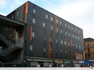
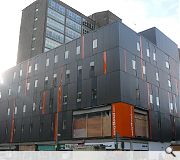
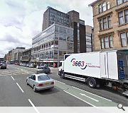
Work to over-clad an unsightly 1960s office block on Glasgow’s Hill Street is nearing completion following a £3m refurbishment programme by ICA Architects.The East Kilbride based practice have chosen to overlay the existing concrete structure with a series of matte grey metal panels, with orange highlights to advertise the low cost pretensions of Greek entrepreneur Stelios Haji-Ioannou’s “Easy” brand.
The EasyHotel will offer 130 rooms at cut price rates upon completion.
|
|
14 Comments
#1 Posted by Enjoy on 20 Feb 2012 at 11:22 AM
TCA Design Associates - Provider of Architectural Design services. Hmmm. Can't believe anyone with any formal design training would think that was any good. Any the Council should be ashamed of themselves for approving it. Looks like a Communist Prison
#2 Posted by Alan Dunlop on 20 Feb 2012 at 11:31 AM
This does look rather depressing. Drummond House was always a good building for a studio, plenty of natural light, good position to the north of the city centre. Trouble was you'd never know who you'd meet at the foot of the stairs. Doubt that that has changed.
#3 Posted by Neil on 20 Feb 2012 at 11:44 AM
And the original was 'unsightly'?
#4 Posted by MJ on 20 Feb 2012 at 12:05 PM
All very depressing. Was a good office to work in - very light and airy. RMJM were in the building as well at one point. Absolutely appalling design!
#5 Posted by Monkey9000 on 20 Feb 2012 at 19:51 PM
Was it ICA or TCA that designed this? Take a look: http://www.icaarchitects.com/index.php/architecture/glasgowcowcaddens.html/
#6 Posted by Robert on 20 Feb 2012 at 21:15 PM
Another dreary building.
#7 Posted by Thomas Hamilton on 20 Feb 2012 at 21:20 PM
Easy on the over cladding. Looks like the "designer" was also budget.
#8 Posted by Lefty the Lag on 21 Feb 2012 at 01:22 AM
A Glesga polis station wi' shops below it.
That's handy.
That's handy.
#9 Posted by Egbert on 21 Feb 2012 at 09:58 AM
There are shuffly barcode facade treatments and then there's plain incompetance. This looks like a badly stacked pile of portakabins with Sainsbury's bags stuck in the gaps.
#10 Posted by Fedupwiththeconstantmoaning on 21 Feb 2012 at 10:31 AM
You lot should be ashamed of yourselves. Didn't your mothers ever teach you that if you have nothing nice to say, don't say anything at all? But then I guess you'd never say anything. Ever. So you don't like it. It's not to my taste either, but then I don't think the photos do it any justice - have any of you even been to see it? Plus is is no longer an office - it's a hotel. So large amounts of daylight might not be a good idea.
#11 Posted by Frank on 21 Feb 2012 at 11:11 AM
Mon the Fishes
#12 Posted by urbanrealm on 21 Feb 2012 at 11:21 AM
@Monkey9000 - yes, it was ICA.
#13 Posted by BL on 21 Feb 2012 at 14:35 PM
Egbert, bad spelling also indicates *incompetence*
#14 Posted by robert on 22 Feb 2012 at 02:18 AM
have any of you even been to see it?
fedupwiththeetc I have been to see it and it's not nice. If it had been, I would have said so. You have a point though...
fedupwiththeetc I have been to see it and it's not nice. If it had been, I would have said so. You have a point though...
Post your comments
Read previous: Strathclyde Police HQ plans delayed
Back to February 2012
Like us on Facebook
Become a fan and share
News Archive
Search News
Features & Reports
For more information from the industry visit our Features & Reports section.


