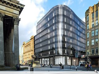
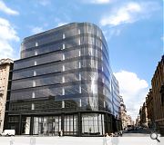
110 Queen Street plans approved
February 8 2012
Plans to erect a £70m office block housing 143,000sq/ft of Grade A accommodation have been approved by Glasgow City Council – although construction will not commence ahead of a pre-let.Demolition work will now commence on a 1964 office block on the prominent Merchant City junction
Designed by Cooper Cromar on behalf of BAM Properties the development comprises a nine storey glass façade around an inverted curve and roof terraces to take advantage of city centre vistas.
It will also incorporate retail/leisure units along the Ingram Street frontage and basement parking for 56 vehicles.
Bam Properties Development Director, Michael Smart, said: “110 Queen Street has been a bit of a blot on the landscape for a number of years and it is a great opportunity for us to create a vibrant new building which links the City Centre to the Merchant City and enhances the Glasgow Style Mile.
“Not only will the building look terrific but it will offer a highly sustainable, desirable office environment. Despite not undertaking a marketing campaign we have already had enquiries for both retail and office accommodation.”
The building will not be completed before 2014 at the earliest.
Urban Realm spoke to project architect Simon Walsh in May of last year.
20 Comments
#1 Posted by glass on 8 Feb 2012 at 17:11 PM
nice piece of glass
#2 Posted by Big Charlene fae the Gorbils wae the icecream van that sells the best MrWhippy in Glesga! on 8 Feb 2012 at 19:00 PM
So, in the middle of a conservation area of sorts, where the character of the architecture is defined by beautiful stone buildings they decide to have a black and chrome metal building.
Pure. Dead. Brilliant.
Not.
Oh, but look, the building has a wavy elevation for added interest. Interest my a*se.
Pure. Dead. Brilliant.
Not.
Oh, but look, the building has a wavy elevation for added interest. Interest my a*se.
#3 Posted by Enjoy on 8 Feb 2012 at 20:18 PM
It's like they picked up their building in Bothwell Street, bent and contorted it into shape to fit this site. Lazy, unimaginative pile of cr*p and wholly inappropriate to the context.
#4 Posted by Noah Murney on 8 Feb 2012 at 20:56 PM
The decision to design a prominent city centre building with a facade featuring as a major design motif the under-desk detritus of unfortunate office dwellers is both bold and imaginative.
At least, it is in the minds of unimaginative property developers like this lot.
('BAM'? In Glasgow? Seriously?)
The existing concrete turdscraper that has dominated this site for the last four decades was execrable enough.
We hoped for an imaginative replacement.
Hope's good. Imagination's good too.
Looks like we've got a long wait.
#5 Posted by Gordon on 9 Feb 2012 at 08:27 AM
Jesus. At least the previous block had a bit of character. This just has...well, lots of glass. You'd think office design would have moved on somewhat in the past 20 years, but apparently not.
At least UR have decided to name and shame those responsible.
At least UR have decided to name and shame those responsible.
#6 Posted by Jesus on 9 Feb 2012 at 11:21 AM
yes my son......oh
#7 Posted by doctorwho on 9 Feb 2012 at 11:24 AM
how can this be approved by the city?
#8 Posted by wow on 9 Feb 2012 at 11:32 AM
at least they have some work dont scoff you bitter mean spirited begrudgers.
#9 Posted by Onesey on 9 Feb 2012 at 11:42 AM
I like it.
#10 Posted by Gordon on 9 Feb 2012 at 12:38 PM
Mean spirited? Quite. They've tried really hard with the CGI so I suppose I should really let them off then.
#11 Posted by bob on 9 Feb 2012 at 12:42 PM
I prefered the previous consented scheme...
http://www.holmespartnership.com/projects/commercial/com_006.php
...lots of stone and deep window reveals, and shoulder heights that actually respect the neighbouring buildings.
http://www.holmespartnership.com/projects/commercial/com_006.php
...lots of stone and deep window reveals, and shoulder heights that actually respect the neighbouring buildings.
#12 Posted by Brian on 9 Feb 2012 at 13:25 PM
It wouldnt look out of place along the clyde!
This is ugly just look at the buildings around it.
This is ugly just look at the buildings around it.
#13 Posted by deek on 9 Feb 2012 at 13:57 PM
Look like the work of one of those krays
#14 Posted by m on 9 Feb 2012 at 17:31 PM
The Holmes scheme was far superior in terms of appropriateness to context - if not exactly world beating. The planning dept really don't know what they're doing...and neither to Cooper Cromar apparently...
#15 Posted by dirige on 9 Feb 2012 at 18:03 PM
The Holmes scheme was a bit overly tame, but perhaps the CC scheme is making the same mistakes of the building it is replacing?
#16 Posted by Dial-a-lama on 9 Feb 2012 at 18:54 PM
It may not be as awful as the majority seem to think. It's reminiscent of the Willis Faber Dumas building by Foster - which, granted, is not flawless. Although that very statement says more than intended; WFD building is 20-30 years old and to be designing something so similar now is questionable.....
"...it will offer a highly SUSTAINABLE, desirable office environment"
That seems like a contradictory statement given that it's an entirely glazed facade (silly me had forgotten how low the embodied energy of glass is and how well it deals with solar gains, thereby reducing cooling demands) and encourages 56 cars to be driven into the city centre each day....
It really doesn't look that bad but I think we'd all appreciate it if BAM and CC didn't sprinkle a turd with sugar and call it chocolate.
#17 Posted by grunter on 10 Feb 2012 at 00:10 AM
I itsss na bad quite smart like. Lije bewkeys aye!
#18 Posted by rA on 10 Feb 2012 at 16:56 PM
Will they ever learn? Characterless and dull, just when some ugly 60's architectural scar can be healed they go and slot in another blunder!
#19 Posted by Ross on 10 Feb 2012 at 21:57 PM
I could like building a lot- but Glasgow was and Scotland was built on sandstone, granite and marbel - could this have not been integrated? At least have some Scottish influence for identity. But alas it is nicer than the current monstrosity.. For the next few decades anyway.
#20 Posted by Charlie on 20 Nov 2012 at 01:03 AM
Conserve buildings by all means but the hell with the city center of Britain's 4th biggest city being a 'conservation area'. It looks excellent.
Post your comments
Read next: Contractor of the year survey launched
Read previous: Edinburgh World heritage seeks new board members
Back to February 2012
Like us on Facebook
Become a fan and share
News Archive
Search News
Features & Reports
For more information from the industry visit our Features & Reports section.


