Alternate Queen Street Station vision outlined
September 30 2011
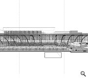
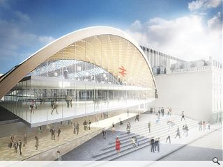
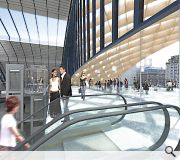
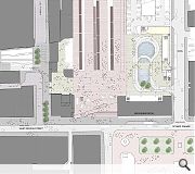
Fresh from Network Rails publication of its preferred solution for the redevelopment of Queen Street Station, a glazed extension penned by architects BDP, Paul Stallan Studio RMJM have released details on the one that got away.Stallan’s refresh studio sought to address two main areas in their proposal - to extrude the existing structural arch of the station out to George Square and create a new public space below it at the entrance to the station concourse.
This additional public space resulted in a net loss of retail space however - which may ultimately have weighed against the scheme.
As in BDP’s scheme Stallan’s approach would have incorporated a redesigned taxi drop off and circulation space to the east, incorporating a huge new multi storey car park to facilitate expansion plans at the Buchanan Galleries – the owners of which are carrying out the revamp.
Buchanan Galleries are seeking to expand their mall with £83m of public money being stumped up by Glasgow City Council for the public works component under a Tax Increment Finance scheme.
This is being challenged by the rival St Enoch Centre, which funded its own recent £100m refurbishment, as uncompetitive.

Queen Street Station's roof, its stand out feature, would be dug out from behind a mess of 60's concrete
|
15 Comments
#2 Posted by Sg on 30 Sep 2011 at 15:52 PM
A much better scheme. The chosen one is crap and an embarrassment. What can we do to get this built!!
#3 Posted by Chris on 30 Sep 2011 at 17:07 PM
Frank Lloyd Wright, the bridge is due to be strengthened in 2013.
#4 Posted by Barry on 30 Sep 2011 at 17:29 PM
I think this scheme is superior with regards to addressing the space between the hotel and building gable-wall adjacent. The arched roof also adds a nice, attractive frontage to the design looking onto George square (which if Glasgow city council pull their fingers out, remove the red tarmac, add a nice fountain, and do a nice classical reconstruction of that office block in the corner, will have easily the best square in the UK).
The other proposal I think is superior is regards to how we can look into the station from outside and see the trains which adds a nice visual component tot he design.
Anyway, either designs are a vast improvement on the concrete sh*te currently there.
The other proposal I think is superior is regards to how we can look into the station from outside and see the trains which adds a nice visual component tot he design.
Anyway, either designs are a vast improvement on the concrete sh*te currently there.
#5 Posted by D to the R on 1 Oct 2011 at 16:56 PM
I dont get it? This scheme is miles better than the preferred one - Maybe RMJM didn't get this 'cos there too busy at the Commonwealth Games site ..... I cant think of any other reason ?!
#6 Posted by RDRR on 1 Oct 2011 at 17:42 PM
Money, surely?
#7 Posted by D to the R on 1 Oct 2011 at 19:08 PM
They found the £££ for that heap of crap along at the Transport Museum - surely this is as impotant an oppurtunity - no?
#8 Posted by RDRR on 1 Oct 2011 at 19:17 PM
I agree completely...in fact I'd say it is far more important but then I don't know where the money is coming from and who allocates it...either way priorities do seem rather skewed. The only reason I can see for them choosing the other scheme over this is money (as stated in the article, less retail space, probably cheaper to build, easier to fudge - see Partick station...).
#9 Posted by murphy on 2 Oct 2011 at 08:38 AM
lets hope we don't end up with another partick station, its a cheap pile of sh**e, cut corners and cheap details which will look outdated and in need of refurbishment in about 3 years.
The extruded roof at least has some conceptual clarity but the steps and a ramp up to the ground floor looks a mess and then you've got that massive big ugly gable as the first thing you see... and we all know we won't be getting a H+dM ala' the CaxiaForum in spain
The extruded roof at least has some conceptual clarity but the steps and a ramp up to the ground floor looks a mess and then you've got that massive big ugly gable as the first thing you see... and we all know we won't be getting a H+dM ala' the CaxiaForum in spain
#10 Posted by pompeii,salute,naughty,naughtay... on 2 Oct 2011 at 12:22 PM
i much prefer this extruded concept to the designed-on-google-sketchup one which is apparently (ha) going ahead. i am appalled that neither this nor the winning scheme include consort house in their remit as that has such prominence from george sq. the millennium hotel originally had a west gable facing into the short section of queen street that serves as the taxi rank, and one would expect this to be reinstated.
#11 Posted by NC on 3 Oct 2011 at 09:49 AM
Infinitely better, but would be nice to see some treatment to the gable of the Millenium Hotel and the streetscape extending to pedestrianising George Square and getting rid of that horrid multi-purpose red stuff.
#12 Posted by forbesio on 3 Oct 2011 at 13:20 PM
I can't believe there are no winges here from Starchitects regarding bemoaning the loss of another icon of modernism (i.e. the existing concrete and glass excresence along the frontage to West George St).
The obvious solution here is to complete George Sq by inserting a new building of appropriate scale / solidity at the west part of the frontage and revealing / reinstating the west elevation of the unfortunately titled and extended Millenium Hotel, thereby respecing the street pattern of the square.
Probably as much chance reinstating the old St Enoch Station and its listed hotel frontage which was unfortunately demolished by the Scottish Development Agency ?
#13 Posted by david nimmo on 5 Oct 2011 at 16:26 PM
It's certainly an improvement but there is something odd about the perspectives. The external one shows two large floorplates under the arch, function unclear, held up by antigravity and populated with hobbits, while the interior view doesn't. The adjoining gable ends are still not addressed.
Alan Dunlop's suggestion offered a better route forward, imho anyway.
When you see St.Pancras in its refurbished state, you appreciate something of what Glasgow lost at St. Enoch's to gain a standard issue Mall. The words criminal negligence come to mind.
Alan Dunlop's suggestion offered a better route forward, imho anyway.
When you see St.Pancras in its refurbished state, you appreciate something of what Glasgow lost at St. Enoch's to gain a standard issue Mall. The words criminal negligence come to mind.
#14 Posted by kevin toner on 8 Oct 2011 at 12:03 PM
Something that hasn’t been discussed yet, but implied in ways, would be to marginally superimpose the grid pattern back onto the station/hotel superblock, i.e. by taking on board the contextual factors below.
All proposals so far have viewed this particular urban condition as a hindrance rather than an opportunity and have ignored the legibility that is currently there, i.e. the exposed gable of the 1960s office block; the radically embellished corner of the Chamber of Commerce; the disgracefully hidden station arch and the obscured Edwardian heritage of the hotel’s western elevation.
Working with this extant legibility means cutting the hotel’s footprint back to where it belongs as planned, but it also means so much more: i.e. A) the hotel’s original west elevation would be reinstated; B) the unsightly 1972 block infill and undercroft building would be removed; C) the exposed east gable of the SW corner office block [i.e. a party-wall in waiting] would be finally built up against with a new ‘urban building’ proper, which will have a proper east elevation to face the hotel’s west elevation; D) would then give a glimpse through to a segment of the impressive Victorian glass/iron arch and the wonderfully inviting internal space beyond; and E) would then make sense of the wonderfully elaborate corner compositions of the Chamber of Commerce that is currently begging to greet passengers to the City and to George Sq. from the arch (nb: there are very few block corners with this level of crescendo)! Therefore such superimposition of the grid pattern is crying out.
Queen Street can of course widen slightly at this proposed head of the street to take full advantage of framing the Chamber of Commerce corner. This would give Queen Street the conclusion it deserves having already had Royal Exchange Square as one of its offerings/bastions.
And finally, we could say to the common Queen Street Station searcher that it’s quite simply at the top of Queen Street and mean it! Let’s do it now and not deny this legibility any further!
#15 Posted by kevin toner on 8 Oct 2011 at 14:58 PM
oops! erratum:
"...obscured Edwardian heritage of..." was meant to read
"...obscured Georgian heritage of...",
a massive accidental [almost 200 years out] word usage slip-up. Embarrassing albeit not an historian!
"...obscured Edwardian heritage of..." was meant to read
"...obscured Georgian heritage of...",
a massive accidental [almost 200 years out] word usage slip-up. Embarrassing albeit not an historian!
Post your comments
Read next: Maggie’s Gartnavel officially opened
Read previous: Summerlee heritage trail given makeover
Back to September 2011
Like us on Facebook
Become a fan and share
News Archive
Search News
Features & Reports
For more information from the industry visit our Features & Reports section.


How long has it sat like that - 10 years?