110 Queen Street plans submitted
September 20 2011
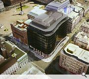
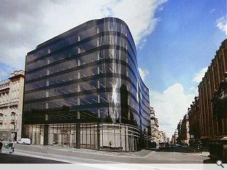
Cooper Cromar Architects and BAM Properties have submitted a planning application for the £28.5m redevelopment of 110 Queen Street.Providing 143,000sq/ft of accommodation over nine levels the development is being sold as an attempt to reinstate the building line of Ingram Street and Queen Street whilst enhancing pedestrian flow from Buchanan Street to the Merchant City - via a rounded form and street level retail.
This latter element will be highlighted via a series of aluminium fins running parallel to the basecourse.
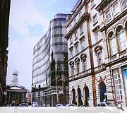
The primary entrance for office workers meanwhile has been positioned opposite Royal Exchange Square, in order to further animate the important public space.
To handle the abrupt juxtaposition of black glass curtain walling and the ornate blonde stonework of neighbouring properties Cooper Cromar have devised a recessive ‘shadowgap’ comprising a black granite transitional strip.
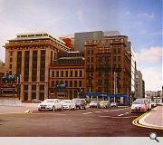
The upper portion of the rear elevation, which will be prominent from George Square, comprises a wall of dark grey metal panels, ostensibly to visually marry with the lead roofing of Lomond House.
A redundant bank building on the existing site is already in process of being stripped in anticipation of its demolition being given the green light by planners.

Cooper Cromar visited the latest office developments in the capital for inspiration - an evolution of Aurora on Bothwell Street
|
24 Comments
#2 Posted by Manifest on 20 Sep 2011 at 12:58 PM
this is one of the worst schemes that has ever been proposed for Glasgow (and thats saying something).
"an attempt to reinstate the building line of Ingram Street"
really? with a curved facade that sticks out past the Ingram Street building line, and a scale massively out of proportion with context.
"a series of aluminium fins running parallel to the basecourse."
a trick they learnt form BDP schemes no doubt (we all know the planners love a feature fin).
"The upper portion of the rear elevation, which will be prominent from George Square, comprises a wall of dark grey metal panels, ostensibly to visually marry with the lead roofing of Lomond House."
Except 5 storeys higher...its like they have put a plant room ziggurat on the roof.
"To handle the abrupt juxtaposition of black glass curtain walling and the ornate blonde stonework of neighbouring properties Cooper Cromar have devised a recessive ‘shadowgap’ comprising a black granite transitional strip."
err...so to match blonde sandstone with black curtain walling - they are using a black granite? thats makes total sense...............
the only thing 'recessive' in this whole mess, is in the genes of Cooper Cromar and BAM who got together to birth this unholy piece of trash.
#3 Posted by Barry on 20 Sep 2011 at 13:21 PM
I don't like this development either. Glasgow has all these sandstone beauties and then up pops some black glass monster.
Why are architects so against classical reconstructions in sensitive areas? I think George Square needs to be made complete via classical reconstructions because the square is already configured that way. Similarly, this new building on Ingram street is completely out of sync with its neighbours.
Don't like it. At all.
#4 Posted by Brian on 20 Sep 2011 at 13:49 PM
It is very imposing,even the old one now blends in well!ingram st is a nice street ,i hope they dont ruin it with this.George sq,was better in 70s/80s.i remember someone suggesting to council to relocate doulton fountain to the sq.they said the terracotta red wouldnt fit well with buildings around it.They put red tarmac all over place!
#5 Posted by Barry on 20 Sep 2011 at 13:53 PM
@Brian
I despise the red tarmac. It's ugly. George square is potentially an incredible square -- but it is blighted by 20th century ugliness.
I despise the red tarmac. It's ugly. George square is potentially an incredible square -- but it is blighted by 20th century ugliness.
#6 Posted by exCC on 20 Sep 2011 at 13:54 PM
one word... pish
#7 Posted by murphy on 20 Sep 2011 at 14:04 PM
This is rotten!
More suited to a crap out of town office development, it makes the previously proposed schemes for the site look beautiful. The current 60s building is 10 times more interesting and at least has some integrity. it seems to be a good excuse to pull down buildings and build new ones - could this be anything to do with the fact they don't pay VAT on new builds?
What a waste and they should be ashamed of ruining such a glorious opportunity, the view out from the square is going to be quite appallingly boring. It isnt helped by the crap images either, if they can't even make it look half good in photoshop its gonna look like a monstrous pile of s**te when its built.
#8 Posted by Stanley Boumchenke on 20 Sep 2011 at 14:36 PM
http://upload.wikimedia.org/wikipedia/commons/7/7d/Foster_-_
#9 Posted by Stanley Boumchenke on 20 Sep 2011 at 14:36 PM
http://upload.wikimedia.org/wikipedia/commons/7/7d/Foster_-_Willis_Faber_and_Dumas_Headquarters_Ipswich.jpg
Even...
Even...
#10 Posted by wtf on 20 Sep 2011 at 16:33 PM
Stop destroying my city.
#11 Posted by Manifestoid on 20 Sep 2011 at 16:51 PM
Clearly Stanley Boumchenke see’s this as a landmark in the development of the 'high tech' architectural style.
#12 Posted by Jamie Hodge on 20 Sep 2011 at 17:31 PM
Well designed, modern office buildings certainly have their place in Glasgow, and certainly developments such as Aurora have brought interest to the street-scene.
However if there is one place that is not suitable for a black, plate glass building it is this site! Are the architects/ developers mad? Have they actually looked around at the surrounding context - the beautiful Royal Exchange Square and GOMA, the neighbouring imposing sandstone buildings? It's like they have deliberately decided to stick two fingers up at the area and by extension Glaswegians in favour of something that would be fine down at Atlantic Quay but definitely not here.
One only hopes that those responsible for conservation and urban design within the council make a stand on this - as well as the Urban Design Panel. If this goes ahead as is, it will be a tragedy, and a disaster for this part of Glasgow's architectural heritage.
And Cooper Cromar (creator of such architectural masterpieces as the Fort and St Enoch's Centre) should be thoroughly ashamed of themselves.
Just saying.
#13 Posted by Boab on 20 Sep 2011 at 19:10 PM
i like it
I don’t see anyone else doing anything better in Glasgow just now ...no ?
I don’t see anyone else doing anything better in Glasgow just now ...no ?
#14 Posted by Ross on 21 Sep 2011 at 01:25 AM
The previous scheme was vastly superior. Expected better from Cooper Cromar.
#15 Posted by Me on 21 Sep 2011 at 10:50 AM
That is just minging and wrong on so many levels! Height, massing, materials, contextual response.....all pants. Visited sites in the capital? Do they mean Edinburgh? I think not. More likely a wee jolly to London, but London isn't Glasgow so maybe if they thinks that's what's appropriate, they should relocate south of the border and take this monstrosity with them.
#16 Posted by Tommy on 21 Sep 2011 at 13:23 PM
I went along to the public consultation event on this a few months back - at the Lighthouse and accessible during the evenings - to look at the plans and there were only 2 other members of the public there. A word to all you keyboard warriors that, although pre application consultation gets mocked, attending and commenting there is more useful than webpage comment posts. Get involved if you want to moan.
#17 Posted by Stanley Boumchenke on 21 Sep 2011 at 13:31 PM
@ Manifestoid
Thats one way of looking at it - the other is a rubbish rip off. Which position do you hold at CC?
Architectural minion or sensitive director?
Thats one way of looking at it - the other is a rubbish rip off. Which position do you hold at CC?
Architectural minion or sensitive director?
#18 Posted by David on 21 Sep 2011 at 13:33 PM
http://www.holmespartnership.com/projects/commercial/com_006.php
...the previous application.
...the previous application.
#19 Posted by Arg on 21 Sep 2011 at 15:47 PM
^ That one is also poo.
Can't we just outfit the current building? It's there, may as well use it. Hell it's even contextually sensitive and rather nice if you ask me (especially compared to any of the rubbish proposed to replace it). Surely these days it is preferable to reuse existing buildings rather than tear down and rebuild (especially profit-led crap such as here that will no doubt lie empty for years anyway)? Especially in a city like glasgow with so many gap sites just dying for development...
Can't we just outfit the current building? It's there, may as well use it. Hell it's even contextually sensitive and rather nice if you ask me (especially compared to any of the rubbish proposed to replace it). Surely these days it is preferable to reuse existing buildings rather than tear down and rebuild (especially profit-led crap such as here that will no doubt lie empty for years anyway)? Especially in a city like glasgow with so many gap sites just dying for development...
#20 Posted by Me on 21 Sep 2011 at 19:02 PM
The Holmes scheme would have been a vast improvement - even more so if it had lost the (transparent therefore invisible!!) glazed upper floors. It at least has a certain dignity and grace about it, is more proportionally correct even if it is caught up in the currently trendy random fenestration idiom.
#21 Posted by Chris on 22 Sep 2011 at 17:56 PM
There is nothing dignified nor graceful about random fenestration, it's a plague on our city.
#22 Posted by Meteor on 23 Sep 2011 at 09:41 AM
GCC planners - lets see how big your cojones are when you write up the recommendation for this!
#23 Posted by Jealous? on 25 Sep 2011 at 09:53 AM
Sounds like a load of jealous snipes from designers with far to much time on their hands wishing they had the opportunity to work on a project of this stature
And no i dont work for CC
And no i dont work for CC
#24 Posted by Barry on 27 Sep 2011 at 07:30 AM
@Jealous?
Or, the building being proposed is utter sh*te and not appropriate for the location. Yep, that's probably the answer.But hey, if people dislike the building, it must be because of jealousy. Not.
Or, the building being proposed is utter sh*te and not appropriate for the location. Yep, that's probably the answer.But hey, if people dislike the building, it must be because of jealousy. Not.
Post your comments
Read next: Work commences on mixed use Stirling project
Read previous: Schoolboy to pull the plunger on three Edinburgh multis
Back to September 2011
Like us on Facebook
Become a fan and share
News Archive
Search News
Features & Reports
For more information from the industry visit our Features & Reports section.


The images contradict everything that the text says about...
"animate the important public space"
"an attempt to reinstate the building line of Ingram Street"
"to visually marry with the lead roofing of Lomond House"
Thank goodness it has Feature Fins. The saviour of every Glaswegian, commercial, behemoth.