Strathclyde University submit Technology and Innovation Centre plans
September 5 2011
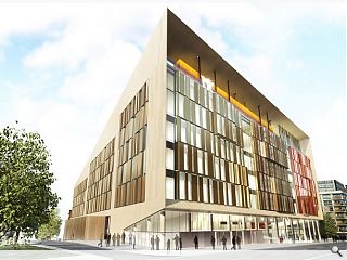
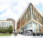
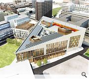
Strathclyde University have submitted plans for a new £89m Technology and Innovation Centre in Glasgow’s Merchant City.Rising on brownfield land on George Street, adjacent to a separate industry engagement building from Scottish Enterprise, the building is intended to facilitate enhanced crossover between academia and industry.
Designed by BDp the 22,000sq/m facility will be clad in stone and encompass a central atrium lined with interactive spaces and balconies.
Subject to planning consent the scheme could commence on site in January 2012 and complete for 2014.
|
|
21 Comments
#2 Posted by Brian on 5 Sep 2011 at 14:59 PM
funny but true.what happened to the circular building plans etc etc etc.
#3 Posted by Barry on 5 Sep 2011 at 15:01 PM
@Brian
I agree. The circular building was far more interesting. Aw well, a nice jagged/random clad build it is. Hoorhah!
I agree. The circular building was far more interesting. Aw well, a nice jagged/random clad build it is. Hoorhah!
#4 Posted by D to the R on 5 Sep 2011 at 15:21 PM
Come on guys...everyone know circles were SO last year ... the triangle is the new circle ... tut ... get with it
#5 Posted by Barry on 5 Sep 2011 at 15:26 PM
@D to the R
How rude of me. I should have knew that. Can't wait for next year when heaxagonal buildings make a comeback. Pure class!
How rude of me. I should have knew that. Can't wait for next year when heaxagonal buildings make a comeback. Pure class!
#6 Posted by Jimbo on 5 Sep 2011 at 16:12 PM
Surely the building is triangular because the site is triangle in shape and to avoid losing the public realm along the site’s western edge? Or is that too pragmatic an observation, lacking in archibabble nonsense, to merit consideration here?
#7 Posted by Barry on 5 Sep 2011 at 16:16 PM
@ Jimbo
Oh my, I'm positively overwhelmed by the usage of the word 'archibabble'.
I suppose the 'random clad' features are there to avoid being a building that aims for something greater than the 'random clad' mediocrity we already have?
Oh my, I'm positively overwhelmed by the usage of the word 'archibabble'.
I suppose the 'random clad' features are there to avoid being a building that aims for something greater than the 'random clad' mediocrity we already have?
#8 Posted by Jimbo on 5 Sep 2011 at 17:21 PM
Focus, Barry, focus... Don’t just bang away at the keyboard like an over-reactive and infuriated chuckle brother!
I didn't comment on the cladding, which I don't really like either, because enough folk had already stuck the boot into it.
Any thoughts on the building maybe being triangular because the site is triangular?!?
I didn't comment on the cladding, which I don't really like either, because enough folk had already stuck the boot into it.
Any thoughts on the building maybe being triangular because the site is triangular?!?
#9 Posted by Jimbo on 5 Sep 2011 at 18:45 PM
The site isn't triangular. The building is. Difference.The new building design, as opposed to the previous proposal, doesn't follow the existing streetplan.And I think it suffers for it.
Regarding my thoughts -- I think it's hideous in terms of its aesthetics.I think it will age terribly and I think the random clad is just so passé.
So there you go Jimbo. That's my 'archibable'.
What's your thoughts?
Regarding my thoughts -- I think it's hideous in terms of its aesthetics.I think it will age terribly and I think the random clad is just so passé.
So there you go Jimbo. That's my 'archibable'.
What's your thoughts?
#10 Posted by Barry on 5 Sep 2011 at 18:45 PM
*post 9 was by Barry and not Jimbo* lol
#11 Posted by Barry on 5 Sep 2011 at 19:08 PM
To me...
#12 Posted by Jimbo on 6 Sep 2011 at 11:34 AM
To you! Thought I was losing it for a minute there.....
I think it does follow the surrounding street pattern, using the link between George Street and Shuttle Street as its western edge. However like a lot of development (Glasgow Harbour is most obvious to me) it's hard to judge it holistically (i.e. as a place, not just buildings) just now because there is empty land around it with a subsequent lack of connections and relationships between buildings, spaces, the surrounding area etc. I think the length of public realm between Glasgow Harbour and the Clyde is really attractive, but until development around it is completed (and you could argue this extends way, way along the Clyde in either direction), it's not a great space, because it's not used much – there’s no reason to go down there unless you live there.
In this case, it appears that there's an area of public realm between the proposed triangular building and the western portion of the block (unless I’m looking at the wrong site and google maps is out of date!). Once and if there's development on the whole block with this link running diagonally across it, I think it will be a nice variation in the area, providing an attractive access and link between George Street and Shuttle Street / Ingram Street. So, in due course, it could respond well to the street layout, it’s hard to say just now, but I’m being optimistic and hoping for the best!
Cue Glasgow Harbour ranting…
#13 Posted by Meteor on 6 Sep 2011 at 13:51 PM
Whichever way you look at it, judging by the published images, the proposal looks like a third-rate derivative version of what was fashionable in London three years ago. Can anyone name three world-class buildings built in Glasgow in the last five years?
#14 Posted by Barry on 7 Sep 2011 at 07:07 AM
@Meteor
Yep. The building looks like it aspires to satisfy some perceived sense of fashion. i.e the overused 'random cladding' etc.
@Jimbo
Glasgow Harbour obviously needs to be viewed within the wider framework of the actual designated plans which are yet to be completed. However, the current buildings are unremarkable and many have complained of a shoddy finish e.g panels falling off the buildings etc.
Regarding this building, it's just bland. There's all these sandstone gems around it, and then this plops up -- random cladding, multicoloured panels, funny triangular shape........... Also, the public realm area is hardly of some civic importance -- it will be mostly frequented during the cold, winter months which is when most of the academic calendar takes place. Most students will go to a cafe instead.....
#15 Posted by brian on 7 Sep 2011 at 11:00 AM
The access to and from train station at secc needs looking at so we can do away with that plastic tunnel.a station that will be easy to access from the secc and new hydro arena /armadillo area.And open up Glasgow x station with hub linking city union line to collegelands.it would help sustain regeneration,and link south-north of city and beyond.had my rant.
#16 Posted by Jimbo on 7 Sep 2011 at 11:09 AM
"crossover between academia and industry" doesn't make really me think of undergrads though. What about all the postgrad students, researchers and members of staff who are there year round?!?
In terms of the public realm area / link, it looks like a throughway anyway, not a hanging about in the cold and / or rain kidding on we're enjoying the street life in a continental kinda way. That said, the area of grass is open to the south, so should be quite nice in the summer??
In terms of the public realm area / link, it looks like a throughway anyway, not a hanging about in the cold and / or rain kidding on we're enjoying the street life in a continental kinda way. That said, the area of grass is open to the south, so should be quite nice in the summer??
#17 Posted by smileyb54 on 7 Sep 2011 at 13:00 PM
Hey guys I'm enjoying your "banterbabble"
#18 Posted by Barry on 7 Sep 2011 at 13:15 PM
@smileyb54
Banterbabble, archibabble -- you name, we've sayin' it! lol
Banterbabble, archibabble -- you name, we've sayin' it! lol
#19 Posted by Arthur on 7 Sep 2011 at 13:32 PM
Oh dear! - I don't think this particular design particularly inspires - strikes me as being a Wedge for the Weegies!!
#20 Posted by godzilla on 7 Sep 2011 at 13:34 PM
I remember looking at a school building in Berlin by Behnisch two decades ago whilst working on a competition for another school. They used a glass module repeatedly, unashamedly and yes well.... And then ...layered, blinds and moveable screens on the room side to offer privacy and moments of texture and colour, where it was required.
Some how amid all the... ppp pfi numbing down of big architecture ...these buildings produced for profit, are loosing all humanity, its that which is ruining standards and society.
We have ended up with this modular coloured glass system thats being used everywhere.
As if we cannot be bothered drawing elevations and think about what those offer the street or the user..
Schools hospitals and now universities. I am sure the "incentives" are abundant for big practice to use square miles of it .
But for goodness sake your fee surely lends itself to asking someone with an eye to look at it.
Its like cheap lipstick on an already fully grown gorilla. Another big chunk of stick on flimsy dressage stone that will look like shit in two winters ... in essence its a nasty coloured Public frontage that offers nothing back.
And as for the big oversimplified geometry that tends to get thrown out at first year in the studio. Clearly there has been no Design input on this. Its all square meters and bums on seats and it reads just as that. I dont think anyone will be celebrating it. Try again.
#21 Posted by sdfjsdlfkjsdlfjsdklf on 7 Sep 2011 at 20:10 PM
The very second you read BDP you should have just closed the page. You say crap . . . I say BDP. They are doing a building in Aberdeen, it really is the worst piece of BDP you could imagine.
Post your comments
Read previous: Dunlop publishes Glasgow sketchbook
Back to September 2011
Like us on Facebook
Become a fan and share
News Archive
Search News
Features & Reports
For more information from the industry visit our Features & Reports section.


It's like architects have a checklist to perform:
1.White render = check
2.Zinc cladding = check
3. Sandstone cladding to pretend that the building is actually relating to its environment = check
4. Random cladding for added crappness just so the building can age quickly = check